 Fonti
FontiYour Brand Name
Hello World
Aesthetic fonts are two different searches sharing one name. Half the people typing it want soft, rounded, decorated text with hearts and curls tucked around the edges, and the cute font generator sorts that out. The other half want the stretched look, like this, where every letter sits in its own wide box with air on both sides. That second one is what this page is for, and it carries a real history plus a set of rules almost nobody writes down. Eight styles, all free to copy and paste, with nothing to install.
Style: Bold Script
Your Brand Name
Hello World
Hello World
Hello World
No favourites yet. Tap the star on a card to save it.
Nothing copied yet.
Nothing matches that search.
Numbers stay plain.
characters
Pick an alphabet, a separator and a decoration, then copy the result.
Live preview
0 units
Ⓒⓘⓡⓒⓛⓔⓓ
Unicode records the circled capital M at U+24C2 as an emoji character.
𝙼𝚘𝚗𝚘𝚜𝚙𝚊𝚌𝚎
𝔻𝕠𝕦𝕓𝕝𝕖-𝕤𝕥𝕣𝕦𝕔𝕜
Fullwidth
Vaporwave Greek
Vaporwave Triangle
S p a c e d O u t
Numbers stay plain.
Letters stay plain. The style is a space between each character.
🅂🅀🅄🄰🅁🄴🄳
Numbers stay plain.
Unicode's squared letters are capitals only, so lowercase letters appear as squared capitals.
Marks added over your text, letters unchanged.
An alphabet wrapped in a decoration.
Decoration wrapped around your text, letters unchanged.
Decoration wrapped around your text, letters unchanged.
Decoration wrapped around your text, letters unchanged.
Decoration wrapped around your text, letters unchanged.
Decoration wrapped around your text, letters unchanged.
Decoration wrapped around your text, letters unchanged.
This takes about ten seconds, and the step people rush is always the last one. All eight styles update together as you type, so you can line them up before you commit to one. Doing that comparison matters more here than it sounds, because one of the eight styles has no numbers at all, and that same one turns your lowercase into capitals.
Put in the full phrase you plan to post, numbers included. Squared letters have no digits, so a year or a handle number stays plain while everything around it changes. A single test word hides that completely. You want to find the mismatch here rather than in a published bio.
Eight styles, and the choice comes down to how far you want the letters spread. Fullwidth is the true aesthetic look and the safest of the styled sets. Spaced out gives you a similar feeling using ordinary letters, which makes it the one style that never breaks anywhere. Monospace and double-struck read more technical than soft, and the two vaporwave variants swap some letters for Greek and triangle shapes.
Fullwidth converts your letters and digits and leaves your spaces exactly as they were, so a copied line carries no hidden wide gaps. Dragging a highlight across the line still tends to catch the space at the end, so the copy button is the safer route here.
Paste it where it is actually going and look at it before you save. Username fields are the ones to watch, because wide letters eat horizontal room fast and a name that fits inside the box on this page can arrive cut short over there. A desktop browser also tells you very little about what the same string will do on a phone.
Ask ten people what an aesthetic font looks like and you get two answers that share almost nothing. One group pictures soft handwriting, pale colours and small drawn shapes sitting around the words. The other pictures wide, evenly spaced capitals laid over a sunset gradient with a Japanese city behind them. Both groups type the same words into a search box, which is why most pages on this subject feel like they are answering somebody else’s question.
The split happened because the word got borrowed twice. Tumblr and Pinterest used aesthetic to mean a curated personal look, which pulled it towards soft and pretty. The vaporwave scene used it to mean the ironic revival of 1980s Japanese design, which pulled it towards wide and cold. Neither side gave the word back, so it now points in two directions at once.
The soft half has since split into named moods of its own. Y2K, cottagecore, dark academia, grunge, kawaii, pastel and minimalist all get sold as separate aesthetic fonts, though most of them draw on the same small group of script and rounded alphabets. Those names describe a colour palette and a mood board rather than a set of characters. Wide letters sit outside every one of them, which is the clearest sign that two different things are sharing one label.
| What it looks like | Which half | Where it lives |
|---|---|---|
| wide letters | Wide | This page |
| FΛDΞ ΛWΛY | Wide | This page |
| S p a c e d o u t | Wide | This page |
| Flowing script and handwriting | Soft | Cursive page |
| Hearts, stars and border frames | Soft | Cute page |
The fastest way to work out which half you want is to look at what the text will sit on. Wide letters need room and a plain background, and they fall apart the moment anything crowds them. Soft styles do the opposite, because they are built to be surrounded by other small decorative pieces. If your plan involves a border of hearts, you are on the soft side and the cute font generator collects those.
There are eight styles here, and they are not eight versions of one idea. Three of them come from the wide family, one is ordinary letters with a space between each one, two are technical alphabets that got adopted later, and the last two are enclosed letters. Each one sends a different signal, and picking the wrong one is the most common mistake on this whole subject.
Fade Away 95
This is the original and the one most people mean. Every letter is drawn in a square box the same width as a Chinese or Japanese character, and the spacing comes out even because of it. It reads calm, deliberate and slightly detached, and it suits a short bio line or a name. Worth knowing: it converts letters and digits only, so your spaces and punctuation arrive exactly as you typed them.
FΛDΞ ΛWΛY 95
The A becomes a Greek lambda and the E becomes a Greek xi, on top of the fullwidth conversion. The swap came out of album artwork and record label logos in the early vaporwave years, where Greek characters stood in for Latin ones to make English look foreign. The tone lands harder and more ironic than plain fullwidth. The swap only applies to capitals, so the sample above is FADE AWAY 95 typed in caps. Lowercase comes out as plain fullwidth a and e with no swap.
F▲D▼ ▲W▲Y 95
Same idea, with a solid triangle replacing A and an upside-down one replacing E. The sample is FADE AWAY 95 in caps, for the same reason. The triangles come from the geometric shapes block rather than any alphabet, which is the important detail. Heads-up: those two characters carry no letter meaning at all, so anything reading your text as language sees a shape where a vowel should be. Use this for a display name, not for a sentence you want understood.
F a d e A w a y 9 5
No special characters at all, just ordinary letters with a space pushed between each one. That makes it the only style on this page that cannot break, cannot turn into boxes and cannot be stripped by anything. The effect is quieter than fullwidth and works better in longer lines, because the eye is not fighting an unfamiliar shape. The trade is that most apps collapse repeated spaces, so double gaps between words sometimes flatten out.
𝙵𝚊𝚍𝚎 𝙰𝚠𝚊𝚢 𝟿𝟻
Every letter takes the same width, the way text does inside a code editor or on an old terminal. It was added to Unicode for writing computer code inside mathematical papers, and it drifted into aesthetic use because it looks like a machine typed it. One catch: it sends a technical signal rather than a soft one, so it fits a developer profile far better than a photo caption.
𝔽𝕒𝕕𝕖 𝔸𝕨𝕒𝕪 𝟡𝟝
Also called blackboard bold, because mathematicians drew it on chalkboards by doubling the strokes of a letter. Seven of the capitals were already in Unicode before this block existed, so ℂ, ℍ, ℕ, ℙ, ℚ, ℝ and ℤ come from a different place. Fair warning: those seven can render in a slightly different weight or shape from the rest, and a word containing one often looks a little off.
🄵🄰🄳🄴 🄰🅆🄰🅈 95
Capital letters inside square outlines, originally built for map keys, transport signage and technical labels. There are no digits, and there is no separate lowercase, so anything you type in lowercase comes out as squared capitals and any number stays completely plain. The result looks like a stamp or a tag rather than writing. Keep it to one or two words, because a full line of boxed letters is genuinely hard to read.
Ⓕⓐⓓⓔ Ⓐⓦⓐⓨ ⑨⑤
Letters inside circles, with a full set of capitals, lowercase and digits. The circled alphabet came from the same signage and labelling need as the squared one, and it is the softest of the styled sets here. It sits closer to the cute end than anything else on this page, which makes it the natural bridge if you cannot decide which half you belong to.
Fullwidth, sometimes written as full width, is a straight one-to-one swap. Unicode has a wide twin for almost every character you can type on a standard keyboard, and the aesthetic letters all sit together in one continuous run. Fonti converts the letters and digits; punctuation and spaces stay as you typed them. That completeness is what makes fullwidth more reliable than any other style on this page, and why nothing ever goes missing when you convert.
| Set | Every character |
|---|---|
| Capitals | ABCDEFGHIJKLMNOPQRSTUVWXYZ |
| Lowercase | abcdefghijklmnopqrstuvwxyz |
| Digits | 0123456789 |
| Punctuation (exists in Unicode, not converted here) | !?.,'-_()@#&*+=∕:; |
The run starts at U+FF01 and ends at U+FF5E, ninety-four characters covering everything from an exclamation mark to a tilde. Capital A is U+FF21, small a is U+FF41 and zero 0 is U+FF10, each exactly 65,248 places above its plain twin. That fixed offset is the whole conversion, so every fullwidth generator produces identical output.
The space is the one exception. Unicode does have a wide space, U+3000, an ideographic space built for Japanese text, but Fonti does not use it: your spaces stay as ordinary U+0020. That keeps a copied line free of invisible wide characters, and a fullwidth line trims and wraps the same way plain text does.
Nobody designed these characters to look good in a bio. They exist because Japanese, Chinese and Korean writing sits on a fixed grid, and Latin letters refused to line up on it. Everything the vaporwave scene later liked about them was an accident of that engineering problem.
A Japanese character occupies one square cell, and a page of them forms a clean grid in either direction. Latin letters are all different widths, so an English word dropped into that grid pushed everything after it out of line. Printers and early typesetters had lived with this for a long time before computers arrived. The fix was to redraw the Latin alphabet at exactly one cell wide, so it could share the grid without breaking it.
Before Unicode existed, Japanese computers ran on encodings that had to fit two writing systems into a small number of slots. Those systems carried a half-width Latin set and a full-width Latin set side by side, and a keyboard could switch between them. When Unicode absorbed those older systems it had to keep both, because millions of existing documents depended on the difference. The result is a block whose official name still says halfwidth and fullwidth forms.
The scene that grew up around 2010 was built on borrowed 1980s Japanese consumer imagery, and the wide alphabet came along with it. Using characters designed for Japanese typesetting to write English words carried exactly the right amount of misuse. The look spread through album covers and forum signatures before it reached bios and usernames. By the time most people met it, the engineering reason behind it had been forgotten entirely.
Every app treats pasted characters slightly differently, and the differences are rarely documented. What follows is field by field rather than app by app, because the same app often accepts a style in one place and refuses it in another. Where a limit is published, the number is included.
Bios and captions both keep fullwidth without complaint, and it is one of the most common places you will see it. The bio gives you 150 characters and a caption gives you 2,200, with only the first 125 showing before the more link. Your display name field, which is separate from your username, takes 30 characters and accepts wide letters. The username itself does not, because that field only allows letters, numbers, full stops and underscores. The Instagram fonts page runs through every field on the app in detail.
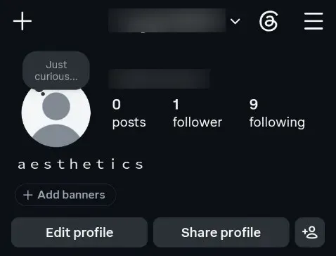
Fullwidth text in an Instagram profile bio.
The bio accepts fullwidth and so does the display name. Comments generally hold up as well, though the search box will not match wide text against anything. Quick note: TikTok occasionally strips unusual characters from a name during a review, so a name that saved fine can come back plain weeks later.
Bios, display names and posts all accept every style on this page. The catch is the counting rule, which is covered further down and matters more here than anywhere else. Your bio holds 160 characters, your display name 50 and your username 15, and the username field rejects anything outside plain letters, numbers and underscores.
Display names, server nicknames, channel topics and messages all take wide letters. Discord also has real markdown, so wide text and actual formatting can sit in the same message without fighting. The Discord fonts page gets into which fields have limits and which ones silently trim. Server and channel names accept fullwidth too, though a long wide channel name gets cut in the sidebar quickly.
Both were where the aesthetic look grew, and both handle it well. Pinterest board titles and descriptions keep fullwidth, and so do Tumblr post bodies, tags and blog titles. Neither platform will match your wide text in a search, which matters more on Pinterest because so much of its traffic arrives that way.
This is the part almost every page on this subject gets wrong, and the correction goes the other way from what you would expect. Wide letters are not one character each on every platform. On the site where character limits bite hardest, they are two.
X does not count characters the way you count them. Its published rule gives most characters a weight of two and then hands a weight of one to a short list of ranges, which covers ordinary Latin letters, common punctuation and a handful of dashes and quotation marks. Fullwidth sits far outside every one of those ranges, so each wide letter costs two. A 280 character post therefore holds 140 wide letters, and a 160 character bio holds 80.
Instagram counts fullwidth as a single character. We pasted ten wide capitals into the bio field on a live account and the counter read 10 of 150, not 20. Some guides claim wide text doubles there too; it does not. Your 150 characters are 150 wide letters.
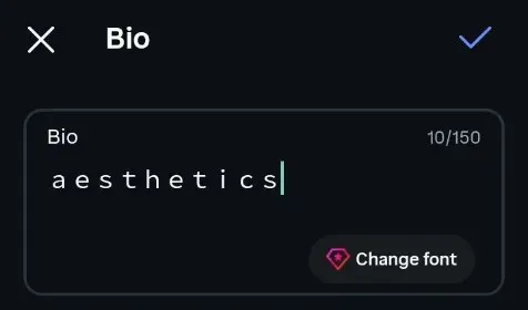
Ten fullwidth capitals in the Instagram bio field, with the counter reading 10 of 150.
The obvious workaround is to skip the wide letters and put spaces between ordinary ones, which does keep every character at weight one. It does not save you anything worth having. The word moonlight costs 18 as fullwidth on X and 17 spaced out, because the spaces you added are characters too. Both routes roughly double your text, just by different means.
Several pages on this subject state that these characters render everywhere. That claim is easy to check and it does not hold. Fullwidth breaking is documented in bug reports across terminal software, translation tools and desktop apps, and the pattern behind those failures is consistent enough to predict.
| Style | How safe | Where it struggles |
|---|---|---|
| Spaced out | Cannot fail | Nowhere |
| Fullwidth | Very safe | Terminals, code editors, older desktop apps |
| Circled | Safe | A few older Android keyboards |
| Double-struck | Mostly safe | Seven capitals may look mismatched |
| Monospace | Check first | Devices without a full maths font |
| Squared | Check first | Older phones, some render them as emoji |
The failures cluster in two places. Anything that lays text out in a fixed grid, such as a terminal or a code editor, has to decide how much room a wide character takes, and getting that wrong pushes the cursor to the wrong column. The second group is any app whose font has no Chinese or Japanese coverage, which leaves it nothing to draw with. Reality check: neither of those is a social app, so for a bio or a caption fullwidth is genuinely dependable.
If a style does come out as empty boxes, the character is fine and the font is missing. Updating the operating system fixes it more often than anything else, because font coverage ships with system updates. Switching to fullwidth or spaced out solves it permanently, since those two need almost nothing from the device.
Most of these styles have digits and one does not. Fullwidth, monospace, double-struck and circled all carry a full set, so 95 stays in style with the letters around it, and the two vaporwave variants inherit the fullwidth digits. Squared has no digits at all. Spaced out leaves your digits as ordinary numerals with a space between them.
That is why 🄵🄰🄳🄴 🄰🅆🄰🅈 95 comes out with a plain 95 on the end. There is no fix, because the characters were never created. If your text has a year, a handle number or a date in it, pick one of the styles that covers digits. The number font generator goes deeper on which digit styles exist and how complete each one is.
A wide letter is a different character from a plain one, and search does not know they are related. If your display name reads moonlight, then somebody typing moonlight into the search box will not find you. This applies to every style on this page except spaced out.
The same rule quietly breaks other things. Mentions and tags often fail, because whoever is typing your name cannot reproduce the characters. Autocomplete stops helping, and anyone who wants to reach you has to copy your name from somewhere else first. Keep your searchable name plain and put the wide version somewhere it costs you nothing, such as a bio line or a pinned post.
Fullwidth handles this better than most styled text, and the reason is in the character names. Each one is formally called a fullwidth Latin letter, so a screen reader has a real letter to work with rather than a symbol. We tested this with TalkBack on Android: it read a line of fullwidth capitals as ordinary letters and words, not as symbols and not by character name.
The enclosed styles are a different matter. A circled or squared letter is not a letter as far as the character data is concerned, it is a symbol that contains one. Depending on the software, a screen reader may read the whole name aloud, announce it as a symbol, or skip it entirely. A short display name in those styles is a minor annoyance, but a full sentence can become unusable.
The practical rule is short and holds everywhere. Style names and single lines, never body text. Anything a person actually needs to read should be typed normally, and the styled version can sit alongside it.
Hearts, stars, sparkle marks and the long decorative frames people wrap around a bio are not part of this. They are separate symbols you add around your text rather than a conversion of it, and they follow completely different rules about counting and screen readers. The distinction matters because a wide letter replaces something you typed, while a heart sits on top of what you wrote.
That ground is already covered properly elsewhere. The cute font generator has the full set of decorations along with what each one costs you. One decoration alongside wide letters works, though two or more starts to fight the calm look this style depends on.
Game name fields are stricter than social apps, and each one draws its own line. Some accept the whole fullwidth alphabet, some allow a short list of symbols and reject everything else, and some silently replace what they do not recognise. There is no general rule that holds across games.
The pattern worth knowing is about field length rather than character support. Game name fields are short, often under twenty characters, and wide letters use that budget at the same rate as plain ones while looking twice as long. A name that fits can still be truncated in a scoreboard or a kill feed where the space is narrower.
Good to know: many games only let you change a name once for free, so a rejected paste can cost real money to undo. Type the name into a search box or a chat message inside the same game first, since that usually reveals whether the characters render before you commit to them. The PUBG fonts page takes over for that game specifically, including which characters the name field keeps and how to test one without spending anything.
The honest answer is less than you think. Wide letters work because they are unusual, and a whole caption in fullwidth loses that effect while becoming hard to read. An aesthetic bio line, a display name or a single heading is where this style does its best work.
There is also a practical reason to hold back. Long wide text wraps unpredictably across screen sizes, so a line that sits neatly on your phone can break in an ugly place on somebody else’s. Two words that fit on one line will look intentional on every device.
Mixing styles is the other thing to avoid. Fullwidth next to squared next to circled reads as someone testing a generator rather than as a considered look. Pick one and let it carry the whole line.
Everything on this page is characters, not fonts. That is what lets them travel into a bio field with no formatting options, and it is also the limit. You cannot change their colour independently, you cannot adjust their weight, and you cannot make them look like anything other than what your device already draws.
For a poster, a thumbnail or a logo you want a real font file instead. Vaporwave and retro Japanese typefaces are widely available, and a design tool will let you set size, colour, spacing and effects properly. Use the characters for places that give you no choice, and use a real font everywhere you have one.
Partly. Vaporwave text is fullwidth, sometimes with Greek or triangle swaps, and it is the wide half of what people call aesthetic. The soft half, with script and decorations, is a separate thing that shares the same search term.
Yes. Bios, captions, comments and your display name all keep fullwidth. The only field that refuses it is your username, which rejects anything outside the plain alphabet, digits, dots and underscores.
No. These are Unicode characters that already exist on your device, so they travel into apps that give you no font controls at all. Nothing is installed and nothing is downloaded.
No. A wide letter is a separate character from a plain one, so searching your name in ordinary letters will not find you. Keep a plain searchable name and put the styled version in your bio.
Sometimes. On X every wide letter costs two, so a 280 character post holds 140 of them. Instagram counts them as one: ten wide letters read as 10 of 150 in the bio field.
Rarely. Fullwidth is supported almost everywhere because it comes from the same character set as Chinese and Japanese text. Squared and monospace letters are the two most likely to fail on an older phone.
No. No mainstream phone keyboard has a fullwidth mode, and no platform has a button for it. Converting and pasting is the only route.
Sometimes. Some games accept the whole alphabet, others reject anything outside plain letters, and several replace unrecognised characters without telling you. Check before you spend a rename.
Almost. Fullwidth, monospace, double-struck, circled and both vaporwave variants have a full set of digits. Squared has none, so your numbers stay plain while the letters change.
Yes, a little. Search, hashtags and mentions all stop matching styled characters, so anything you want found should stay in plain letters. Using it for a name or one bio line costs you almost nothing.