 Fonti
FontiYour Brand Name
Hello World
Freaky text is not a font. It is Mathematical Bold Script, a set of maths symbols from Unicode, and this page turns any words you type into it, ready to copy and paste.
Style: Bold Script
Your Brand Name
Hello World
Hello World
Hello World
No favourites yet. Tap the star on a card to save it.
Nothing copied yet.
Nothing matches that search.
Numbers stay plain.
characters
Pick an alphabet, a separator and a decoration, then copy the result.
Live preview
0 units
Marks added over your text, letters unchanged.
An alphabet wrapped in a decoration.
Decoration wrapped around your text, letters unchanged.
Decoration wrapped around your text, letters unchanged.
Decoration wrapped around your text, letters unchanged.
Decoration wrapped around your text, letters unchanged.
Decoration wrapped around your text, letters unchanged.
Decoration wrapped around your text, letters unchanged.
𝓑𝓸𝓵𝓭 𝓢𝓬𝓻𝓲𝓹𝓽
Numbers stay plain.
𝒞𝓁𝒶𝓈𝓈𝒾𝒸 𝒮𝒸𝓇𝒾𝓅𝓉
Numbers stay plain.
Ⓒⓘⓡⓒⓛⓔⓓ
Unicode records the circled capital M at U+24C2 as an emoji character.
𝕭𝖔𝖑𝖉 𝕱𝖗𝖆𝖐𝖙𝖚𝖗
Numbers stay plain.
𝙼𝚘𝚗𝚘𝚜𝚙𝚊𝚌𝚎
𝔻𝕠𝕦𝕓𝕝𝕖-𝕤𝕥𝕣𝕦𝕔𝕜
Fullwidth
ꜱᴍᴀʟʟ ᴄᴀᴘꜱ
Numbers stay plain.
Unicode has no small-capital X, so x stays plain. This site ships no small-capital Q, so q stays plain. Capitals and lowercase both appear as small capitals.
🅂🅀🅄🄰🅁🄴🄳
Numbers stay plain.
Unicode's squared letters are capitals only, so lowercase letters appear as squared capitals.
uʍo◖ ǝpısd∩
Some capitals and digits 2, 3, 4 and 7 use borrowed characters, so their appearance can vary by device. Digits 1 and 5 stay plain. The text is reversed so it reads when the page is turned upside down.
Combining marks stacked on each letter. The last card removes them.
Somewhere around the end of 2023, a picture of a distorted SpongeBob started going round Instagram on a fake incoming call screen. The caller was saved as “Freaky Bob”. The joke spread to TikTok and X through the following year, and the word came with it. Before long people were typing 𝓯𝓻𝓮𝓪𝓴𝔂 in comments and searching for the font that made it.
There is no such font. It is not a font at all, it is a set of maths symbols that Unicode published in 2001 for writing equations. The same fifty-two characters come out of every cursive text generator on the internet. Almost no page that ranks for this term will tell you that, which is a strange thing to leave out of an explanation. Once you know the characters are Bold Script, the rest of the page stops being a mystery and starts being a set of practical limits.
This page gives you the characters and the actual story behind the name. It also covers the parts nobody writes down: where the letters survive, where they get quietly stripped, what a screen reader does when it reaches them, and what the word itself signals to whoever is reading your bio. There is a short section on why your numbers stay plain, and another on the one route that gets this style into Photoshop or Canva. If you only came to copy and paste the text, the box at the top is all you need. Keep reading if you care where the joke came from, or where the paste will break.
Put your text into the field at the top of this page. The output changes as you type, so you can watch a username or a caption turn over letter by letter. Everything happens inside your browser, and nothing you type is sent anywhere. If your line includes a number or a year, leave it in place so you can see that the digits stay plain while the letters change.
Tap the copy button next to the result. On a phone you can also press and hold the output, then choose Copy. Either way, copy and paste here moves real characters, so they behave like any other text once they leave this page. You are not copying an image or a font file, only the letters themselves.
Drop it into an Instagram bio, a TikTok comment, a Discord message or a game profile. No download, no install, no image. The characters travel with the text, which is why they keep their shape in places that give you no font settings at all. Check the finished paste in the real field before you publish, because a preview inside this page cannot prove what another phone will draw.
The first Freakbob post went up on Instagram on 30 December 2023, a collaboration between two accounts, showing a phone screen with an incoming call from “Freaky Bob”. The wider joke had already been running since that September, built around the word freak and a deliberately awful use of the Papyrus typeface. Know Your Meme files the whole family under Papyrus irony. Through 2024 it moved to TikTok and X, and by the middle of the year it had turned into a bait-and-switch format where the call screen cuts into something wholesome.
The word had been circulating for a few months before Freakbob arrived. An Instagram post that September paired the same ironic Papyrus treatment with a heavily filtered photo, and the format was already recognisable by the time the call screen showed up. Know Your Meme lists the two as separate entries in the same family. Freakbob is the one that pushed the word into everyday comment sections.
Here is the part that trips up most explanations. The meme’s own font was not the curly script people now call freaky, it was Papyrus. Papyrus is a real typeface, a file that lives on your computer, and no text generator anywhere can produce it. Pages that list “Papyrus Mix” or “Freaky Bob Style” as options in a generator are describing something their own tool cannot do.
The curly script attached itself to the joke later, through comments and captions rather than the images. It fitted because it looks overwrought in the same way Papyrus does, and because it survives being pasted into places that strip everything else. The pairing you see most is “𝓗𝓮𝓵𝓵𝓸 𝓑𝓻𝓸” answered by “𝓗𝓮𝓵𝓵𝓸 𝓕𝓻𝓸”, usually over a heavily filtered photo.
The filter does as much work as the letters in most of these posts. A washed-out Rio de Janeiro or New York overlay signals the same thing the typeface does, which is that none of this is meant seriously. Take away the filter and the styled text and you are left with a plain sentence carrying no joke at all. That is why the script travelled so far: it holds the tone by itself, in places where you cannot add a picture.
The characters are called Mathematical Bold Script. They sit in a Unicode block called Mathematical Alphanumeric Symbols, which runs from U+1D400 to U+1D7FF, and they were added in March 2001. Capital 𝓐 is U+1D4D0 and small 𝓪 is U+1D4EA. They were put there so a physicist could write one kind of variable in a paper and a different kind two lines down without the reader losing track.
None of that had anything to do with social media. The Unicode consortium prints a note at the top of that block, and it is worth reading before you paste this into anything that matters. It is one sentence long, and it says the opposite of what almost every generator on the internet implies. The note is aimed at authors of papers and software, not at people writing bios, but it still describes how the characters were meant to travel.
“To be used for mathematical variables where style variations are important semantically. For general text, use standard Latin and Greek letters with markup.”
The people who created these characters are telling you not to use them for ordinary writing. That does not make it forbidden, and millions of people ignore it every day. It does explain most of the odd behaviour further down this page, from the missing digits to the empty boxes on older phones.
A font freak is a person who collects typefaces. Freaky font is this meme script. The two phrases turn up in each other’s results constantly, so if you landed here looking for a font collector’s directory, that is the mix-up. This page is only about the Bold Script alphabet that the meme made famous, not about typeface collecting.
Sites that rank for this term tend to offer a whole menu of freaky fonts. Five options, sometimes more, each with its own name and preview. Line the previews up next to each other and most of them turn out to be identical characters with different labels on top.
That is not five styles, it is one alphabet wearing five hats. The names are invented, and the menu collapses as soon as you know the real ones. Here is what the common labels actually point at, so you can stop comparing near-identical previews and pick the real script once.
| What it gets called | What it actually is |
|---|---|
| Classic Freaky, Classic Cursive | 𝓯𝓻𝓮𝓪𝓴𝔂 — Mathematical Bold Script, the real one |
| TikTok Variation, Freaky Bob Style | The same Bold Script under a different label |
| Bold Fraktur | 𝔣𝔯𝔢𝔞𝔨𝔶 — a separate block, and its own subject |
| Papyrus Mix | Papyrus, a font file. Not producible by any generator |
| Thin Script | 𝒻𝓇ℯ𝒶𝓀𝓎 — plain Mathematical Script, the lighter cousin |
Straight answer on the cursive question, since it comes up more than any other. People search for freaky in cursive as though it were a separate variant, and there is no such variant to find. 𝓯𝓻𝓮𝓪𝓴𝔂 and cursive text are the same fifty-two characters: not similar, not related, the same code points. If you generate the word freaky on a cursive font generator and generate it here, your clipboard holds an identical string both times.
What changes is why you came. Somebody looking for cursive usually wants their name to look elegant in a bio or wants to see how a phrase might sit as a tattoo. Somebody looking for freaky is in on a joke. The letters do not care, but the two pages are worth keeping separate because the questions are not the same.
Fraktur is the one genuine outlier on that list. It is a different block with a different history, closer to old German printing than to anything in this meme, and it has its own page here. Italic and bold italic are also separate blocks rather than freaky variants, which is why a generator offering both under one heading is stretching.
Italics are worth a note of their own, since people search for freaky font italics alongside the real thing. Mathematical Italic and Mathematical Bold Italic are real Unicode sets, published in the same 2001 release, and they look nothing like the curly script. Anything sold to you as a freaky italic is a different alphabet under a borrowed name. It still works perfectly well, it is just not the thing the meme made popular.
The cards above the article are the real list. Type freaky into the box and you get Bold Script first, then Classic Script, Circled, Bold Fraktur, Monospace and Double-struck, each with its own caveat badge where Unicode is incomplete.
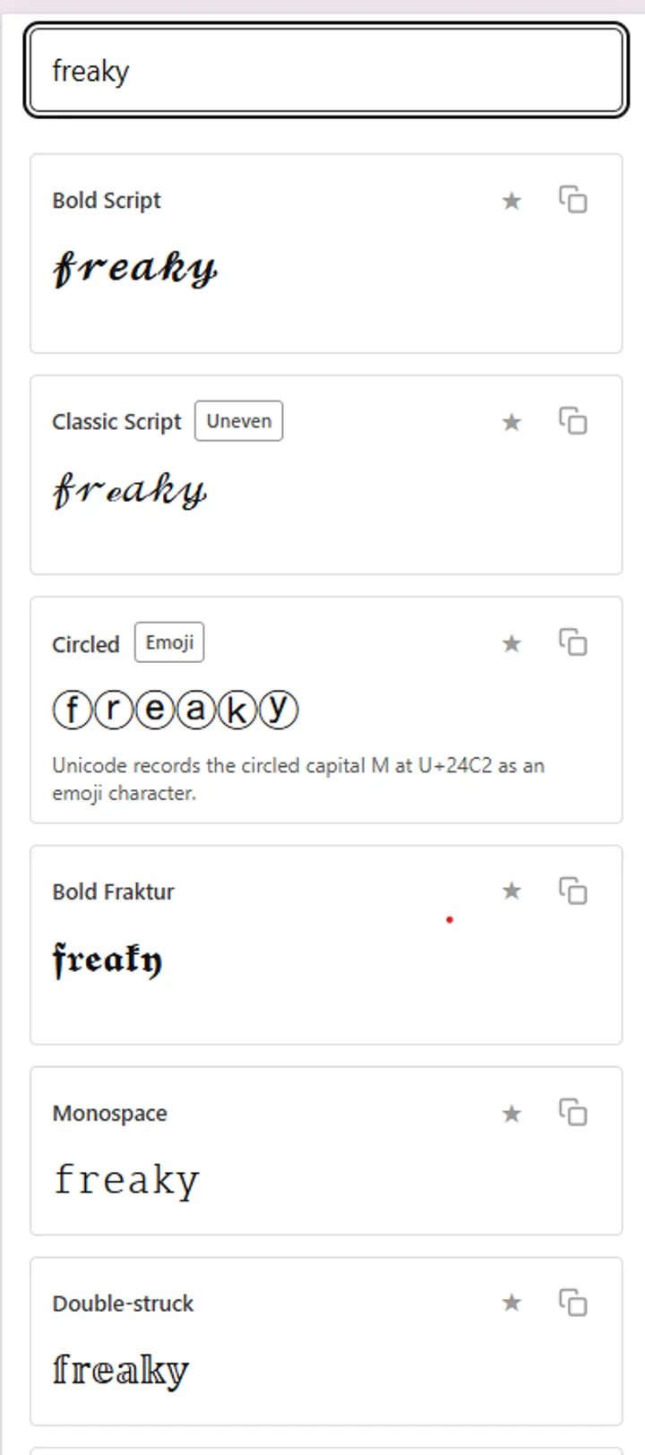
Cards from the tool on this page, with freaky typed in. Bold Script through Double-struck.
Scroll the same results and the rest of the set appears: Fullwidth, Small Caps, Squared and Upside Down, again with Partial or Caps only notes where the alphabet has holes.
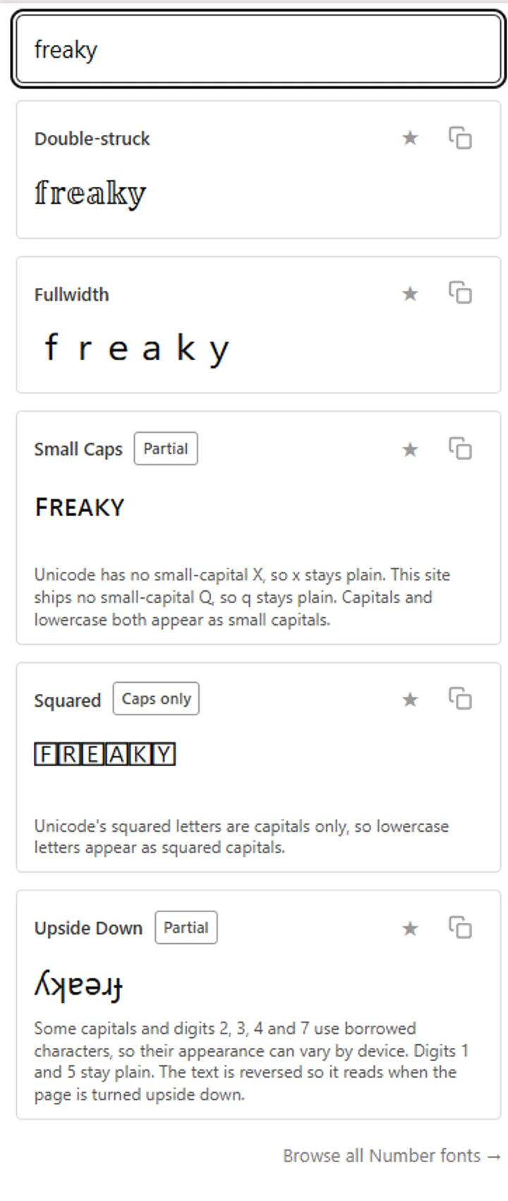
Same tool scrolled on: Double-struck through Upside Down.
Search results for this term keep bundling freaky together with cursed and glitch text. The three get treated as one category, and they are built in completely different ways. Knowing which one you actually want saves you pasting the wrong thing into a username field and wondering why it came back rejected. Freaky is a ready-made alphabet. Cursed and glitch are ordinary letters with marks piled on top, which is why games and apps treat them differently.
| Style | Example | How it is built |
|---|---|---|
| Freaky | 𝓯𝓻𝓮𝓪𝓴𝔂 | One purpose-built character per letter |
| Cursed | F҉r҉e҉a҉k҉y҉ | Normal letters with marks layered on top |
| Glitch, or Zalgo | Letters buried under dripping marks | The same trick as cursed, stacked dozens deep |
| Papyrus | Not reproducible here | An installed font file |
The difference matters in practice. Freaky characters are single code points, so a platform either supports them or shows a box. Cursed and glitch text is ordinary letters plus stacked combining marks, which means it can spill outside its line, get truncated halfway, or trip filters that count characters. One site treats F҉r҉e҉a҉k҉y҉ as the freaky style, and that is a minority reading of the word rather than a mistake.
The gap shows up most clearly in how platforms count them. A freaky letter is one character, so a hundred letters is a hundred characters almost everywhere. A cursed letter is two or more characters stacked in the same space, which means a hundred visible letters can register as three hundred. Bio fields with tight limits fill up fast when you go that route.
The honest summary is that Bold Script survives nearly everywhere. Failures cluster in a few specific fields rather than in whole apps, and the pattern is consistent once you notice it. Anything a human reads gets through, and anything a machine has to match against a database usually does not. Below is where it holds and where it does not.
| Where | Result |
|---|---|
| TikTok comments and captions | Works |
| TikTok username | Works, display name is more forgiving than the handle |
| Instagram bio | Works |
| Instagram captions and comments | Works |
| Instagram username | Blocked, handles are letters, numbers, dots and underscores |
| Instagram hashtags | Technically posts, but the tag stops working |
| Discord messages | Works |
| Discord display name | Works |
| Discord username | Often rejected |
| WhatsApp, Snapchat, X posts | Works |
Comments, captions and display names all take styled text without complaint, which is why most of this meme lives there. The handle is the one field that refuses it. Search behaves the way it does everywhere else, so a styled word in a caption will not surface for anyone typing that word into the search bar. Keep a plain version of whatever you want found.
Your bio, captions and comments all take it without complaint, and the bio limit stays at 150 characters because each freaky letter still counts as one character there. Your handle is the exception and always has been, since Instagram restricts usernames to plain letters, numbers, full stops and underscores. Hashtags are the trap worth knowing about, because a styled tag will post and look fine while quietly matching nothing. There is more on how the app handles styled text on the Instagram fonts page.
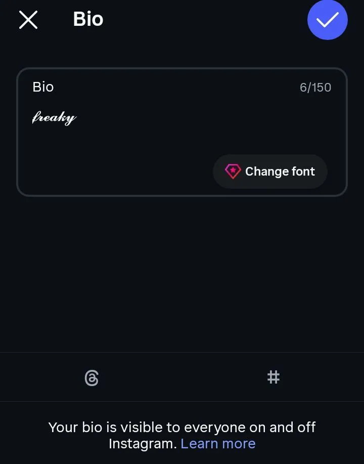
Instagram’s own bio field with freaky pasted in, reading 6 of 150.
Messages and display names are fine. Usernames are a different system, tightened in 2023 when Discord moved everyone to unique handles, and styled characters are usually refused outright. Server nicknames sit between the two and generally work. The Discord fonts page covers which fields accept what.
Minecraft, Roblox and Steam display names take these characters in most cases, though each platform runs its own filter and Roblox is the strictest. One catch that catches people out: a name you cannot type is a name nobody can search for or add you by. If your friends need to find you manually, a styled handle turns into a small daily obstacle.
WhatsApp, Snapchat and Telegram carry these characters through messages and profile names without any trouble. Facebook accepts them in posts and comments, though its name field runs on separate rules and a change there locks you out of changing it again for sixty days. Paid advertising is the one place to avoid entirely. Meta’s ad policies state plainly that using Unicode characters or symbols to obfuscate words is not allowed, and a styled ad can be rejected on that basis alone.
The word carries two meanings at once. Merriam-Webster defines freaky as strange or unusual, and that is the meaning the SpongeBob meme runs on. In everyday slang it also means sexually adventurous, and that is the only meaning Urban Dictionary’s top entry lists. Both are live at the same time, which is exactly what makes the joke work.
That does not make the style off limits. Millions of people paste it into TikTok comments and Discord names every day, and inside a meme nobody reads it the second way. It matters in one place only, which is somewhere a stranger sees your words with no joke around them. A client-facing bio is a different room from a group chat.
Context does nearly all the work here. The same three words under a meme and in the bio of an account you use for freelance enquiries will be read two entirely different ways. Nobody needs a rule for this, they just need to have thought about it once. Thinking about it once is the whole purpose of this section.
Whether freaky text is cringe on Discord is the version of this question people ask most, and the answer has less to do with the characters than with the room. In a meme channel or a friend group, styled text reads as part of the bit. In a support server, a study group or a work-adjacent community, it reads as somebody trying slightly too hard.
Heads-up on one thing that is easy to miss. The joke is roughly two years old now, and jokes that old carry a signal about when you picked them up. Using it knowingly is fine. Using it as decoration, with no trace of the meme around it, is where the reaction turns.
The practical test is short. Ask whether the person reading it will recognise the reference, and ask whether they will see anything else of yours in the same moment. If both answers are yes, it lands. If your styled name is the only thing they have to go on, plain text does more work for you.
The thing most people miss is that you do not have to style everything. A line with one word in bold script and the rest in plain letters reads better than a wall of curly text, and it keeps every practical advantage of plain text intact. Search still finds you, screen readers still work, and the styled word carries more weight for being the only one. Full conversion is the setting people reach for first and regret second.
For a bio, keep your name or handle in plain letters and style a tagline underneath it. Anyone searching for you still finds you, and the decoration sits somewhere it costs nothing. Instagram gives you 150 characters and each freaky letter counts as one, so the styling is free there. On X it is not, which is the one place to keep it short.
For comments, following the meme conventions is what makes it land. The joke usually rides on a short phrase rather than a paragraph, and the humour comes from the mismatch between ornate letters and something completely mundane. A styled three-word reply reads as a reference. A styled essay reads as somebody who just found a settings menu.
One habit saves most of the trouble. Before pasting anything into a field you cannot easily edit, send it to yourself in a message first and look at it on your phone. That takes ten seconds and catches boxes, truncation and rejected characters before they are attached to your profile.
When a device meets a character it has no shape for, it draws an empty rectangle instead. The nickname for that rectangle is tofu, and the Noto font family is named after the goal of having none of it. Older phones and older desktop browsers are where it shows up, because the fix arrives with a system font update rather than with the app you are using. The app that hosts your bio usually has no control over that update path.
Bold Script is one of the safer styled alphabets to paste around, and there is a structural reason for that. Every one of the fifty-two letters was published in the same release, in one block, with nothing borrowed from elsewhere. Other script styles have to pull individual letters out of a separate corner of Unicode, and those borrowed letters are the ones that break first. Freaky text benefits from that tidy history more than most of the alphabets people paste into bios.
This was tested on real hardware rather than assumed. An Infinix Note 7 running Android 10 rendered the full Bold Script alphabet cleanly in WhatsApp, in the Chrome search bar and in an Instagram bio, with identical results in all three. A phone from 2020 on an older Android build is close to a worst case for this kind of thing, so if it holds there it will hold on most of what your audience is carrying. That still leaves room for rarer failures on devices that never received later font packs.
If you do see boxes, the cause is nearly always the device doing the viewing rather than anything wrong with what you copied. The characters are intact in the text. The reader’s phone just has no picture to draw for them. Opening the same paste on a newer phone is the fastest way to confirm that the text itself is fine.
There is very little you can do about somebody else’s device, and accepting that early saves a lot of frustration. On your own machine, installing a broad font family such as Noto usually clears it up, and on Android a system update generally does the same. What you cannot do is push a fix onto the person reading your bio. When the audience matters more than the styling, that is the moment to leave the text plain. A single plain backup line is enough insurance for most profiles on any platform today.
X counts most characters outside the basic Latin set as two characters instead of one. Bold Script sits well outside that set, so a post written in freaky text eats through the 280 limit at roughly half the usual speed. Around 140 visible letters is where you will hit the wall. A short joke still fits. A full caption written entirely in freaky script often does not.
Worth knowing that this is not the same everywhere. Instagram bios and captions count each freaky letter as one, so a 150 character bio stays a 150 character bio. Discord behaves the same way. X is the platform where the maths turns against you, and it is the one people most often get caught out by mid-sentence. If you are drafting for more than one app, check the counter on X before you assume the Instagram length will still fit.
The reason is technical rather than arbitrary. X counts in a unit that basic Latin letters fit inside and most other characters do not, and Bold Script sits in a range that needs twice the room. None of this is visible while you type, so the counter drops faster than the words appear on screen. Writing the plain version first and styling only the part you want to stand out avoids the problem completely. That habit also leaves you a plain backup if you need to shorten the post in a hurry.
Type a phone number or a year into the box and the digits come out looking exactly as they went in. This is not the tool giving up. Mathematical Bold Script was published without any digits in it, so there is no freaky 4 anywhere in Unicode to swap in. Every generator that claims otherwise is either mixing in a different alphabet or leaving the digits plain and hoping you do not notice.
Other maths styles did get digits. Mathematical Bold has a full set from 𝟎 to 𝟗, and a few others do too, but none of them belong to the curly script this page is about. Mixing them in would give you a line where the letters and the numbers clearly came from different places. If you want styled digits on their own terms, the number font generator covers which sets actually exist.
Punctuation works the same way. Full stops, commas, question marks and apostrophes have no bold script versions, so they pass through untouched. Spaces and emoji are unaffected too. That mix of curly letters and plain marks is normal for this alphabet, and it is not a fault in the generator.
This is the part no other page on this topic covers, and it is the strongest reason to think before styling something people rely on. Screen readers work from the underlying character, not the shape on screen. When they hit a character that was designed as a maths symbol, they do one of three things: read out its full technical name, skip it in silence, or read the whole word as gibberish.
Accessibility researchers at Deque and Eleven Ways have both written about how badly styled Unicode behaves in this situation, and users on r/Blind describe the same experience from the other side. A bio written in freaky text can come out as a stream of the phrase “mathematical bold script” repeated once per letter. A name written that way may not be announced at all.
Behaviour also varies by software, which makes the outcome hard to predict. VoiceOver, NVDA and JAWS each handle unsupported characters in their own way, so the same bio can be read three different ways depending on what somebody is using. There is no version of that outcome where the styled text communicates better than plain letters would have. It is the clearest argument on this page for keeping decoration and information apart.
This connects back to the note Unicode prints above the block. These characters were never meant to carry ordinary words, and the assistive software built on top of Unicode treats them accordingly. Fair warning applies most to the places that matter: a bio, a display name, a caption on a post you want read. A styled word inside a joke in a comment thread is a much smaller thing.
The workaround is uncomplicated. Keep one plain-text version of anything important somewhere on the same profile, and let the styled version sit alongside it instead of replacing it. A styled display name with a plain name in the bio underneath costs you nothing visually and solves the whole problem. The same applies to a caption: style a word or two and leave the sentence readable.
Pasting freaky characters into a design tool works only if the font you have selected contains those exact glyphs. Most do not. You will usually get a row of boxes, or the tool will silently swap in a fallback font that looks nothing like what you copied.
The reason is worth understanding, because it explains a lot of frustration. Design tools apply a font to your text. These characters are not a font, so there is nothing for the tool to apply. It is looking for the shape inside whatever typeface you picked, and Bold Script glyphs are absent from nearly all of them.
There is one route out of this, and it is not widely known. A small open-source project on GitHub called fontfreaky rebuilt Mathematical Bold Script as an actual TTF and SVG typeface, published in February 2025. Install it like any other font and it becomes available in Photoshop, Figma, Illustrator and anywhere else that reads system fonts.
Reality check on that project before you rely on it. It is tiny, it has almost no users, and the licence terms are stated differently in two places on the same repository. For a personal graphic it is fine. For anything commercial, read the licence yourself first.
For a website the situation is different and much simpler. Any font file you have the rights to can be loaded with a single CSS rule, which means a real bold script typeface will render for every visitor no matter what their device supports. That is the proper way to get this look onto a page you control. Pasting Unicode characters into a headline is the workaround for places where you control nothing at all.
Mathematical Bold Script. It lives in the Mathematical Alphanumeric Symbols block of Unicode, added in March 2001.
Yes, exactly the same fifty-two characters. The two names describe why people are looking, not what they get.
The word comes from a meme that started on Instagram in late 2023 featuring a distorted SpongeBob on a fake call screen. The characters themselves are twenty-four years older and were made for mathematics.
Yes. Bios, captions and comments all accept it. Your username will not, and styled hashtags stop working as hashtags.
The device viewing them has no glyph for that character. It is a display problem on their end, and the text itself is unchanged.
No. Bold Script was published without digits, so numbers stay plain no matter which tool you use.
Yes. These are ordinary Unicode characters with no code attached to them, and nothing about pasting them can affect your account or device.
It can. Search and hashtag matching work on plain characters, so styled words are effectively invisible to both. Keep your searchable terms unstyled.
Not from Unicode, since these are characters rather than a typeface. One small open-source project has rebuilt the style as an installable TTF, which is the only route currently available.
Discord usernames follow stricter rules than display names and generally refuse characters outside the basic set. Change your display name or server nickname instead.