 Fonti
FontiYour Brand Name
Hello World
You might already have a bold button. WhatsApp, Reddit, Discord, Telegram, Slack and Word all build one in, and most people never find it.
Style: Bold Script
Your Brand Name
Hello World
Hello World
Hello World
No favourites yet. Tap the star on a card to save it.
Nothing copied yet.
Nothing matches that search.
Numbers stay plain.
characters
Pick an alphabet, a separator and a decoration, then copy the result.
Live preview
0 units
Marks added over your text, letters unchanged.
An alphabet wrapped in a decoration.
Decoration wrapped around your text, letters unchanged.
Decoration wrapped around your text, letters unchanged.
Decoration wrapped around your text, letters unchanged.
Decoration wrapped around your text, letters unchanged.
Decoration wrapped around your text, letters unchanged.
Decoration wrapped around your text, letters unchanged.
𝑩𝒐𝒍𝒅 𝑰𝒕𝒂𝒍𝒊𝒄
Numbers stay plain.
𝐼𝑡𝑎𝑙𝑖𝑐 𝑆𝑐𝑟𝑖𝑝𝑡
Numbers stay plain.
𝘏𝘢𝘯𝘥𝘸𝘳𝘪𝘵𝘪𝘯𝘨
Numbers stay plain.
𝙎𝙡𝙖𝙣𝙩𝙚𝙙
Numbers stay plain.
𝐁𝐨𝐥𝐝
𝗕𝗼𝗹𝗱 𝗦𝗮𝗻𝘀
This generator is for everywhere else: Instagram bios, LinkedIn headlines, TikTok profiles, and any field that gives you no formatting at all. It makes six styles, which is every bold and italic alphabet Unicode contains, and the characters hold their shape wherever you paste them. Free, no sign-up, works on a phone.
The whole thing takes about ten seconds. Everything updates as you type, so you can line up all six styles and compare them before you copy anything. The step worth slowing down for is the last one, because bold text can look perfect in the box you typed it into and fall apart in the place you posted it.
Type the full thing you plan to post, not a test word. Include any numbers. Italic has no digits at all, so a year, a price or a phone number stays plain while the letters around it change. You want to see that before it goes somewhere public.
Six styles, two decisions. Serif or sans serif first, then bold, italic or both. Sans serif usually looks better inside a social app, because it sits closer to the font the app already uses and the text reads as deliberate instead of pasted in. Serif carries more weight, which suits a single word doing a job, like a name or a label.
One tap copies the whole line. On a phone, use the copy button instead of selecting the text by hand, because a long press usually grabs the space at the end and a few fields reject anything with a trailing space. Small thing. It causes a surprising number of failed pastes.
Paste it into the real field and look at it before you publish. A composer preview and a published post don’t always render the same, and a desktop browser proves nothing about what a phone will do. Fair warning: this is also the step where some people discover the app had a bold button the whole time.
Before you copy anything, check whether you need to. Several of the places people ask about most already have real bold and italic built in, and the shortcut is usually two characters. Most people never learn it because there’s no visible button, just a typing habit nobody announced.
| Where you are typing | Bold | Italic |
|---|---|---|
| *word* | word | |
| **word** | *word* | |
| Discord | **word** | *word* |
| Slack | *word* | word |
| Telegram | select the text, then pick Bold | select the text, then pick Italic |
| Facebook group post, computer only | highlight the text, press B | highlight the text, press I |
| Word, Google Docs, Canva | Ctrl+B or Cmd+B | Ctrl+I or Cmd+I |
The asterisk convention is older than any of these apps. It came from plain text email, where people wrapped a word in asterisks because there was no other way to stress it. The apps kept the habit and taught it to almost nobody.
Discord goes furthest of any chat app, adding underline, strikethrough, spoilers and code blocks on top of the two above. Our Discord font guide lists the full set with the exact characters. The opposite case is the small text generator, where no app anywhere offers a native version, so pasted characters are the only route there is.
Real formatting wins in three ways that show up later. Search still finds the words, because underneath the styling they’re ordinary letters. A screen reader still reads them as a sentence instead of a run of symbols. And the text survives a redesign, since the formatting belongs to the app rather than to the characters sitting in your clipboard.
One argument against native formatting says that it vanishes when you copy the text somewhere else. That’s true. It’s also beside the point most of the time, because the message gets read in the app it was written in. If a line genuinely has to travel between apps and hold its look, that’s the case where pasted characters earn their place.
Then there are the fields with nothing at all. Instagram bios and captions, LinkedIn headlines, posts and about sections, TikTok bios, Facebook timeline posts, comments, Marketplace listings, and every Facebook post written on a phone. No button, no shortcut, no hidden menu. That gap is the reason the rest of this page exists, and it helps to know which side of the line you’re standing on before you paste.
Here is the entire set. Not a selection, not the popular ones. Six alphabets, which is every bold and italic variant Unicode has ever encoded. The same phrase runs through each one so you can see what changes and what stays put.
| Style | Serif | Sans serif |
|---|---|---|
| Bold | 𝐖𝐚𝐭𝐜𝐡 𝐓𝐡𝐢𝐬 𝟐𝟒 | 𝗪𝗮𝘁𝗰𝗵 𝗧𝗵𝗶𝘀 𝟮𝟰 |
| Italic | 𝑊𝑎𝑡𝑐ℎ 𝑇ℎ𝑖𝑠 24 | 𝘞𝘢𝘵𝘤𝘩 𝘛𝘩𝘪𝘴 24 |
| Bold italic | 𝑾𝒂𝒕𝒄𝒉 𝑻𝒉𝒊𝒔 24 | 𝙒𝙖𝙩𝙘𝙝 𝙏𝙝𝙞𝙨 24 |
Two decisions produce all six. Serif or sans serif, then bold, italic or both. Look at the digits while you’re there, because half the grid has them and half doesn’t. That single detail is the thing most other pages get wrong.
Serif italic is missing a lowercase h. The slot where it belongs, U+1D455, was left empty when the block was encoded, so every generator including this one substitutes ℎ, a character officially named PLANCK CONSTANT that physics claimed first. It matches closely enough that almost nobody notices. The other five styles have no gaps at all, which is unusual for Unicode. If you want joined-up letterforms rather than a slant, the cursive font generator handles those separately.
You’ll see 𝔹𝕠𝕝𝕕 listed as a bold option on other sites. It isn’t one. The proper name is blackboard bold, and it was built so mathematicians could write number sets on a chalkboard: ℝ for real numbers, ℕ for natural numbers, ℤ for integers. Look closely and the strokes are outlined rather than thickened, which is why a word in it reads lighter than plain text instead of heavier.
𝐚𝑙𝐭𝑒𝐫𝑛𝐚𝑡𝐢𝑛𝐠 looks like a seventh style. It isn’t. It’s two of the six above applied to every other letter, which any generator can produce by flipping between them as it goes. Some sites count three or four of these patterns as separate styles to inflate their totals. Be careful where you use it, because that pattern has been shorthand for sarcasm online for years, and plenty of readers will hear your sentence in a mocking voice.
Two more bold styles exist, and they live on other pages because they’re different alphabets rather than different weights. 𝓑𝓸𝓵𝓭 is bold script, which belongs with the joined-up styles. 𝕭𝖔𝖑𝖉 is bold blackletter, and the gothic font generator covers where it came from and where it breaks.
Press Ctrl+B and the letter stays a letter. The app just draws it heavier. A bold copy and paste of a word from this page gets you something else entirely, a different character that happens to be shaped like a heavy B. That difference explains everything else on this page.
| Real bold formatting | Pasted bold characters | |
|---|---|---|
| What it is | An instruction to the app | A different character |
| Who applies it | The app you’re typing in | You, before pasting |
| Survives copy and paste | Usually not | Yes |
| Works with no formatting button | No | Yes |
| Guaranteed to display | Yes | Depends on the reader’s device |
| Findable by search | Yes | No |
These characters exist because of maths. In an equation a bold V and an italic v mean two different things, a vector and a scalar, and that difference has to survive when the equation gets written in plain text with no formatting available. Unicode encoded a full set of styled letters so the meaning would travel. Nobody added them so a bio could look louder.
That origin explains the odd parts. It’s why the letters carry official names like MATHEMATICAL BOLD CAPITAL A. It’s why bold has digits and italic doesn’t, since equations needed bold vectors and never needed slanted numbers. And it’s why the set stops at six, because six covered what the notation required.
Bold stops the eye. It’s for the one thing a person skimming must not miss: a deadline, a price, a warning, the name of the thing you’re selling. It works by contrast, so it only works while most of the text around it stays plain. Bold everything and you’ve bolded nothing.
Italic changes how a sentence sounds in your head. English uses it for titles of books and films, for words borrowed from other languages, and for a word the writer wants you to lean on slightly. It’s quieter than bold and it holds up over longer stretches, which is why a whole italic sentence still reads as a sentence while a whole bold sentence reads as shouting.
Bold italic is for the rare line that needs both jobs at once. Used once, it lands. Used four times in a bio, it reads as someone who couldn’t decide.
One rule covers most cases. Pick a style, keep it for the whole profile or post, and change it only when the job changes. A bio running bold, italic and bold italic across three lines looks broken rather than designed. Quick note: none of the italic styles carry numbers, so if your line leads with a date or a price, bold is the only branch that styles the whole thing.
| Field | Accepts these characters | Native formatting instead | What to do |
|---|---|---|---|
| Instagram bio | Yes | None | Good place for it, keep keywords plain |
| Instagram name | Yes | None | Works, and it’s searchable, so be careful |
| Instagram caption | Yes | None | Works, watch the character cost |
| Instagram username | No | None | Letters, numbers, periods and underscores only |
| LinkedIn headline | Yes | None | Riskiest field on this list |
| LinkedIn post | Yes | None | Style a divider or a label, never a keyword |
| X display name | Yes | None | Works |
| X post | Yes | Premium long posts (untested) | Works |
| TikTok bio | Yes | None | Works |
| Discord message | Yes | Markdown | Use the markdown |
| Discord display name | Yes | None | Works |
| WhatsApp message and status | Yes | Asterisks and underscores | Use the native version |
| Facebook group post, desktop | Yes | B and I buttons | Use the buttons |
| Facebook timeline post and comment | Yes | None | Characters are the only option |
| Reddit comment | Yes | Markdown | Use the markdown |
| YouTube comment | Yes | None | Asterisks stay plain; use these characters |
The middle column is the part other pages leave out. A field can accept these characters perfectly and still be the wrong place for them, which is true of about half the rows above. Where an app has its own formatting, use the app’s version every time.
Handles follow different rules from display names, on every platform. Instagram usernames accept letters, numbers, periods and underscores and nothing else, so the styled version goes in the name field instead. The Instagram font guide breaks down each field separately, and our Facebook font guide walks through names, Page names and Marketplace listings, which each behave differently again.
YouTube comments do not turn asterisks into bold. A posted comment with single asterisk wrapping and *double asterisk wrapping both stayed plain, with the asterisks visible as ordinary characters. Pasted Unicode is the only way to get bold or italic there.
X appears to allow real formatting only inside Premium long posts. That could not be tested here, because the account used for these checks has no Premium. Until someone with Premium confirms it, treat the row as a hedge rather than a measured fact.
YouTube is the clear case: the asterisk habit from chat apps does not apply in comments, so if you want bold there you paste it from a tool like this one.
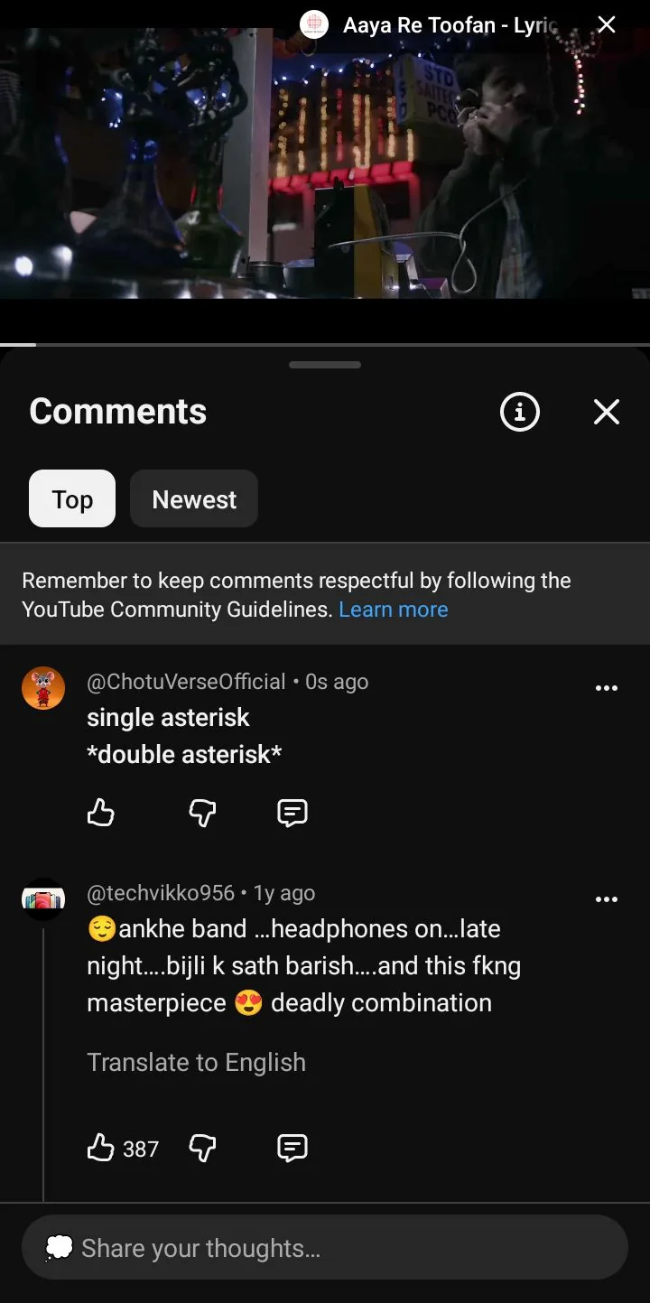
YouTube comment: asterisk wrapping left both lines plain
LinkedIn is where this technique gets used most and questioned hardest. The platform has no formatting anywhere: not in a post, not in a headline, not in the about section. So the workaround is genuine, and a large share of the bold text you see there was pasted from a page like this one.
The problem is search, and the measured behaviour is the opposite of the usual warning. LinkedIn does not ignore these characters. It treats them as distinct letters that match nothing in a plain search. A search for Watch in italic styled characters still returned People results for profiles that use the plain word, and a search for a nonsense string in styled characters returned “Your search returned no results.” So a recruiter typing a plain job title will not match a headline written in bold characters, because the characters are different, not because LinkedIn skipped them.
Plain Watch in the LinkedIn search box returned Jobs and People hits that contain the ordinary word.

LinkedIn search for plain Watch, with Jobs and People results
The same word typed in italic styled characters still returned People results. LinkedIn is matching on the styled query as its own string of characters, not stripping the style away.
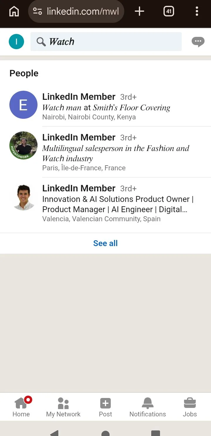
LinkedIn search for Watch in italic styled characters
A nonsense string in styled characters returned no results at all, which is what you would expect if those characters are real search tokens rather than decoration LinkedIn ignores.
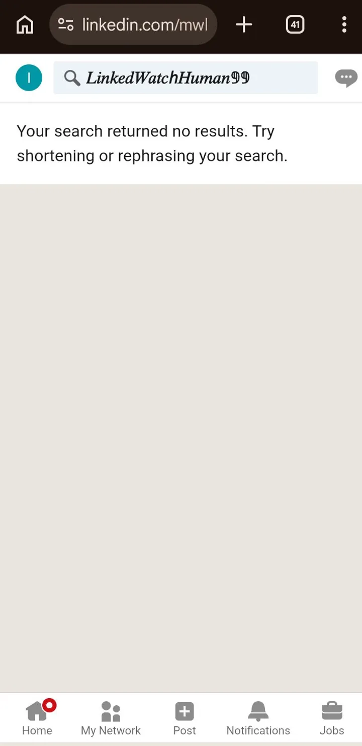
LinkedIn search for a nonsense styled string, no results
There’s a second problem specific to this platform. LinkedIn carries a large concentration of accessibility professionals, and several of them write about this regularly. Comments pointing out that a formatted post is unreadable to a screen reader turn up under exactly the kind of post that uses it most.
A workable compromise exists. Style a divider, a section label or your own name, and leave every keyword in plain text: your job title, your skills, your company, the thing you want to be found for. Reality check: if a plain search for that word would miss your styled version, that word is too important to bold.
Every styled character costs you two. Plain letters live in the first block of Unicode and count as one. These live thousands of positions further out, and platforms that weight characters by position count each one double. On X, plain Watch left 4 slots on the counter, and styled Watch This (10 plain characters) left 14 in one draft and 1 in a fuller draft, which is the two-slot rule in measured numbers.
The arithmetic is unkind. An Instagram bio holds 150 characters, so a fully styled bio holds around 75 letters. A 280 character post drops to roughly 140. Bios take the worst of it, because they’re short to begin with and people tend to style the whole thing.
On X the counter itself stays hidden for short posts. It only starts showing a number when roughly 20 characters remain, so a short line like Watch this shows an empty ring with no digit at all until you fill the composer close to the limit.
With only Watch this typed, the X counter ring is empty. No number appears yet.

X composer: Watch this, counter still hidden
Once the draft is near the limit, the number appears. Here the counter reads 9.
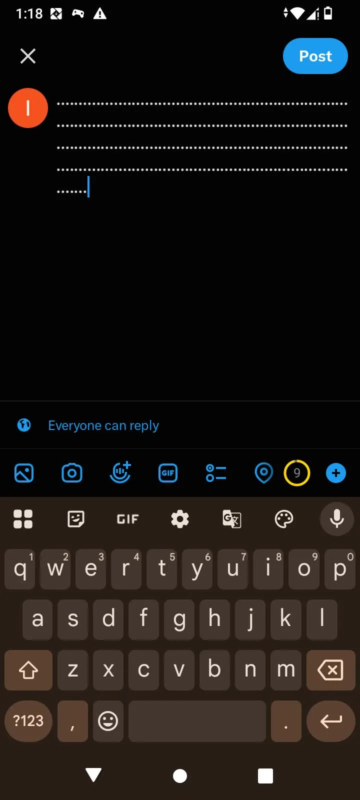
X composer: counter reading 9
A little earlier in the fill, the same counter reads 20, which is about where the digit first becomes useful to watch.
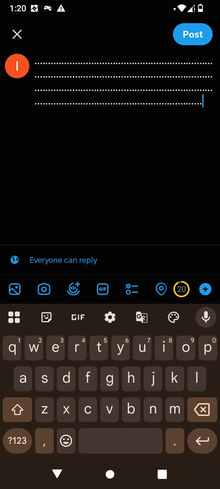
X composer: counter reading 20
Plain Watch at the end of a near-full draft left the counter at 4.
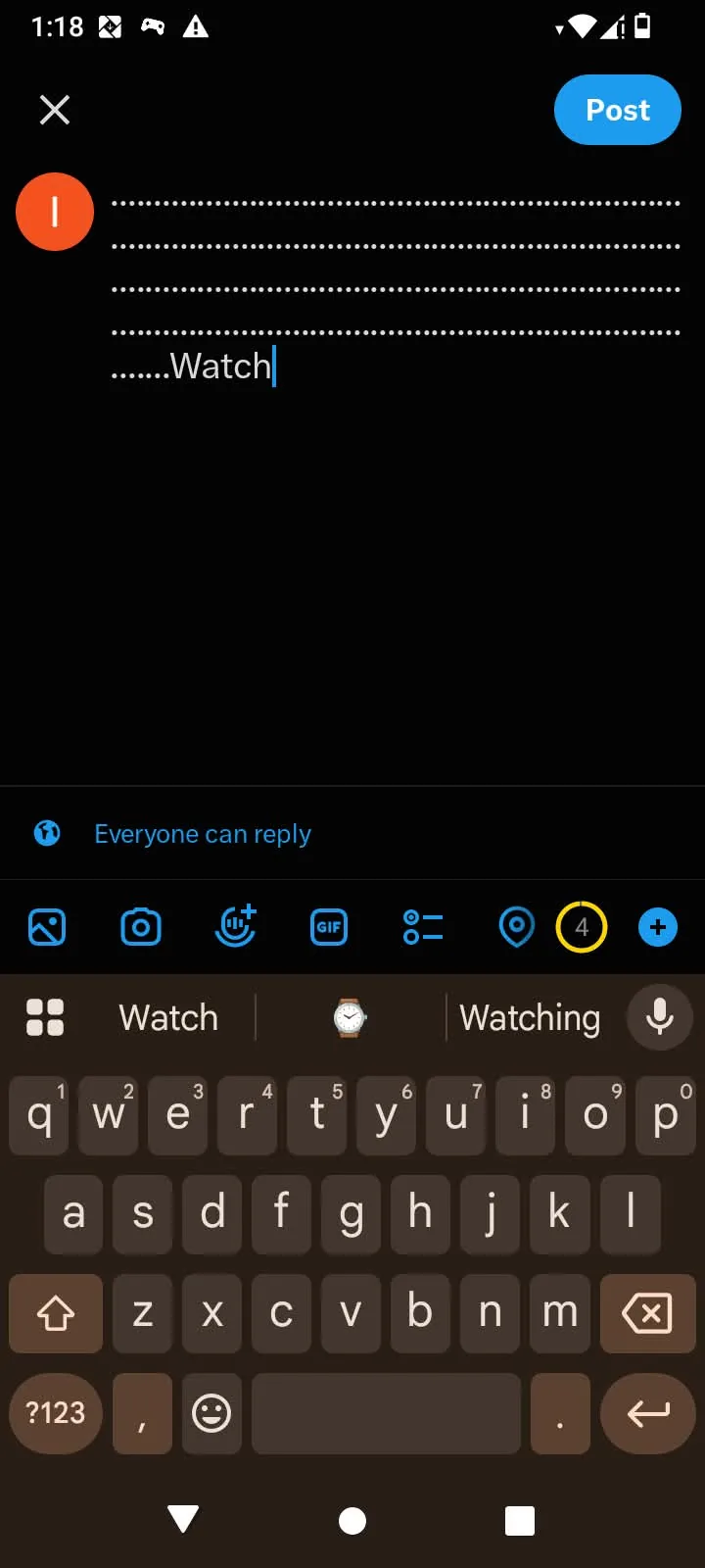
X composer: plain Watch, counter reading 4
The same near-limit draft ending in styled Watch This left the counter at 1.
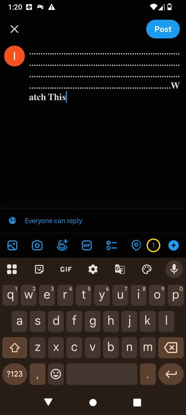
X composer: styled Watch This, counter reading 1
Styled Watch This alone against the remaining room left the counter at 14, for a phrase that is only 10 plain characters long.
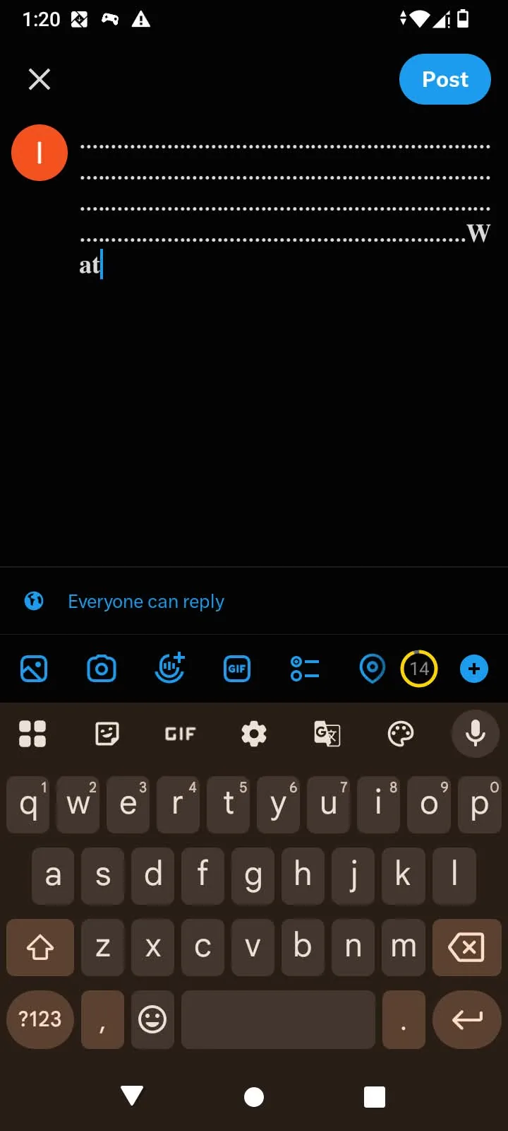
X composer: styled Watch This, counter reading 14
The cost is identical across all six styles. Switching from bold to italic saves nothing, and neither does choosing sans serif over serif. The only thing that buys back room is styling less of the text. Our small text page hits the same rule from the opposite direction, where people assume smaller letters take up less space and they take up more.
Bold is the safest thing on this page. Serif and sans serif bold have been in system fonts for years and effectively never fail on a current device. Italic and bold italic carry the risk, especially sans serif italic, which is the one older handsets are most likely to be missing.
When a device doesn’t have a character, it does one of two things. It borrows the shape from a different font, which is why one word can come out taller or thinner than the rest of your sentence. Or it draws an empty rectangle, the failure everyone recognises. The second one is honest. The first one is worse, because your post looks slightly off and you never find out why.
None of this is the tool or your phone. It’s whichever fonts are installed on the device of the person reading, which is outside everyone’s control including the platform’s. Heads-up: the only reliable test is your own phone plus one older one, which takes two minutes and settles the question for good.
On an iPhone, Watch This 24 renders in all six bold and italic styles with no empty boxes. The three italic cards leave 24 in plain text, which is the digit gap the tool labels on the card.

iPhone: all six styles for Watch This 24
The same phrase on a Redmi A2+, an older handset, also shows all six styles without boxes. That is the safer outcome for these alphabets, and it is why bold stays the first pick when the audience may include older phones.
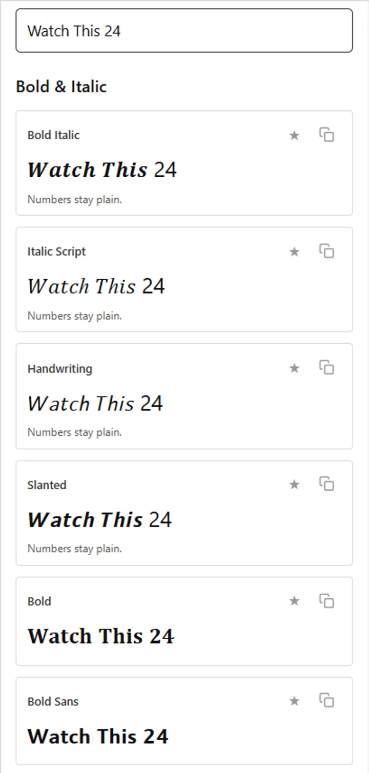
Redmi A2+: all six styles for Watch This 24
Bold has a full set of digits. Two sets, in fact: 𝟎𝟏𝟐𝟑𝟒𝟓𝟔𝟕𝟖𝟗 in serif and 𝟬𝟭𝟮𝟯𝟰𝟱𝟲𝟳𝟴𝟵 in sans serif. Italic has none. Not italic, not bold italic, not the sans serif version of either.
That’s why the test phrase on this page ends in a number. 𝑾𝒂𝒕𝒄𝒉 𝑻𝒉𝒊𝒔 24 shows exactly what happens: the letters change and the digits sit there in plain text, at a different weight from everything around them. In a bio it reads as a mistake rather than a style.
The reason goes back to the equations. Mathematical notation needed bold digits for vectors and matrices, so they were encoded. Italic was already doing a different job in maths, where a slanted letter means a variable, and a slanted 2 would have meant nothing useful to anyone. Nobody asked for them, so nobody made them.
Two ways around it. Use bold for any line containing a date, a price or a phone number, since bold is the only branch of the six with digits. Or leave the numbers plain deliberately and style only the words, which looks intentional as long as you do it consistently.
This is the section most font sites skip, and it’s the one that should change how you use the tool. Screen reading software doesn’t see a bold word. It sees a run of mathematical symbols shaped like letters, and it has to decide what to do with them.
There are two outcomes and both are bad. In the first, the software reads the character names out one at a time, so a single bolded word turns into a recital of MATHEMATICAL BOLD CAPITAL W, MATHEMATICAL BOLD SMALL A, and onward. In the second, it skips the styled run completely and says nothing. The second one is worth sitting with. The word you chose to emphasise is the word that disappears.
Which behaviour you get depends on the software and its settings. NVDA, JAWS and VoiceOver all handle these characters differently, so the same post can be a recital on one setup and silence on another. An article published in August 2023 by an accessibility specialist described the practice as damaging to accessibility, findability and predictability at the same time, and working accessibility professionals have repeated the point ever since. In one widely read public thread, a developer explained the character-name behaviour and the site’s owner, who has a vision impairment, confirmed it firsthand.
Bold carries more of this risk than any other style. Nobody writes a whole bio in blackletter, but people bold entire paragraphs, whole posts and every heading in an update. The longer the styled run, the more there is to lose.
Three rules keep the look without the damage. Keep anything that must be read in plain text, and style only what’s decoration. Never bold a full paragraph or a full post. And if a line carries information someone might actually need, like a date, a price, an address or a link, leave it alone completely.
A search box compares characters, not shapes. When someone searches for a word, the system looks for those exact letters in that exact order. A styled version contains none of them, so the match never happens, however identical the two look on screen.
You can prove it in ten seconds. Paste a styled word into the search box on any site and watch it return nothing, then paste the plain version and watch the results appear. The same thing happens to hashtags, which stop working as hashtags the moment the letters change.
The places this costs you are predictable. A job title in a headline, a product name in a bio, a skill on a profile, your own name if you styled it. Those are the words you most want to be found for, and they’re also the words people style most often, because they’re the ones that feel important.
So the rule writes itself. Style the words that decorate. Leave the words that get searched.
Bold works by contrast, so the amount matters more than the style. A commonly repeated guideline says to bold about a tenth of your text. That number isn’t measured from anything, but the instinct behind it holds: emphasis stops working the moment there’s a lot of it.
Three patterns that hold up:
The failure state is easy to picture. A fully bold post reads as shouting, a fully bold bio reads as broken on the phones that render it unevenly, and a post using three styles at once reads like a ransom note. One catch worth naming: bold renders heavier on some phones than others, so a line that looks balanced on your screen can look aggressive on someone else’s.
If you’re in a document, close this page and press Ctrl+B. Cmd+B on a Mac. Word, Google Docs, Canva, Pages, Slides and every other editor has real bold built in, and the shortcut has worked the same way for decades.
Real bold does three things pasted characters can’t. It changes when you change the font, so the document stays consistent. It searches correctly, so find-and-replace still catches the word. And it exports cleanly, while pasted characters depend on a font being available at export or print time that might not be.
Pasting styled characters into a document is the one case where the result is worse in every direction. It won’t match the document font, it breaks search inside the file, and it can reach the printer as a row of rectangles. Save the six styles for the places that give you no choice.
Plenty of pages do this. Most of them count their styles generously and stay quiet about what breaks. Here’s what’s different about ours.
The tool sits at the top of the page whenever you want it. Type your phrase, compare the six against each other, then copy the one that fits. There’s nothing to install and no account to make.
Yes, in the bio, the name field and captions. No in the username, which accepts only letters, numbers, periods and underscores. Style the name field instead, and remember that the name field is searchable.
No. Ctrl+B applies formatting to ordinary letters. This swaps in different characters that are drawn bold, which is why they survive copy and paste and also why they cause the problems further up this page.
Because italic digits were never encoded. Bold has two sets of digits and italic has none, in any of its three variants. Use bold if your line contains a date, a price or a phone number.
Six. Three slant options across two typeface families. Higher counts on other sites include separate alphabets like script and blackletter, or count alternating patterns as styles in their own right.
Yes, carefully. LinkedIn has no formatting of its own, so this is the only route available. Keep every keyword plain, because LinkedIn treats styled letters as different characters, so a plain search for your job title will not match a styled headline.
Yes. Screen readers either recite the character names one by one or skip the styled text entirely. Keep anything that has to be read in plain text and style only decoration.
Because serif italic has no lowercase h. The character standing in for it is borrowed from a physics symbol, and in some fonts it sits slightly differently from the letters around it. It is the only gap in all six styles, and the other five are complete.
Unclear. No platform publishes anything on it, so treat any specific percentage you read elsewhere as invented. What is measurable is that search stops matching the styled words.
Yes. Bold italic exists in both serif and sans serif, and both are in the tool. It has no digits either.
Because the device reading it does not have that character in any installed font. It is a reader-side problem rather than a fault in the text. Serif and sans serif bold are the two safest styles if you need to avoid it.
Depends. On a social profile it is fine. For anything printed, filed or searched, use real bold in real software, because these characters break search and can fail at print time.