 Fonti
FontiYour Brand Name
Hello World
Type a word into the box above and this tool rewrites it in blackletter you can copy into a bio, a chat, a caption or a profile name.
Style: Bold Script
Your Brand Name
Hello World
Hello World
Hello World
No favourites yet. Tap the star on a card to save it.
Nothing copied yet.
Nothing matches that search.
Numbers stay plain.
characters
Pick an alphabet, a separator and a decoration, then copy the result.
Live preview
0 units
𝔉𝔯𝔞𝔨𝔱𝔲𝔯
Numbers stay plain.
𝕭𝖔𝖑𝖉 𝕱𝖗𝖆𝖐𝖙𝖚𝖗
Numbers stay plain.
Marks added over your text, letters unchanged.
An alphabet wrapped in a decoration.
Decoration wrapped around your text, letters unchanged.
Decoration wrapped around your text, letters unchanged.
Decoration wrapped around your text, letters unchanged.
Decoration wrapped around your text, letters unchanged.
Decoration wrapped around your text, letters unchanged.
Decoration wrapped around your text, letters unchanged.
It is free, there is no signup, nothing installs, and it behaves the same on a phone as on a desktop. What comes back is not a font but a set of Unicode characters shaped like medieval blackletter, which is why the style survives a paste into fields that have no font settings at all. Unicode contains exactly two blackletter alphabets, so this page names both instead of advertising a hundred. Fair warning before you scroll: gothic is the least readable style on this site, and the sections below tell you where that matters and where it does not.
The whole process takes about ten seconds. Below is each step, including the parts that trip people up on a phone.
Enter the name, title or line you actually plan to use. Every style updates live as you type, so there is no generate button to press. One tip specific to gothic: type a capital letter early, because capitals are where blackletter styles differ most from each other and from what you expect.
Compare your own words rather than the sample text, since letter combinations change how a style reads. Fraktur is the classic look most people picture. Bold Fraktur holds its shape better once the text gets small. Judge it at the size it will really appear, because a bio line renders far smaller than this page does.
One tap puts the full line on your clipboard with the spacing intact. If you ever need to select it by hand on a phone, press and hold the text, drag the handles, then check that the last character made it in. Gothic characters are wide, so a partial selection is easy to miss at a glance.
Press and hold and tap Paste on mobile, or use Ctrl+V and Cmd+V on desktop. When the Instagram app refuses to paste, drop the text into your Notes app first, copy it again from there, then paste into Instagram. That re-copy clears the problem almost every time.
Worth knowing: a few fields reject styled characters by rule rather than failing to display them, and usernames are the usual culprit. The platform table further down gives the verdict for each one.
Nothing here installs and nothing downloads. The tool swaps each letter you type for a different character that already exists inside Unicode, the standard that assigns an ID number to every character on the internet. Your ordinary “h” and the blackletter 𝔥 are two separate characters with two separate ID numbers, not one letter wearing a costume.
That single fact explains the naming mess around this tool. A gothic text generator, a blackletter generator, a fraktur font generator, a medieval font generator, an old english text generator and a gothic letter generator are all the same lookup table under different names. Search engines treat those phrases as one thing because they are one thing, and this page covers all of them.
Three nearby searches land on this page. Only one of them is a different product. A gothic translator or a gothic converter is this tool renamed, since nothing is being translated: the language stays English and only the characters change. A gothic keyboard is genuinely different, an app that installs on your phone and offers blackletter as you type, which is more than you need to style one name once. Gothic script in typography means any written hand rather than the joined-up kind, so a search for joined-up letters belongs on the cursive page instead.
One real translation case does exist. Gothic was an extinct language with its own alphabet and its own Unicode block (U+10330 to U+1034F), unrelated to the blackletter on this page, and those letters cannot spell English.
Bold and italic in a document are formatting, an instruction sitting on top of the letters, and any app that accepts only plain text throws the instruction away. Gothic has no instruction to lose. The style is the characters themselves. There is nothing an app can strip without deleting the text, which is exactly why blackletter shows up in bios and profile names that officially support no fonts at all. If you want the longer version of how Unicode differs from a .ttf file, the Font Generator homepage lays it out in full.
Competitors will not print this number. Unicode holds two blackletter alphabets. Not fifteen, not a hundred and fifty. Every extra style you see advertised is one of those two wrapped in symbols, or it is not blackletter at all.
| Style | Sample | What it really is | Best for | Risk |
|---|---|---|---|---|
| Fraktur | 𝔊𝔬𝔱𝔥𝔦𝔠 | True blackletter | Band names, fantasy titles, tattoo wording | Five capitals come from Letterlike Symbols, a second Unicode block |
| Bold Fraktur | 𝕲𝖔𝖙𝖍𝖎𝖈 | True blackletter, complete alphabet | Display names, clan tags, anything small | Single complete block with no substitutions |
The table lists the two alphabets, and decorated versions of each appear on the Combined cards.
Fraktur is the alphabet people mean when they say gothic, and five of its capitals are borrowed from elsewhere in Unicode, which gets its own section below. Bold Fraktur is the complete set. It holds its shape better once text shrinks, which makes it the safer default for a display name. Combined cards wrap either alphabet in a decoration. The Make your own builder offers every wrapper in the catalogue, plus None. Those wrapper characters, not the letters, are the part that can fail to render.
⚠ Styles sold as gothic that are not gothic. Several generators list a “Gothic Serif” (𝐆𝐨𝐭𝐡𝐢𝐜) and a “Minimal Gothic” (𝘎𝘰𝘵𝘩𝘪𝘤). Those are plain bold serif and sans italic characters. They are perfectly good characters and they have nothing to do with blackletter. If that heavier plain look or that slant is what you came for, no gothic style on this page will give it to you, because neither one is blackletter.
One phrase, the two gothic alphabets next to the plain original. The test phrase is chosen on purpose: both the I and the C in “Iron Cathedral” are substituted characters, so the quirk described in the next sections is visible in the table itself.
| Style | Example | Safest for |
|---|---|---|
| Normal | Iron Cathedral | Anything, including usernames and search |
| Bold Fraktur | 𝕴𝖗𝖔𝖓 𝕮𝖆𝖙𝖍𝖊𝖉𝖗𝖆𝖑 | Display names, clan tags, small text, permanent use |
| Fraktur | ℑ𝔯𝔬𝔫 ℭ𝔞𝔱𝔥𝔢𝔡𝔯𝔞𝔩 | Titles, band names, headings at normal size |
Look closely at the Fraktur row. The ℑ and the ℭ sit at a slightly different weight from the letters beside them, because those two capitals come from a separate part of Unicode. The Bold Fraktur row has no such mismatch, which is why it suits anything you cannot easily change later.
All four words point at the same characters this tool produces, so nothing here changes what you paste. The words do mean different things though. Knowing which is which saves you from picking the wrong search term or the wrong tattoo reference.
Blackletter is the typography term for the dense angular script used across Europe from roughly the 1100s onward. Gothic is the everyday name for it, and it started life as an insult: Renaissance Italians used “gothic” to mean barbaric and un-classical, and the label outlived their criticism by five centuries. Fraktur is one specific blackletter family, the one that dominated German printing, and it is the name Unicode itself uses in the character standard.
Old English is the one that causes real confusion. Old English the language is Anglo-Saxon, spoken in Britain before about 1150. Old English the font is just blackletter under a different name, popularised by tattoo and jersey culture. Beowulf was not written in this lettering, and the two have no connection beyond the shared word.
| Term | What it actually refers to | Who uses the word | Same characters as this tool? |
|---|---|---|---|
| Blackletter | The script family | Typographers, font designers | Yes |
| Gothic | Everyday name for blackletter | Most searchers | Yes |
| Fraktur | One blackletter family, and Unicode’s own label | Unicode, historians | Yes |
| Old English (font) | Blackletter, informally named | Tattoo and jersey culture | Yes |
| Old English (language) | Anglo-Saxon, spoken before about 1150 | Linguists | No, unrelated |
| Century / Franklin / News Gothic | Sans-serif typefaces | Designers | No, opposite meaning |
Century Gothic and Franklin Gothic are sans-serifs with no medieval character anywhere in them. Nineteenth-century American type founders used “gothic” to mean a plain letter with no serifs, so the same word ended up describing the opposite look centuries later. Japanese typography does the same thing, where ゴシック体 also means sans-serif. Those are font files you install rather than characters you paste, so this page cannot produce them, and searching for them here will only return blackletter. The full character list lives in Unicode’s Mathematical Alphanumeric Symbols chart.
Scribes did not design blackletter to look dramatic. Parchment was expensive, and narrow vertical letterforms packed more words onto each sheet, so economics produced the style rather than taste. Gutenberg set his 1455 Bible in Textura, the most formal blackletter of the day, which made the look the default for early European printing.
Fraktur stayed standard for German-language printing for roughly four centuries. It did not quietly fade out either. Martin Bormann’s edict of 3 January 1941 (Normalschrifterlass) ended official Fraktur use and Germany switched to roman type, which is why German books printed before and after that date look like they come from different centuries.
Not for bios. Mathematicians needed fraktur letters to carry a different meaning from roman letters inside equations, so blackletter arrived in Unicode’s Mathematical Alphanumeric Symbols block in 2001, alongside the script letters you can style your whole name with in the cursive font generator. Every gothic generator on the internet, including this one, is handing you mathematical notation.
That origin explains everything awkward about the sections that follow. Characters built for equations were never tested against username validators, character counters, accented languages or screen readers, so all four break in their own way.
Heads-up on one thing the history books make unavoidable: blackletter carries associations beyond the medieval. It is genre convention for metal, tattoo and jersey work, and it has also been used by extremist groups, so for a brand mark a modern blackletter typeface is the safer choice than the most historically loaded style.
Unicode has a rule that it never encodes the same character twice. Five fraktur capitals had already been filed years earlier in a block called Letterlike Symbols, so when the blackletter alphabet arrived those five slots were left empty. The letters are C, H, I, R and Z, and they come to you as ℭ ℌ ℑ ℜ ℨ.
In practice that means one letter in your word is drawn from a different part of your device’s font than its neighbours. It can sit at a slightly different weight, width or height. Nothing is wrong with your text when it happens. You will notice it most on names and words that begin with those letters: Christian, Henry, Iron, Richard, Zara.
Bold Fraktur has no gaps at all, because that alphabet was encoded complete. That is the second concrete reason to choose it for a display name, on top of holding up better at small sizes. This generator implements all five Letterlike substitutions: C (U+212D), H (U+210C), I (U+2111), R (U+211C) and Z (U+2128). Bold Fraktur has an empty substitutions map, so those five capitals cannot come out as blank boxes here.
The irony sits at the centre of this style. Fraktur was Germany’s printing standard for four hundred years, and Unicode Fraktur cannot spell a single German word that needs an umlaut. There is no ä, no ö, no ü and no ß anywhere in the block. The same is true of every other accented letter, including é, ñ, ç and å. Those characters fall back to their plain form, so you end up with a half-styled word: Müller and Köln both break visibly in the middle. Whole writing systems are missing too. Urdu, Arabic, Hindi, Cyrillic, Chinese and Japanese have no blackletter equivalent at all.
One catch worth planning around rather than fighting: style only the words that use unaccented Latin letters, or transliterate before converting. Mueller and Koeln both style cleanly, and for a display name that trade is usually worth it.
Gothic suits short, heavy, deliberate text. Below are the four places it earns its keep, plus the rules that come with each one.
Blackletter sits so close to genre convention in metal that plain text can read as a deliberate statement against it. The real constraint is format. A band logo is artwork, not text, so what you paste here belongs in social profiles, streaming bios and merch mock-up wording. Quick note: test the wording in both alphabets before a designer draws anything, because the letterforms change which words look balanced.
Steam, Xbox and Discord all accept Unicode in display names, and gaming is still the most restrictive category on the internet because every title enforces its own filter. Bold Fraktur is the pick here. A clan tag or profile badge renders tiny, and plain Fraktur loses its strokes at that size. Good to know: if a game rejects your styled name outright, that is the game’s username rule rather than a fault in the text. The platform-by-platform detail lives in our Discord Fonts guide.
Your @handle allows only letters, numbers, periods and underscores, capped at 30 characters, so blackletter goes in the display name or one line of the bio. One line is the honest limit, because gothic is dense and a fully styled bio stops being read. Reality check: your name still has to be recognisable to people who already follow you.
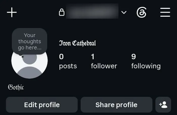
A blackletter Instagram display name above a plain username.
Old English lettering is embedded in jersey culture and West Coast streetwear, which is the real intent behind most searches for old english font letters and goth lettering. It is also the intent that needs a font file rather than pasted characters, because a jersey print, a mock-up or a heat transfer all need artwork. Use this page to settle the wording and read it back at size. Then move to the font-file section further down for the production step.
Gothic also works well for the short stuff: campaign and kingdom names for tabletop games, chapter headings, certificates, Halloween content and dark-themed invitations. The one rule that holds everywhere is the length rule. Style a name, a title or a single word, and never a full paragraph.
Competing pages claim gothic works on 99% of platforms with no compatibility issues. Almost every platform will display blackletter correctly, and several will still reject it, count it twice or fail to find it in a search. The verdict for each, with the catch that matters:
| Platform | Displays? | The catch to know |
|---|---|---|
| Yes | Bio, captions, comments and display name are fine. The @handle takes letters, numbers, periods and underscores only | |
| TikTok | Yes | Nickname and bio work, the username does not. Bio search matches plain text, not styled |
| Discord | Yes | Since the 2023 change usernames must be lowercase letters, numbers, underscores and periods. Display names and server nicknames accept full Unicode |
| X / Twitter | Yes | Each gothic character costs two of your post limit. Handle stays plain |
| Yes | Messages and the About line are fine. Inside chats the built-in formatting is more reliable than styled characters | |
| Partly | Posts and comments accept it. The legal name field rejects it, and Page names are reviewed | |
| Yes, but don’t | It renders, and it removes you from recruiter name and keyword searches | |
| YouTube | Yes | Channel name and descriptions work. A styled title is invisible to keyword search |
| Steam | Yes | Profile names are permissive. Friend search on a fully styled name is close to impossible |
| Xbox / PlayStation | Varies | Gamertag filters are strict and change. Test before paying for a name change |
| Microsoft Word / Google Docs | Yes | Renders fine, but spellcheck ignores it and find-and-replace will not match it |
| Canva | Yes | It pastes as characters, so the font picker cannot restyle it. For real design work use a font file |
| Gmail | Yes | Decorative characters in a subject line read as a spam signal. Keep subjects plain |
One pattern predicts every case that is not in this table. Where text is only displayed, gothic works. Where text is processed by a search index, a username validator, a keyword parser, a spellchecker or a legal name check, it either fails outright or quietly costs you something.
On X, the six letters of 𝔊𝔬𝔱𝔥𝔦𝔠 cost twelve characters of your post limit rather than six. These characters are counted twice. Most other platforms count them once, so a 150-character Instagram bio behaves normally.
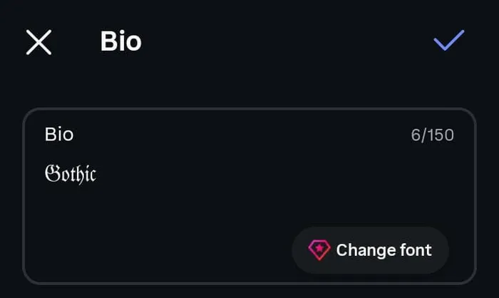
Gothic in blackletter in the Instagram bio field, with the counter reading 6 of 150.
That contradicts a claim repeated across font sites, which is that styled text never changes your character count. It does on X specifically. Learn that before you write a post that fits and then will not send. The practical rule is simple: budget for double on X, and paste into any tight field to confirm the count before you rely on it.
The empty rectangle has a name. Type designers call it tofu, and Google built an entire font family aimed at wiping it out, which is why that family is called Noto, short for “no tofu”. Seeing one means your characters arrived perfectly intact and the device simply has no drawing for them, so it paints a placeholder in the gap. Nothing was lost in the copy.
The two alphabets are not built the same way. Fraktur draws five capitals from a second Unicode block, Letterlike Symbols, so those letters can sit at a different weight. Bold Fraktur is a single complete block with no substitutions. Combined cards wrap either alphabet in a decoration. The Make your own builder offers every wrapper in the catalogue, plus None. Those wrapper characters, not the letters, are the part that can fail to render.
Fixes, ordered by how often they actually work:
Every other style on this site can claim legibility. This one cannot, and pretending otherwise costs you a bad username or a worse tattoo. Blackletter buys atmosphere and spends readability, so use it where atmosphere is the job. Swap to wide spacing at the aesthetic font generator when the mood still matters but the words have to stay readable.
The failure is specific rather than general. Lowercase blackletter holds up surprisingly well, because the letters keep their basic shapes. Capitals are where it collapses: 𝔍, 𝔗, 𝔉, 𝔅 and 𝔖 share strokes and flourishes, so readers guess, and a guessed first letter changes the whole word. That is why a gothic name is often misread at the very first character.
Style a name, a title or a single word. Never a sentence, and never a full bio. Anything longer than a few words asks the reader to decode instead of read, and most will scroll past instead.
Capitals are already the weak point. Setting everything in capitals also removes word shape, which is the other thing readers use to recognise words at a glance. Combining both is how a name becomes decoration nobody can repeat back to you.
Read it aloud to someone who does not already know the words and see whether they get it right. Check it at bio size rather than article size, check it in dark mode, and check it on one older device. For a tattoo this step is not optional. For a username it saves a name change fee.
Unicode’s fraktur set covers letters only. There is no blackletter 4 and no blackletter 7, in any Unicode block. Digits pass through this tool unchanged and sit in your text in plain form.
Some generators present 𝟎 𝟏 𝟐 𝟑 as “gothic numbers”. Those are mathematical bold digits. They pair acceptably next to Bold Fraktur and they are not blackletter, which matters if you were about to put a date on your arm in a style you believed matched the lettering beside it. For circled, bold and other styled digit sets, pull them from the number font generator and choose deliberately instead of by accident.
To a screen reader, 𝔤𝔬𝔱𝔥𝔦𝔠 is not a word. VoiceOver and NVDA announce the characters one at a time using their technical Unicode names, and some setups read nothing at all, so a fully styled bio can be effectively blank to a blind visitor. Voice assistants and automatic translation treat them the same way, as symbols rather than language.
Gothic is worse here than lighter styles, because gothic bios tend to be styled end to end for effect. Three rules keep the look without the cost:
Keep one plain-text version of your name, your contact line and any call to action.
Never let styled text be the only copy of information someone needs.
A styled display name is fine when plain text carrying the same meaning exists elsewhere on the profile.
Profile search matches plain letters, so a fully styled name stops your own followers from finding you. Google reads a gothic heading as the characters it actually contains rather than the words it appears to spell, so a styled title ranks for nothing. Heavy Unicode styling reads as a spam signal too. Filters see it that way, and so do people deciding whether to trust a profile.
The rule that falls out of both halves is the same one: style what is decorative, and keep plain text for anything that has to be searched, indexed, read aloud or trusted.
People arrive here wanting one of three different things, and only one is solved by copying characters. Find your row before you go further.
| What you want | What you need |
|---|---|
| Styled text to paste into a bio, chat, caption, username or clan tag | This generator |
| Blackletter type inside Photoshop, Canva, Word, a jersey mock-up or a print job | A downloadable font file (.ttf or .otf) |
| A logo, band mark or tattoo stencil | A font file plus a designer, or a hand-lettering artist |
The difference is which half of the equation changes. A font file changes how the same letters are drawn on one machine, which is why it works in design software and cannot work inside someone else’s Instagram app. This page does the opposite by changing which characters you use, so the style travels anywhere text goes.
If a font file is what you actually need, UnifrakturMaguntia and UnifrakturCook are free blackletter families on Google Fonts, and the Font Generator homepage carries the full comparison between characters and font files.
Pasted characters are the wrong tool for a tattoo, a logo or a band mark. A stencil has to be scaled, kerned, recoloured and redrawn, and Unicode characters cannot be any of those things. What this page is good for is the step before that one: deciding the wording, comparing it in both alphabets, and reading the capitals back before anything becomes permanent.
Four warnings specific to gothic that other pages leave out:
Capitals get misread, and a misread tattoo is permanent. Check the first letter hardest, and remember that C, H, I, R and Z are substituted characters here.
Dates cannot be gothic at all, since blackletter digits do not exist. The numbers section above covers what generators substitute instead.
Dense blackletter loses its internal detail as tattoos spread and soften with age, so wrist, finger and behind-the-ear placements suffer most.
Accented names cannot be styled, which rules this out for many German, Spanish and Scandinavian spellings.
Band logos and jerseys end the same way. Both are artwork, so use this page to lock the wording and the letter count, then hand it to a font file or a letterer. Getting the wording right first is what saves money.
Two alphabets, labelled honestly. Unicode contains two blackletter alphabets and this page says so, instead of selling symbol wrappers as a hundred and fifty styles.
The missing capitals are documented. C, H, I, R and Z are substituted characters, and no other gothic page explains why one letter in your own name looks slightly different from the rest.
A verdict per platform instead of green ticks. You learn Instagram’s handle rule and X’s double character count here, before a field rejects your text rather than after.
Digits are marked unavailable rather than faked. Other tools hand you mathematical bold digits and call them gothic numbers. This one tells you the truth and points you to the right page.
The accented-language limit is stated up front. If your name carries an umlaut you find out on this page, not after you paste a half-styled bio.
Accessibility gets a real section. You are told what a blind visitor actually hears, then given three rules that keep the styling anyway.
This is the least readable style on the site, and we would rather say it. Gothic is beautiful and genuinely hard to read, especially in capitals and especially small. If legibility matters more than atmosphere, the bold and italic pages will serve you better than this one.
Both alphabets are waiting at the top of the page. Type your name once and the choice usually makes itself.
Yes. Unicode characters are not licensed the way font files are, so styled text can go in business bios, product listings, marketing posts and shop names without paying anyone. Check the platform's own naming rules, since those are separate from any licence question.
Nothing, as far as this tool is concerned. Blackletter is the typography term, gothic is the everyday name for it, Fraktur is the specific family Unicode encodes, and Old English is the informal name used in tattoo and jersey culture. All four describe the same characters.
Type your text above, tap copy, then paste it into your bio or display name in Edit Profile. Your @handle cannot be styled, since Instagram allows only letters, numbers, periods and underscores there. If the app refuses to paste, paste into Notes first and copy it again from there.
Because the device viewing it has no drawing for those characters, not because the text broke. Bold Fraktur is a single complete block with no substitutions. Check the result on a second device before saving anything permanent.
Because five Fraktur capitals live in a different part of Unicode. C, H, I, R and Z come through as ℭ ℌ ℑ ℜ ℨ, drawn from another block, so they can sit at a slightly different weight. Bold Fraktur has no gaps if the mismatch bothers you.
No. Unicode has no blackletter digits in any block, so numbers stay plain. Generators advertising gothic numbers are handing you mathematical bold digits, which pair acceptably with Bold Fraktur but are not blackletter.
Yes, in the right fields. Discord display names and server nicknames accept it while usernames must stay lowercase letters, numbers, underscores and periods. Steam profile names are permissive, though a fully styled name makes you hard to find in friend search.
Only for choosing the wording. A stencil needs artwork that can be scaled and refined, so use this page to compare the phrase in both alphabets, then take it to a blackletter font file or a lettering artist. Dates cannot be styled at all.
On X, yes. Each gothic character costs two of the post limit, so a six-letter word spends twelve. Most other platforms count these characters once, so an Instagram bio behaves normally.
Poorly. VoiceOver and NVDA usually spell the characters out one at a time by their technical names, and some setups skip them entirely. Keep a plain-text version of your name, your links and anything essential so nothing important exists only in styled form.
No. There is no ä, ö, ü or ß in the Fraktur block, and no accented Latin letters at all, which is an irony given Fraktur's four centuries in German printing. Accented letters fall back to plain form, so transliterate first or style only the unaccented words.
Yes, and more than any other style here. Capitals are the weak point, since several share strokes and get misread at a glance. Style one word or a name, keep it out of sentences, and check it at the size it will really appear.