 Fonti
FontiYour Brand Name
Hello World
You scroll past a Facebook post with bold text in it and wonder how that person did it. Then you go looking for the button, and there is no button. There are two different answers to that question, and they apply in completely different places on Facebook. One is a real formatting control that Facebook keeps tucked away in a single spot. The other is a copy-and-paste method that works almost everywhere else, and it comes with a set of rules that no font site bothers to mention.
Style: Bold Script
Your Brand Name
Hello World
Hello World
Hello World
No favourites yet. Tap the star on a card to save it.
Nothing copied yet.
Nothing matches that search.
Numbers stay plain.
characters
Pick an alphabet, a separator and a decoration, then copy the result.
Live preview
0 units
Marks added over your text, letters unchanged.
An alphabet wrapped in a decoration.
Decoration wrapped around your text, letters unchanged.
Decoration wrapped around your text, letters unchanged.
Decoration wrapped around your text, letters unchanged.
Decoration wrapped around your text, letters unchanged.
Decoration wrapped around your text, letters unchanged.
Decoration wrapped around your text, letters unchanged.
𝓑𝓸𝓵𝓭 𝓢𝓬𝓻𝓲𝓹𝓽
Numbers stay plain.
𝒞𝓁𝒶𝓈𝓈𝒾𝒸 𝒮𝒸𝓇𝒾𝓅𝓉
Numbers stay plain.
𝑩𝒐𝒍𝒅 𝑰𝒕𝒂𝒍𝒊𝒄
Numbers stay plain.
𝐼𝑡𝑎𝑙𝑖𝑐 𝑆𝑐𝑟𝑖𝑝𝑡
Numbers stay plain.
𝘏𝘢𝘯𝘥𝘸𝘳𝘪𝘵𝘪𝘯𝘨
Numbers stay plain.
𝙎𝙡𝙖𝙣𝙩𝙚𝙙
Numbers stay plain.
𝐁𝐨𝐥𝐝
𝗕𝗼𝗹𝗱 𝗦𝗮𝗻𝘀
Ⓒⓘⓡⓒⓛⓔⓓ
Unicode records the circled capital M at U+24C2 as an emoji character.
⒫⒜⒭⒠⒩⒯⒣⒠⒮⒤⒵⒠⒟
Numbers stay plain.
Capitals fold to lowercase
🄟🄐🄡🄔🄝🄣🄗🄔🄢🄘🄩🄔🄓 🄒🄐🄟🄢
Numbers stay plain.
Lowercase folds to capitals
🅕🅘🅛🅛🅔🅓 🅒🅘🅡🅒🅛🅔🅓
Lowercase folds to capitals
𝔉𝔯𝔞𝔨𝔱𝔲𝔯
Numbers stay plain.
𝕭𝖔𝖑𝖉 𝕱𝖗𝖆𝖐𝖙𝖚𝖗
Numbers stay plain.
𝙼𝚘𝚗𝚘𝚜𝚙𝚊𝚌𝚎
𝔻𝕠𝕦𝕓𝕝𝕖-𝕤𝕥𝕣𝕦𝕔𝕜
𝖲𝖺𝗇𝗌-𝗌𝖾𝗋𝗂𝖿
Fullwidth
Vaporwave Greek
Vaporwave Triangle
S p a c e d O u t
Numbers stay plain.
Letters stay plain. The style is a space between each character.
ꜱᴍᴀʟʟ ᴄᴀᴘꜱ
Numbers stay plain.
Unicode has no small-capital X, so x stays plain. This site ships no small-capital Q, so q stays plain. Capitals and lowercase both appear as small capitals.
ˢᵘᵖᵉʳˢᶜʳⁱᵖᵗ
Unicode has no superscript q, so q stays plain. Raised letters are lowercase forms, so capitals are not preserved.
ₛᵤbₛcᵣᵢₚₜ
Nine letters have no subscript form in Unicode, so b, c, d, f, g, q, w, y and z stay plain. Lowered letters are lowercase forms, so capitals are not preserved.
🅂🅀🅄🄰🅁🄴🄳
Numbers stay plain.
Unicode's squared letters are capitals only, so lowercase letters appear as squared capitals.
🅵🅸🅻🅻🅴🅳 🆂🆀🆄🅰🆁🅴🅳
Numbers stay plain.
Lowercase folds to capitals
Unicode lists U+1F170, U+1F171, U+1F17E and U+1F17F as emoji characters.
Ⅎʃıddǝp
Some capitals and digits 2, 3, 4 and 7 use borrowed characters, so their appearance can vary by device. Digits 1 and 5 stay plain. This card does not reverse the line.
uʍo◖ ǝpısd∩
Some capitals and digits 2, 3, 4 and 7 use borrowed characters, so their appearance can vary by device. Digits 1 and 5 stay plain. The text is reversed so it reads when the page is turned upside down.
Cⲟⲡⲧⲓc
Numbers stay plain.
Letters c, j, q, u and v have no Coptic shape and stay plain.
ᔕyᒪᒪᗩᗷiᑕᔕ
Numbers stay plain.
A single set of shapes. Capitals and lowercase look the same. Letters i, k, q, t, y and z stay plain.
ᏟᎻᎬᏒᎣᏦᎬᎬ
Numbers stay plain.
A single set of shapes. Capitals and lowercase look the same. Letters f, i, n, q and x stay plain.
ꌩꀤ
Numbers stay plain.
A single set of shapes. Only twelve letters have a Yi form, the rest stay plain.
The Yi block is not in every system font.
Zhuㄚノn ⽖ノx
Numbers stay plain.
A single set of shapes. Only twelve letters have a form here, the rest stay plain.
These shapes come from four blocks: CJK Unified Ideographs, Bopomofo, Kangxi Radicals and Halfwidth Katakana. Line height varies.
𐌏𐌋𐌃 𐌉𐌕𐌀𐌋𐌉𐌂
Numbers stay plain.
A single set of shapes. Letters f, g, j, p, q, v, w and y stay plain.
Old Italic sits above the basic plane, so bio counters on Instagram and X count every letter twice.
Type the full phrase you plan to post, not a single test word. Some styles are missing letters, and those gaps only appear once you can see a whole sentence. Every style updates as you type, so you can compare them side by side before you commit to one.
Styles fall into three groups: the ones that render everywhere, the ones that render almost everywhere, and the ones that leave gaps on older phones. If your post is going to a wide audience, stay in the first group. Save the riskier styles for short bursts where a missing letter will not ruin the sentence.
Press copy on the style you want. Copying and pasting on Facebook behaves the same on both platforms: tap and hold to paste on a phone, or use the usual keyboard shortcut on a computer. What lands on your clipboard is plain text as far as your phone is concerned, which is exactly why it travels into fields that have no formatting buttons at all. The same string behaves the same way in a post, a comment or a message.
Paste it where you actually plan to publish, then look at the result before you hit post. The composer preview and the live post do not always agree, and a Page post and a personal post can render differently on the same phone. Checking takes five seconds and saves you from a post full of empty rectangles.
Most people working out how to bold text on Facebook assume the feature does not exist, and go hunting for a Facebook bold text generator instead. It does exist, and it gives you genuine formatting, the same kind you would get in a word processor. The catch is where Facebook put it.
The formatting toolbar lives inside Facebook Group posts, and only when you are writing from a computer. Start a post in a group, highlight some text, and a small bubble appears with a B and an I in it. The same bubble gives you headers, bulleted lists, numbered lists and block quotations. Facebook’s own help page states the limit plainly: you can only format a group post on a computer.
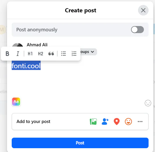
Facebook’s Bold and Italic buttons exist, but only inside a group post.
That one sentence explains almost every confused thread on the subject. Someone tries the same trick on their timeline and nothing happens. Someone else tries it in the mobile app and finds no bubble at all. The control simply is not there outside group posts on desktop.
So here is the full picture for bold text in a Facebook post. Real formatting: group posts, desktop browser. No real formatting: timeline posts, Page posts, comments, your bio, Marketplace listings, Messenger, and the entire mobile app on both iOS and Android.
Worth knowing: the two methods are not equivalent, even when the result looks the same. Text bolded with the B button is still the letter B underneath, so search can find it and a screen reader reads it normally. Pasted styled text swaps in different characters that only look like letters, which is why it works in places the button cannot reach and also why it causes the problems covered further down this page.
The styles below are grouped by how reliably they display, not by how they look. Sunday Roast is used as the test phrase in every row so you can compare them fairly. Two words with an ascender, a descender and a repeated letter will expose most of the gaps you are likely to hit.
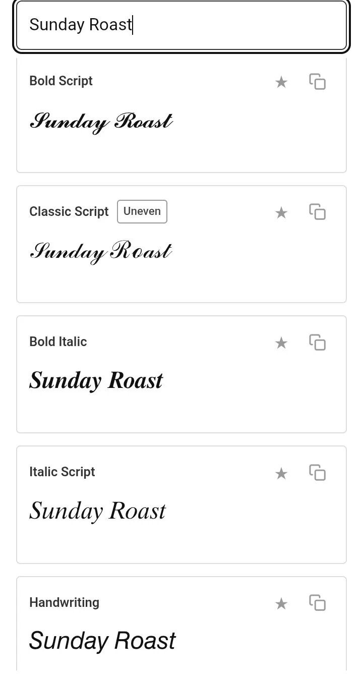
Sunday Roast in the five script-family styles, all rendering cleanly.
| Style | Sunday Roast | Where it holds up |
|---|---|---|
| Bold | 𝐒𝐮𝐧𝐝𝐚𝐲 𝐑𝐨𝐚𝐬𝐭 | Everywhere |
| Bold Sans | 𝗦𝘂𝗻𝗱𝗮𝘆 𝗥𝗼𝗮𝘀𝘁 | Everywhere |
| Handwriting | 𝘚𝘶𝘯𝘥𝘢𝘺 𝘙𝘰𝘢𝘴𝘵 | Everywhere |
| Monospace | 𝚂𝚞𝚗𝚍𝚊𝚢 𝚁𝚘𝚊𝚜𝚝 | Everywhere |
| Classic Script | 𝒮𝓊𝓃𝒹𝒶𝓎 ℛℴ𝒶𝓈𝓉 | Almost everywhere |
| Bold Script | 𝓢𝓾𝓷𝓭𝓪𝔂 𝓡𝓸𝓪𝓼𝓽 | Almost everywhere |
| Double-struck | 𝕊𝕦𝕟𝕕𝕒𝕪 ℝ𝕠𝕒𝕤𝕥 | Almost everywhere |
| Small Caps | ꜱᴜɴᴅᴀʏ ʀᴏᴀꜱᴛ | Gaps on older phones |
| Fullwidth | Sunday Roast | Gaps on older phones |
| Circled | Ⓢⓤⓝⓓⓐⓨ Ⓡⓞⓐⓢⓣ | Gaps on older phones |
The first four styles come from a block of Unicode that has been supported for decades and is included in essentially every font shipped on a modern phone. Classic Script and double-struck are nearly as safe, though a few of their capitals come from a separate part of Unicode and can look slightly off-weight next to the rest. The bottom three are where problems start. Small Caps borrows from a phonetics block, Fullwidth from an old East Asian typing standard, and Circled from an enclosed-symbols block, and none of those three is guaranteed to be complete in the font on someone else’s phone.
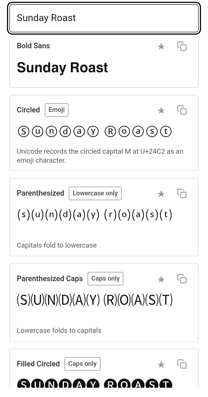
The bold family and the enclosure styles. The Circled card carries the app’s own Emoji note.
Whether styled text survives depends on the field you paste it into, and Facebook has a great many fields. Some accept whatever you give them. Others run your text through checks that plain letters pass and substituted characters fail. The table below covers the ones people actually use.
| Field | Limit | Styled text |
|---|---|---|
| Timeline or Page post | 63,206 characters | Yes |
| Comment | Very high | Yes |
| Group post | Very high | Yes, though the B button is better on desktop |
| Profile bio | 101 characters | Yes |
| Page intro | 101 characters | Yes |
| Page description | Around 255 characters | Yes |
| Display name | Short | Blocked in practice |
| Username and profile URL | 5 characters minimum | No, letters, digits and full stops only |
| Page name | — | Reviewed against naming rules, keep it plain |
| Group name | — | Usually accepted |
| Event name | — | Usually accepted |
| Marketplace listing title | — | Accepted sometimes, but it hurts your search visibility |
| Messenger message | — | Yes |
| Story text | — | Yes, by pasting into a text layer |
Quick note about that 63,206 figure. It is the true ceiling for a Facebook post, and it is by far the most generous limit on any major platform, but almost nobody sees the whole thing. Facebook cuts posts off behind a See more link at roughly 477 characters on desktop and around 125 on mobile. Styling that sits below the cut is styling nobody reads.
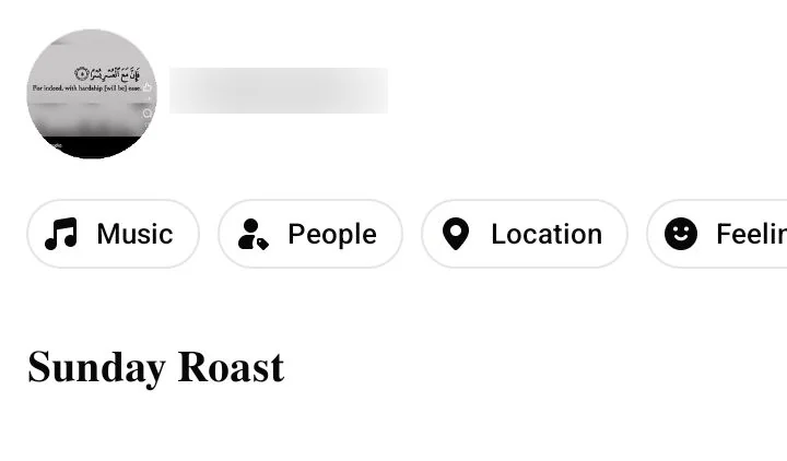
Styled text pasted into a post, rendering as typed.
The pattern across the table is simple once you see it. Anywhere Facebook treats your text as content, styled characters go through. Anywhere Facebook treats your text as an identifier, whether that is a username, a Page name or a listing title, the rules tighten and styled characters either get rejected or quietly cost you something.
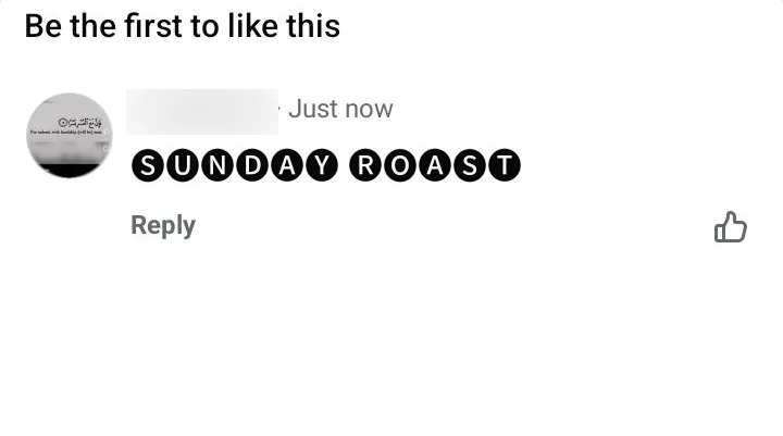
The same paste in a comment. Every character showed.
A lot of sites lump these together and tell you to style your name. They are three separate systems with three separate rule sets. Getting them mixed up can leave you stuck with a name you did not choose for the next two months.
This is the name that appears above your posts. Facebook’s help page on the subject is direct about what is not allowed: no unusual capitalisation, no punctuation, no unusual characters, no random words. The banned list also covers numbers, repeating characters, characters from more than one language, professional or religious titles, and words used in place of a name.
Then there is the part that catches people out. Once you change your name, you cannot change it again for sixty days. Fair warning: if you push a styled name through and Facebook later reverts it or you decide you hate it, that sixty-day clock may already be running. TikTok runs a far looser version of the same rule, and our TikTok fonts guide puts a nickname with no waiting period next to a handle locked for thirty days.
Your username is the part after facebook.com in your profile link. Facebook restricts it to letters, digits and full stops, with a minimum of five characters. Full stops and capitalisation do not create separate usernames either, so johnsmith55 and John.Smith55 are treated as the same handle. That character set leaves no room at all for styled letters, which is why every generator on the internet fails here.
Business Pages get reviewed against their own naming guidelines. Those rules bar improper capitalisation such as tHe best CaFE, symbols like the registered trademark mark, unnecessary punctuation, and slogans or descriptions tacked onto the end. A styled Page name runs straight into the capitalisation and symbol rules, and a Page name rejection is a slower problem to fix than a personal one.
This is the section that matters most if you spend money on Facebook, and it is the one every font site skips. Meta’s advertising standards list Unicode characters used to obfuscate words or phrases as something you are not allowed to do in ad text. That wording is broad, and the people who decide whether your styling counts as obfuscation are not you.
The reason behind the rule is mechanical. Facebook’s ad review system reads your copy to check it against policy. Styled characters are not the letters they resemble, so an automated scan cannot read them as words. Text a review system cannot read looks a great deal like text someone is hiding on purpose.
One catch makes this worse than a simple rejection. Repeated policy violations can restrict your advertising privileges or close the ad account entirely, and arguing that the fancy font was innocent is a slow and uncertain process. Boosting an existing post carries the same risk, because a boosted post passes through the same review as a fresh ad.
Marketplace is a different problem with the same outcome. Listing titles feed Facebook’s internal search, and a buyer typing sofa will not match a title spelled with mathematical alphanumeric characters. Some sellers also report listings rejected for invalid characters in the title.
The safe approach is straightforward. Keep ad copy, headlines, Page names and Marketplace titles in plain text. Save styled characters for organic posts, comments and your own bio, where nothing is scanning them for compliance.
Sites sell these characters under a dozen different labels. A Facebook font changer, an FB font generator, a fancy text generator, a lettertype converter and a Facebook fonts online tool are all handing you the same substituted characters. The name on the site changes nothing about what lands on your clipboard.
When you copy a styled phrase from any generator, you are not copying a font. Fonts are files that live on your device and control how existing letters are drawn. What you copied is a set of entirely different characters that happen to be shaped like letters.
Most of them come from a Unicode block called Mathematical Alphanumeric Symbols, added so that mathematicians could write a bold vector and an italic variable as distinct things in plain text. A bold S from that block is a separate character with its own code point and its own formal name. As far as any computer is concerned, it has no relationship to the letter S at all.
Straight answer on why this matters: the distinction explains every quirk on this page at once. Search cannot match characters that are only shaped like the letters you typed. Neither can an ad review system, a screen reader, or the validator sitting behind a username field.
| Real formatting (the B button) | Pasted styled text | |
|---|---|---|
| What changes | How the letter is drawn | The letter itself |
| Searchable | Yes | No |
| Screen reader | Reads normally | Reads badly or not at all |
| Allowed in ads | Yes | Risky |
| Works in name fields | Not applicable | Rejected |
| Works in the mobile app | No | Yes |
The last two rows hold the whole trade-off in miniature. Substituted characters reach places real formatting cannot, including the mobile app and every field without a toolbar. They also break the things real formatting keeps intact, and that is the price you pay for the reach.
Facebook does not ship one font to everyone. The interface uses a system font stack, which means it asks your device for whatever font that device already uses and falls back through a list until something matches. On Windows you get Segoe UI, on a Mac or iPhone you get San Francisco, and on Android you get Roboto.
This sits behind something people notice and misdiagnose. The same post genuinely looks different on your phone and your friend’s laptop, and neither of you did anything wrong. It also means there is no Facebook site font to download or install, because the letters you see already belong to your own operating system.
The wordmark is a different story. Facebook’s current logo uses Facebook Sans, a proprietary typeface built for the company by the type foundry Dalton Maag. The original 2005 wordmark used a modified version of Klavika Bold, a typeface by Eric Olson, with the customisations handled by the agency Cuban Council.
Good to know: several sites describe Facebook Sans as a custom version of Helvetica, which is not correct. It is an original design, and like the Klavika modifications before it, it is not licensed for public use. Nothing in any font generator will reproduce it.
A box, or an empty rectangle, means the device displaying your post has no glyph for that character. The character arrived intact. Whoever is reading simply has no font on their phone that knows how to draw it. Typographers call that box a tofu, which is where the Noto font family got its name, short for no tofu.
Bold, Bold Sans, Handwriting and monospace sit in the Mathematical Alphanumeric Symbols block. This block has been in Unicode since 2001 and font support for it is close to universal. If your post uses only these, boxes are very unlikely.
Classic Script, double-struck, Small Caps, Fullwidth and Circled all exist as proper characters, but they live in blocks that some fonts cover only partly. Older Android builds and cheaper devices are where you see the failures. This is the tier where one letter breaks and the rest of the word survives.
A few letters were never encoded in some of these sets. When a generator hits one of those, it leaves the plain letter in place rather than substituting a lookalike. That is why a Small Caps phrase can contain one full-size letter, and it is a deliberate choice rather than a bug.
The honest answer needs two halves. Facebook runs two separate systems over your text, and they treat styled characters very differently. Most advice online collapses them into a single question and then gets the answer wrong in both directions.
Feed ranking works mainly on behaviour. Whether people stop, react, comment and share carries the weight, and there is no evidence that Facebook demotes a post for containing Unicode characters. If a styled hook makes people slow down, that is a real effect, and if it makes them scroll past because it looks like spam, that is a real effect too.
Search is the half people forget. Facebook search matches what you typed against what is stored, and a styled character is not the letter it resembles. A Page named with script characters will not surface when someone types the plain name. The same applies to Marketplace titles, group names and anything else people find by typing.
You will see specific numbers quoted around the internet, claims like forty per cent more engagement or a doubling of join requests. None of them cite a study, and none of them survive a look at the source. Treat styled text as a design choice with a discoverability cost rather than a growth tactic.
Screen readers read the underlying characters, and the shape on screen means nothing to them. When one hits a run of mathematical alphanumeric characters, it does one of three things. It reads out the formal Unicode name of every character in turn, it spells the phrase letter by letter in a flat voice, or it skips the run entirely and stays silent.
Reality check on what that sounds like. A styled bio of 101 characters can turn into a minute of a machine reciting mathematical bold capital S, mathematical bold small u, and onward. Nobody listens through that. They move on, and your bio has effectively said nothing.
The fix costs almost nothing. Keep your name, your bio and the substance of your post in plain characters, and use styling for one short line where losing the words does no damage. On desktop group posts, the B button gives you emphasis with none of this cost, because the letters underneath stay ordinary letters.
Style the hook and leave the rest alone. Facebook hides everything past roughly 125 characters on mobile behind See more, so the opening line is the part doing the work. One styled sentence at the top earns attention; a fully styled post reads as noise and gets scrolled.
Facebook bios are tighter still. At 101 characters you have room for about fifteen words, and every one of them is doing a job. Styling all of it costs you searchability and screen reader access for the whole field, so pick a single word if you want the effect at all.
Comments deserve a mention as well. A styled comment stands out in a thread of plain replies, which is useful once and irritating by the fourth time. Use it when the comment matters, not as a signature.
Every style is grouped by how reliably it renders, so you know before you paste whether older phones will show gaps
The generator leaves unencoded letters plain rather than substituting a lookalike that would sit at the wrong height
Styles update live as you type, so you can compare the full phrase instead of a single test word
No account, no download and no browser extension, on desktop or mobile
Field-specific guidance on this page, so you know which Facebook surfaces will reject what you copied
One honest limitation: nothing here can put styled text into your username, and any tool that claims otherwise is wrong
Not with a button. Facebook's formatting toolbar only appears in group posts written from a computer. For a timeline post, a Page post or anything on mobile, pasting bold Unicode characters is the only route.
Almost always because you are not in a group post, or you are on the mobile app. The toolbar needs both conditions: a group post, and a desktop browser. Highlighting the text is what makes the bubble appear.
Facebook's name standards rule out unusual characters, punctuation and unusual capitalisation, so styled names are generally rejected or reverted. Even when one slips through, it makes you harder to find in search.
Once every sixty days. That lock is the main reason not to experiment with a styled name, since a change you regret leaves you waiting two months.
They can. Meta's advertising standards prohibit using Unicode characters to obfuscate words, and the review system cannot read styled text as words in the first place. Repeated violations can restrict the ad account, so keep ad copy plain.
Page names are reviewed against naming guidelines that bar symbols and improper capitalisation. Styled characters run into both rules, and a rejected Page name is slower to sort out than a personal one.
The reader's device has no font covering that character. The text is fine on your end. Small caps, full-width and bubble styles are the usual culprits on older Android phones.
Yes. Messenger messages accept styled Unicode the same way posts and comments do, and the text carries across without changing.
Not through feed ranking, as far as anyone can demonstrate. It does cost you search visibility, which matters most for Pages, groups and Marketplace listings.
No. Facebook search matches the stored characters, and styled characters are not the letters they look like. Someone typing your real name will not reach your profile.
Type your phrase into the generator, tap the style you want, and it goes to your clipboard. On a phone, tap and hold in the Facebook field and choose Paste. On a computer, use the standard paste shortcut. Nothing needs to be installed on either.
Yes. They are Unicode characters, not font files, so there is no licence attached and nothing to buy for personal or commercial use.