 Fonti
FontiYour Brand Name
Hello World
Type a number, pick a style, tap it, paste it. Every style here swaps your digits for different characters that already exist inside the Unicode standard, which is why they survive a copy and paste when normal formatting does not. Ten styles, no signup, no cost, same on phone and desktop. Your font never changes.
Style: Bold Script
Your Brand Name
Hello World
Hello World
Hello World
No favourites yet. Tap the star on a card to save it.
Nothing copied yet.
Nothing matches that search.
Numbers stay plain.
characters
Pick an alphabet, a separator and a decoration, then copy the result.
Live preview
0 units
𝐁𝐨𝐥𝐝
𝗕𝗼𝗹𝗱 𝗦𝗮𝗻𝘀
Ⓒⓘⓡⓒⓛⓔⓓ
Unicode records the circled capital M at U+24C2 as an emoji character.
𝙼𝚘𝚗𝚘𝚜𝚙𝚊𝚌𝚎
𝔻𝕠𝕦𝕓𝕝𝕖-𝕤𝕥𝕣𝕦𝕔𝕜
𝖲𝖺𝗇𝗌-𝗌𝖾𝗋𝗂𝖿
Fullwidth
ˢᵘᵖᵉʳˢᶜʳⁱᵖᵗ
Unicode has no superscript q, so q stays plain. Raised letters are lowercase forms, so capitals are not preserved.
ₛᵤbₛcᵣᵢₚₜ
Nine letters have no subscript form in Unicode, so b, c, d, f, g, q, w, y and z stay plain. Lowered letters are lowercase forms, so capitals are not preserved.
Ⅎʃıddǝp
Some capitals and digits 2, 3, 4 and 7 use borrowed characters, so their appearance can vary by device. Digits 1 and 5 stay plain. This card does not reverse the line.
uʍo◖ ǝpısd∩
Some capitals and digits 2, 3, 4 and 7 use borrowed characters, so their appearance can vary by device. Digits 1 and 5 stay plain. The text is reversed so it reads when the page is turned upside down.
Marks added over your text, letters unchanged.
An alphabet wrapped in a decoration.
Decoration wrapped around your text, letters unchanged.
Decoration wrapped around your text, letters unchanged.
Decoration wrapped around your text, letters unchanged.
Decoration wrapped around your text, letters unchanged.
Decoration wrapped around your text, letters unchanged.
Decoration wrapped around your text, letters unchanged.
The whole job takes about ten seconds. Type the number you want, scroll until a style catches your eye, then tap it to copy. The four steps below add the parts that are easy to get wrong, mostly around long numbers and where you test the result.
1. Type your numbers. Enter the number exactly as you want it to appear, including any zeros. The tool works on digits, so letters typed alongside them pass through unchanged. Type the full thing rather than a single digit, because a year like 2026 behaves very differently from a lone 7. That difference is the point of step two.
2. Pick a style. Scroll the categories and watch your own number render in each one. Test the longest number you plan to use. Some styles cover every digit from zero to nine, others run out partway through, which is covered in full further down this page. A style that looks fine on 7 can fall apart on 2026.
3. Tap to copy. One tap on desktop copies the whole string to your clipboard. On a phone, press and hold if a single tap does not register, which happens in some mobile browsers. Windows users can press Win and V to open clipboard history, which helps when you are comparing three or four styles before deciding. Copy a few, then pick.
4. Paste and check it renders. Paste into the app you actually plan to use, not into a notes app first. Rendering is decided by the device and app doing the display, so the same characters can look correct in one place and blank in another. Check it on your phone as well as your computer if the number is going somewhere permanent. If anything shows as an empty box, pick a different style rather than trying to fix it.
These steps cover digits only. If you need letters styled the same way, switch over to the full font generator and do the whole line at once. The styles carry the same names there, so a bold number and a bold word will match.
Ten styles, one number, so you can see the difference side by side. The table runs from the safest at the top to the most decorative at the bottom. Every row shows 2026, because a four-digit year is a fair test.
| Style | 2026 rendered |
|---|---|
| Bold | 𝟐𝟎𝟐𝟔 |
| Sans-serif bold | 𝟮𝟬𝟮𝟲 |
| Monospace | 𝟸𝟶𝟸𝟼 |
| Double-struck | 𝟚𝟘𝟚𝟞 |
| Full-width | 2026 |
| Superscript | ²⁰²⁶ |
| Subscript | ₂₀₂₆ |
| Circled | ②⓪②⑥ |
| Negative circled | ❷⓿❷❻ |
| Keycap emoji | 2️⃣0️⃣2️⃣6️⃣ |
The first five rows are safe for anything permanent, including a username, a bio or a profile name. They come from a single designed set, they cover every digit, and they render on almost every modern device. The last three rows are decorative, and they behave in ways you would not expect from looking at them. Keycap digits in particular are not really numbers at all, which the next section explains.
Nothing on this page changes your font. The tool looks up a different character that happens to look like the digit you typed, and hands you that instead. Those characters were added to Unicode over three decades, by different committees, for reasons that had nothing to do with social media. Once you know which block a style came from, its odd behaviour stops being odd.
The 2001 maths block. Bold, sans-serif bold, monospace and double-struck digits all come from Mathematical Alphanumeric Symbols, a block of 996 characters introduced in Unicode 3.1 in 2001. Mathematicians needed a way to tell one variable from another inside an equation, where a bold B and a plain B mean different things. Because the block was designed as one complete set, all four of those styles cover every digit from zero to nine. That completeness is why they are the safest styles on the page. It also has a side effect that shows up further down: these characters sit outside the Basic Multilingual Plane, and some character counters charge you double for them.
Enclosed Alphanumerics. Circled digits live in a block called Enclosed Alphanumerics, starting at U+2460. They came from document numbering and legacy typesetting, where a circled figure marked an item in a list. The block only runs to twenty; circled 21 to 50 live in a completely different block, Enclosed CJK Letters and Months, added for Chinese, Japanese and Korean use. Circled zero and negative circled zero sit outside the main run as well, which is why some tools skip zero entirely. The block was built to number things, not to spell values.
Number Forms. Roman numerals have their own block, called Number Forms. Unicode describes it as a block of compatibility characters. They behave differently enough to deserve their own section further down. Short version: use the letters, not the characters.
Keycap emoji are not a font. 2️⃣ looks like a styled digit and it is not one. It is a sequence of three separate code points: the ordinary digit, VARIATION SELECTOR-16, and COMBINING ENCLOSING KEYCAP. Your device draws that sequence as a single coloured tile, and the tile looks different on iPhone, Android and Windows. Because each one is three code points rather than one, expect a keycap year to cost roughly three times what a plain year costs anywhere a character counter is watching. Tools that file these under number fonts are mixing two different things together.
You have probably already hit this. You type a long number, and half of it comes back styled while the rest stays plain. The reason is that the two families of digit styles were designed for opposite jobs. The maths block was built as a complete set of digits, and the enclosed blocks were built as finite lists of numbered items.
| Style | Covers | Has zero |
|---|---|---|
| Bold, sans bold, monospace, double-struck | 0 to 9, any length | Yes |
| Full-width | 0 to 9, any length | Yes |
| Superscript, subscript | 0 to 9, any length | Yes |
| Circled | 0 to 50, across two blocks | Yes, ⓪ |
| Negative circled | 0 to 20 | Yes, ⓿ |
| Double circled | 1 to 10 | No |
| Parenthesized | 1 to 20 | No |
| Full stop | 1 to 20 | Yes, but from a separate block |
| Roman numerals | 1 to 12, then L, C, D, M | No |
| Keycap emoji | 0 to 9, plus 10 | Yes |
One catch worth understanding: enclosed styles number items, they do not spell values. ⓪ placed after ② is two separate list markers sitting next to each other, and nothing reading it will understand the year 2026. If the number needs to mean something, stay in the top half of the table. If it is pure decoration, the bottom half is fine.
These two styles are the only ones here with a real job. Everything else on the page is decoration, and that is fine, but superscript and subscript carry meaning. They exist so you can write an exponent or a chemical formula in a place that has no formatting. That makes them the most useful characters on this page by a distance.
Maths and chemistry. x², H₂O, CO₂ and 10⁻³¹ all work as plain text anywhere Unicode is supported. Digits have complete superscript and subscript sets, zero through nine, plus the plus, minus, equals and bracket signs. Letters are where it falls apart, and subscript is far worse than superscript. Superscript covers nearly the whole lowercase alphabet, scattered across several blocks. Subscript covers only thirteen letters — a, e, o, x, schwa, h, k, l, m, n, p, s and t — so there is no subscript i, no subscript c and no subscript f. Subscript w, y and z appear in the Unicode 18.0 charts at U+209D to U+209F, but almost no font draws them yet, so treat them as unusable for now. Anything longer than H₂O can easily come back half-styled.
One rendering quirk to know about: superscript one, two and three were inherited from ISO-8859-1 and sit in a different part of Unicode from the rest of the set. Many fonts also draw these characters as numerator and denominator glyphs rather than true superscripts, so a string like ²⁰²⁶ can come out slightly uneven in height. Look at it before you commit to it.
The spreadsheet workaround. Google Sheets has no built-in superscript or subscript at all, so pasting the Unicode character is how people actually do it there. We checked: the Format then Text menu in Sheets offers Bold, Italic, Underline and Strikethrough, and nothing else.
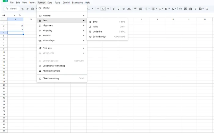
Google Sheets, Format then Text. No superscript or subscript option exists.
Word and Google Docs both have real superscript formatting, and in those you should use the real thing, because proper formatting stays searchable and a pasted character does not. The same menu in Docs has both options, with keyboard shortcuts.

Google Docs, same menu path. Superscript and Subscript are both there.
Fair warning: a pasted ² is a character, so a spreadsheet treats the whole cell as text and refuses to do maths on it. Use it in labels and headers, never in a cell you plan to calculate with. There is a screenshot of exactly what that failure looks like further down.
Footnotes, ordinals and ranks. Superscript numbers make usable footnote markers on platforms that have no footnote feature, which is most of them. Ordinals like 1ˢᵗ and 2ⁿᵈ look tidy in a bio or a headline.
Reddit is the case worth spelling out, because it is usually described wrongly. Reddit does support a caret for superscript, but only as Markdown. Reddit’s own formatting guide explains that comments and posts default to the Rich Text editor, and that Markdown is what you get if you switch to the Markdown editor. We typed x^2 into the default comment box on r/test and posted it, and the caret stayed visible as typed. The pasted Unicode x² in the next comment rendered as an exponent, because it is simply a character.
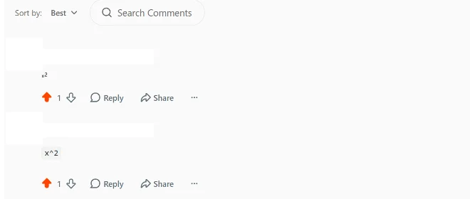
Same thread, same box. Pasted x² holds its shape; x^2 typed into the default Rich Text editor stays as x^2.
So the rule is: HTML has a superscript tag, and Reddit’s Markdown editor has the caret. Where you have either of those, use it. Where you do not, which includes Reddit’s default editor, the Unicode character is what works.
Roman numerals are the most requested number style and the one almost every tool gets wrong. Unicode does contain dedicated Roman numeral characters, and you should mostly not use them. The reason is a good story, and it changes what you should actually copy.
Why the characters exist. Precomposed Roman numerals sit in the Number Forms block from U+2160, and they have been in Unicode since its earliest versions. They were not added for typography. Unicode classes the whole block as compatibility characters, and U+2160 is formally a compatibility version of the ordinary capital letter I. The commonly cited reason for the individual run stopping at twelve is round-trip compatibility with older encodings that had dedicated code points for the numbers on a clock face, which is why there is no XIII. That explanation is only partial, though: the block also carries L, C, D and M, plus several archaic forms for five thousand, ten thousand and higher, and a clock face needs none of those.
Use the letters instead. Ⅻ and XII look nearly identical on screen. The first is a single character that most software cannot search, sort, spell-check or read aloud correctly, and the second is two ordinary capital letters that work everywhere. Straight answer: write Roman numerals with plain capital I, V, X, L, C, D and M. It costs you nothing visually and it keeps the text usable.
Styling a date. A date is where numbers and style meet most often, whether it is a founding year, an anniversary or a tattoo reference. Use the safe styles for this, so 𝟎𝟒 · 𝟏𝟏 · 𝟐𝟎𝟐𝟔 rather than an enclosed style that stops at twenty. A middle dot or a full stop separates the parts more cleanly than a slash, which some apps turn into a link. For tattoo work specifically, your artist draws from a reference image, so what matters is the shape you show them rather than the character you copied.
Support is decided by the device reading your text, not by the tool that made it. That means the honest answer is different for every platform, and in some places styled digits are rejected outright. Everything in this section that has a screenshot beside it is something we pasted in and watched happen.
An Instagram bio gives you 150 characters, and Instagram counts styled digits one for one. We pasted four bold digits and four circled digits into the bio field and the counter read 4 of 150 both times, so a styled year costs exactly what a plain year costs.
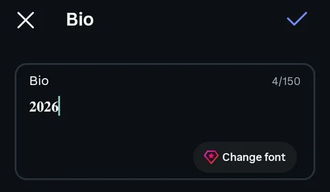
Bold digits pasted into the Instagram bio field. The counter reads 4/150, one per digit. Note that Instagram’s own bio font is fairly heavy, so the styling is hard to see; the counter is the evidence, not the shape.
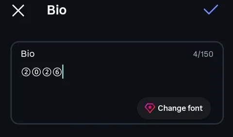
Circled digits in the same field. Same count.
Handles are stricter still, because Instagram allows letters, numbers, periods and underscores only, which means styled digits are rejected in the handle and belong in the display name instead.
X behaves differently, and this is the one that catches people. We watched the post counter drop from 10 remaining to 2 remaining after typing four bold digits, eight units for four characters, two each. The maths-block digits sit outside the Basic Multilingual Plane, and X’s counter charges double for them.
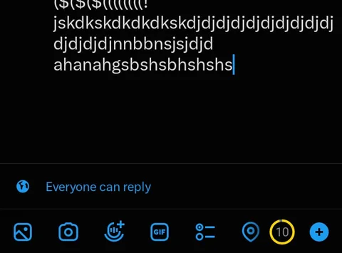
Before: 10 characters remaining.
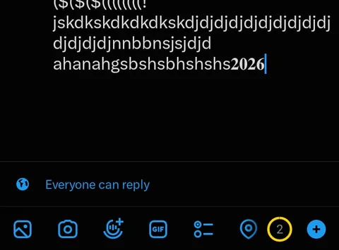
After four bold digits: 2 remaining. Four characters cost eight.
So the same four digits cost four on Instagram and eight on X. If you want something gentler than bold digits, the bubble text generator leans on rounder shapes.
Discord gives you 32 characters for a server nickname, applied per server, so a styled number that fits in one place may not fit in another. Styled digits are accepted there without complaint. We saved a nickname of bold digits and it stuck.
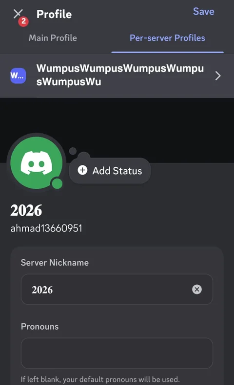
Bold digits pasted into Discord’s Server Nickname field and saved. Discord renders member names in a heavy weight anyway, so again the shape does not prove much on its own. What it shows is that the field accepted and kept the characters.
Channel names are the interesting case, and the usual advice about them is too blunt. Discord does not simply force everything to lowercase. It lowercases letters that have a lowercase form. Its own API documentation puts it as: if there is a lowercase variant of any letters used, you must use those, and characters with no lowercase variants are still allowed. We pasted TestChannel into the Create Channel dialog and watched it become testchannel on the spot. We then pasted a name made of sans-serif bold capitals from the maths block, and the capitals survived, because U+1D5EA has no lowercase mapping for Discord to apply. That test and its screenshots live on the Discord fonts page, which covers every field and its limit.
Gaming platforms are the most restrictive category and the rules vary wildly between them, so test rather than assume.
Styled digits turn up in spreadsheet headers, document titles, forum posts, shop listings and playlist names. The unexpected failure is in documents, because a styled digit in a heading breaks automatic numbering once the software stops recognising it as a number. Quick note: anything that feeds a template, a mail merge or an export will carry the styled characters straight through into the output. Look at what comes out the other end.
Form fields are where they fail hardest, and it is worth being precise about who does the rejecting. We used a plain HTML tel input with a pattern attribute, which is browser-level validation with no platform involved. Plain digits in the required format submitted cleanly. The same format with styled digits was refused with “Please match the requested format”, because the browser does not count those characters as digits.
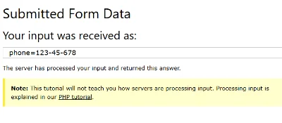
Control: plain digits in the required format, accepted and submitted.
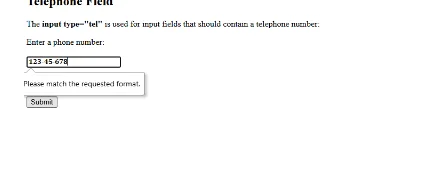
Same field, same format, styled digits. Refused by the browser’s own validation.
That is the browser’s rule, not one platform’s policy, which makes it worse news rather than better, because it means the behaviour follows you everywhere a numeric field is validated.
That empty rectangle has a name. It is called tofu, and Google’s Noto font family is literally named for getting rid of it, as in “no tofu”. It appears when the device has no glyph for the character, which is a gap in the fonts on that device rather than a fault in your text. To go dark with the styles most likely to produce it, the gothic font generator covers this in far more depth.
The short version of compatibility, in three tiers:
This is the section no competitor writes, and it is the one most likely to save you trouble. The moment you style a digit, it stops being a number to every piece of software that reads it. It still looks like a number to you. It is text to everything else.
Here is the plainest possible demonstration. One cell holds styled digits, one holds a plain 2, and the formula asks for the sum.
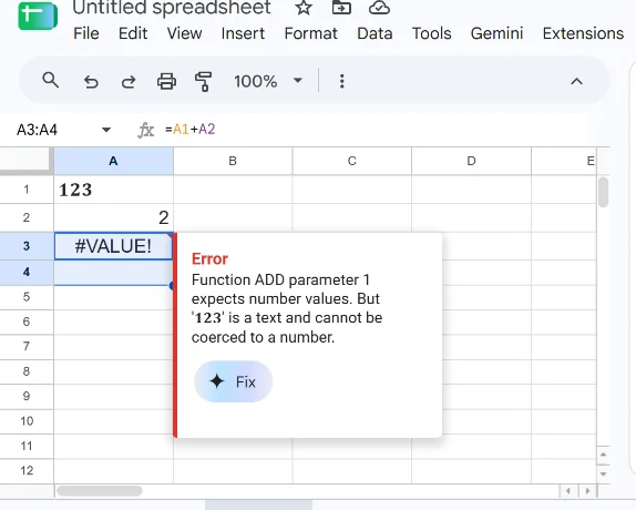
=A1+A2 where A1 holds styled digits. Sheets returns #VALUE! and says the parameter “expects number values. But ‘123’ is a text and cannot be coerced to a number.”
The rest follows from the same cause. A column of 𝟏𝟐𝟑 will not sum, sort or average, because every cell is text. Styled digits sort by code point rather than by value, so 𝟏𝟎 lands before 𝟐. Searching for 2026 will not find 𝟐𝟎𝟐𝟔, and that is the one that quietly costs people reach. Phone fields, postcodes, card numbers and date pickers reject them, as the screenshots above show. A styled phone number cannot be dialled from a tap, so never style a contact number. And a calculator returns an error rather than a sum.
Reality check: none of this is a bug in the tool, and none of it can be fixed by picking a different style. It is what happens when a character that looks like a three is not the character three. The rule that keeps you out of trouble is short. Style numbers people read, never numbers a machine has to process.
Style is a seasoning, not the meal. That applies twice as hard to numbers, because a number usually carries information that a decorative letter does not.
Screen readers. We have not tested this ourselves, so here is what the people who have say. Accessibility designer Per Axbom demonstrated a screen reader falling completely silent on a sentence where two words had been written with these characters, and his summary is that screen readers will most often skip them, or read something that sounds very long as an explanation of each character. His conclusion is blunt: do not fake bold and italic with Unicode. The behaviour depends on which reader and which characters, so we are not going to put numbers on it, but silent or unbearably verbose is the realistic range, and a styled phone number or address can become genuinely unusable for someone relying on assistive technology.
Three rules keep the look without excluding anyone. Keep any number that carries information in plain digits, meaning prices, dates, phone numbers, addresses and quantities. Style the decorative numbers only, such as a founding year in a bio or a rank in a display name. And if a number must be both styled and understood, write it twice: once styled for the look, once plain in the text nearby.
Use it as an accent. One styled number in a line reads as a design choice. A whole paragraph of styled numbers reads as a wall of symbols, and people skim straight past it. The effect works because it contrasts with the plain text around it, so styling everything removes the contrast that made it work. Good to know: a styled username stands out more when the bio underneath it is left plain.
Test before you commit. Thirty seconds of checking beats finding out later that your new display name is four empty boxes. Paste it into the real destination on your phone, then on a desktop, then look at it in dark mode. If you can, get someone on the other operating system to screenshot it back to you, because iPhone and Android draw several of these characters differently. Use your longest number for the test.
There are plenty of number generators, and several of them carry more styles than we do. Here is what we do differently, stated plainly. None of it is a claim about speed or privacy that we cannot back up.
That last point costs us nothing and saves you a real headache. Use the styles where they belong and they work well. The tool sits at the top of this page whenever you need it.
No. They are separate characters inside the Unicode standard that happen to look like styled digits. Your device is not applying a font, it is drawing a different character. That is exactly why they survive a copy and paste into apps with no formatting options.
Because the device displaying them has no glyph for that character. The empty rectangle is called tofu, and it means a gap in that device's fonts rather than a problem with your text. Pick a more widely supported style, such as bold or monospace.
Yes. The bio field accepts them, and Instagram counts them one per digit against the 150-character limit. We pasted four styled digits and the counter read 4. Your handle is a different matter, because Instagram allows only letters, numbers, periods and underscores there.
On X, yes. We watched the post counter drop by eight for four bold digits, because those characters sit outside Unicode's Basic Multilingual Plane and X's counter weights them at two each. Instagram's bio counter charges one each for the same characters. Keycap digits are three code points apiece, so expect them to cost more wherever a counter is involved.
Depends on the style. Bold, monospace, double-struck, full-width, superscript and subscript cover every digit from zero to nine. Enclosed styles were designed as finite lists, so circled runs to 50, negative circled and parenthesized to 20, and double circled to 10.
No. A spreadsheet treats them as text, so it will not sum, sort, average or filter them. Google Sheets says so outright: the value "is a text and cannot be coerced to a number". Use them in headers and labels if you like the look, and keep the actual data in plain digits.
Copy the superscript or subscript character from this page and paste it. In Word or Google Docs, use the built-in superscript formatting instead, because real formatting stays searchable. Google Sheets has no built-in option at all, so pasting the character is the only route there.
Only in Reddit's Markdown editor. The caret is Reddit Markdown, and the default comment box is the Rich Text editor, where we typed x^2 and it stayed as x^2. A pasted x² renders as an exponent in either one.
Yes. These are standard Unicode characters, not licensed typefaces, so there is nothing to buy and nothing to attribute. You can use them in a logo mockup, a product listing or an advert.
No. We tested a plain HTML telephone field: the required format submitted fine with ordinary digits and was refused with "Please match the requested format" when the digits were styled. That is the browser's own validation, so it happens regardless of the site. And even where a field does accept them, the number cannot be dialled from a tap. Never style a contact number, an order reference or anything someone needs to type back.
① is a single Unicode character from the Enclosed Alphanumerics block. 2️⃣ is an emoji sequence built from three code points, the digit plus VARIATION SELECTOR-16 plus COMBINING ENCLOSING KEYCAP, and it renders in colour with a different look on every platform. The first behaves like text, the second behaves like an emoji.
Use ordinary capital letters: I, V, X, L, C, D and M. Unicode has dedicated Roman numeral characters, but the standard classes them as compatibility characters, the individual run stops at twelve, and most software cannot search or read them properly. Plain letters look the same and work everywhere.