 Fonti
FontiYour Brand Name
Hello World
Most people find small text the same way. You copy a line of tiny letters from somewhere, paste it into a bio, and one letter comes out full size while the rest stay small.
Style: Bold Script
Your Brand Name
Hello World
Hello World
Hello World
No favourites yet. Tap the star on a card to save it.
Nothing copied yet.
Nothing matches that search.
Numbers stay plain.
characters
Pick an alphabet, a separator and a decoration, then copy the result.
Live preview
0 units
ꜱᴍᴀʟʟ ᴄᴀᴘꜱ
Numbers stay plain.
Unicode has no small-capital X, so x stays plain. This site ships no small-capital Q, so q stays plain. Capitals and lowercase both appear as small capitals.
ˢᵘᵖᵉʳˢᶜʳⁱᵖᵗ
Unicode has no superscript q, so q stays plain. Raised letters are lowercase forms, so capitals are not preserved.
ₛᵤbₛcᵣᵢₚₜ
Nine letters have no subscript form in Unicode, so b, c, d, f, g, q, w, y and z stay plain. Lowered letters are lowercase forms, so capitals are not preserved.
Marks added over your text, letters unchanged.
An alphabet wrapped in a decoration.
Decoration wrapped around your text, letters unchanged.
Decoration wrapped around your text, letters unchanged.
Decoration wrapped around your text, letters unchanged.
Decoration wrapped around your text, letters unchanged.
Decoration wrapped around your text, letters unchanged.
Decoration wrapped around your text, letters unchanged.
Nothing you do fixes it, and no generator explains why. The short answer is that there is no complete alphabet of small letters, and there never has been. This page gives you the three alphabets that do exist, marks every letter that is real, borrowed or missing, and tells you where each one survives.
Type or paste your text into the box above. If it is a bio line, put in the whole line. Gaps only show up once you can see the full phrase, and a single word will hide them. All three alphabets update at once as you type. That side-by-side view matters more here than on other generators, since the three sets fail on different letters.
You have small caps, superscript and subscript. Small caps read most easily and hold up best across devices, so start there unless you need one of the other two. Superscript sits high and reads as a note or an exponent. Subscript sits low and has the widest gaps of the three.
Press Copy on the row you want. What lands on your clipboard is plain text as far as your phone is concerned, which is why it travels into apps that offer no formatting controls at all. The same string looks the same in a note, a message or a search bar.
This step matters more for small text than for any other style. Paste it into the real field on the real device before you save, and read it once. You are looking for two things: a box or blank where a character did not render, and a letter that stayed full size because no small version exists. Both are common, and both are easier to fix before you publish.
There are exactly three sets of small letters in wide use, and they were built for three unrelated jobs. Small caps are capital letters drawn at roughly the height of lowercase, and printers were using them for acronyms and quiet emphasis centuries before computers existed. Superscript letters sit raised above the line and exist because mathematicians and phoneticians needed them. Subscript letters sit below the line and exist mainly for chemistry and indices.
Those origins decide what each one is good for now. Small caps suit names, labels and short headings, because they stay readable at a glance. Superscript suits short notes, powers and ordinals like 1ˢᵗ. Subscript suits formulas and variable indices, and it is the weakest choice for anything decorative.
One thing worth separating out: upside-down text is not small text. Flipped letters are the same size as normal ones, just rotated, and they come from an entirely different set of borrowed characters. If that is what you are after, it is a different tool and a different alphabet.
Different sites sell these three sets under different names. A tiny text generator, a small font tool, a mini font generator, a small caps generator, a superscript generator and a subscript generator are all handing you characters from the same three sets. People describe the result as thin, little or miniature letters too, and none of those labels tells you how many letters the set actually covers. Here is the test phrase quick fox in all three, copied exactly as a generator would produce it:
| Style | quick fox | Best for |
|---|---|---|
| Small caps | qᴜɪᴄᴋ ꜰᴏx | Names, labels, short headings |
| Superscript | qᵘⁱᶜᵏ ᶠᵒˣ | Notes, powers, ordinals |
| Subscript | qᵤᵢcₖ fₒₓ | Formulas and indices |
Look closely at that table before reading on. The x stayed full size in the small caps row, and so did the q. The q stayed full size in the superscript row, and the subscript row lost the q, the f and the c. Nothing is broken here. Unicode has no small-capital x, and this page also leaves q plain. The next section maps every letter.
This is the table the rest of the internet gets wrong. Generators tend to say a letter is either available or missing, but there are actually three states, and the difference between them changes what you see on screen. A real character was encoded for that purpose and behaves normally. A borrowed character is a lookalike pulled from another writing system, and it will often sit at the wrong height or weight. A missing character means nothing exists, so the letter stays at full size.
| Letter | Small caps | Superscript | Subscript |
|---|---|---|---|
| a | ᴀ real | ᵃ real | ₐ real |
| b | ʙ real | ᵇ real | missing |
| c | ᴄ real | ᶜ real | missing |
| d | ᴅ real | ᵈ real | missing |
| e | ᴇ real | ᵉ real | ₑ real |
| f | ꜰ real | ᶠ real | missing |
| g | ɢ real | ᵍ real | missing |
| h | ʜ real | ʰ real | ₕ real |
| i | ɪ real | ⁱ real | ᵢ real |
| j | ᴊ real | ʲ real | ⱼ real |
| k | ᴋ real | ᵏ real | ₖ real |
| l | ʟ real | ˡ real | ₗ real |
| m | ᴍ real | ᵐ real | ₘ real |
| n | ɴ real | ⁿ real | ₙ real |
| o | ᴏ real | ᵒ real | ₒ real |
| p | ᴘ real | ᵖ real | ₚ real |
| q | q plain here | encoded, rarely renders | missing |
| r | ʀ real | ʳ real | ᵣ real |
| s | ꜱ real | ˢ real | ₛ real |
| t | ᴛ real | ᵗ real | ₜ real |
| u | ᴜ real | ᵘ real | ᵤ real |
| v | ᴠ real | ᵛ real | ᵥ real |
| w | ᴡ real | ʷ real | plain here |
| x | missing | ˣ real | ₓ real |
| y | ʏ real | ʸ real | plain here |
| z | ᴢ real | ᶻ real | plain here |
Small caps come out best. Unicode has twenty-five real small capitals, and only x has nothing at all. This page maps 24 of them and leaves both q and x plain. If you want small text that behaves predictably, this is the set to use, and it is the reason small caps turn up far more often than the other two on profiles and usernames.
Superscript is nearly as complete, with one awkward exception. A superscript q was finally encoded in 2021, but it was placed in a part of the standard that most system fonts never load, so in practice it shows as a box or falls back to a full-size q. Fair warning if your text contains a q: test it rather than trusting the preview on any site, including this one.
Subscript is the set to avoid for words. Latin subscript b, c, d, f, g and q still do not exist. Unicode 18.0 contains U+209D, U+209E and U+209F, but this page does not emit them, so w, y and z stay plain. Generators paper over these gaps by substituting Greek letters or shrunken script characters, which is why pasted subscript words so often look uneven. Writing a full word in subscript is only reliable if the word happens to avoid the letters this page leaves plain.
A font is a file sitting on your device that decides how letters are drawn. You cannot copy a font into a bio, because the bio field has no way to carry it. What a small text generator gives you instead is a set of different characters, each with its own permanent identity in Unicode, the standard that assigns a number to every character your device can display.
| A font | A small text character | |
|---|---|---|
| What it is | A file on the device | A character in Unicode |
| Who applies it | The app | You, by pasting |
| Survives copy and paste | No | Yes |
| Works where there is no font setting | No | Yes |
| Guaranteed to display | Yes | No |
That last row is the trade. Because these are ordinary characters, they go anywhere text goes, including fields that offer no styling at all. Because they are unusual characters, whether they appear correctly depends on the font installed on the reader’s device rather than on yours. The letter ᴀ is no more decorative to your phone than the letter a is. It is a different letter that happens to look like a smaller capital.
Good to know: this is also why small text cannot be undone by the app. Once the characters are in the field, they are the content, not a formatting layer over it. Editing them means retyping them.
The gaps look arbitrary until you learn how these characters arrived, and then they make complete sense. Nobody at Unicode ever set out to build an alphabet of small letters. Each character was added to solve a separate, narrow problem, and the near-alphabet you can assemble today is a side effect.
The first small capitals arrived in the early 1990s, and there were only eight of them: ʙ, ɢ, ʜ, ɪ, ʟ, ɴ, ʀ and ʏ. They were encoded for phonetic transcription, where a small capital marks a specific speech sound. Most of the rest came in 2003, when a block of 108 phonetic characters was added for dictionary notation. Small capital F and S followed in 2008, and small capital Q did not arrive until Unicode 11.0 in 2018.
Subscripts have a similar story. A run of alphabetically ordered subscript letters from h to t was added in 2010, and a widely cited explanation notes that it was squeezed into the space left over in an existing block, covering under a third of the alphabet. There was no plan to finish it later.
Superscript q is the clearest case, because the reasoning survives in writing. On the Unicode mailing list in 2016, one contributor described the missing q as the last key keeping a door locked, on the grounds that completing the series would invite an avalanche of requests for other superscript alphabets with no principled way to refuse them. When a proposal to add superscript S and X came in five years later, the committee shelved it with a short verdict: rich text or font styling would be appropriate for this, but not plain text.
That is the whole answer. These sets are incomplete because they were never meant to be alphabets, and Unicode has said plainly that making them complete is not its job. Any site claiming a complete set of small letters is either counting borrowed lookalikes or has not checked.
A box or a blank rectangle means your device received a character it recognises but has no drawing for. It is a font gap on the reader’s end, not a mistake in what you pasted. Small text characters fall into three tiers, and knowing which tier you are in tells you what kind of failure to expect.
The small capitals from the 1990s and 2003, and the common superscript letters, have been in system fonts for two decades. These are as safe as ordinary letters on any device made in the last ten years. Almost everything in the small caps row of the chart above sits here.
Some characters exist in the standard but are missing from many fonts. Superscript q is the worst offender, since it lives in a region most fonts never load. The subscript run from h to t was absent from Mac system fonts as recently as 2014, and older Android devices still miss scattered characters across all three sets. This tier is where boxes actually come from.
Here the failure looks different, and this is the part no other generator explains. When a letter has no small version, nothing breaks and no box appears. The letter stays its normal size, sitting inside a small word. Reality check: this looks worse than a box, because a box reads as a technical glitch while a full-size letter reads as carelessness. The x in ꜰᴏx and the q in qᵘⁱᶜᵏ are both tier three.
A claim that turns up on almost every small text page is that tiny letters let you fit more into a bio. It is backwards. On X the cost depends on which code points you used, and on every other platform it costs exactly what plain text costs. Nowhere does it cost less.
X counts characters by weighted code points rather than by what you see. The official source is twitter/twitter-text, config/v3.json. The maximum weighted length is 280, the scale is 100 and the default weight is 200. Code points in the configured one-weight ranges count as one. The others normally count as two. Not every small letter counts as two.
The arithmetic depends on the mixture. For quick fox, Small Caps has 9 code points and an X weighted length of 14. Superscript has 9 code points and an X weighted length of 15. Subscript has 9 code points and an X weighted length of 14. A 280-character small-text post does not necessarily hold about 140 letters, and a 150-character Instagram bio does not hold about 75 small letters. On the Instagram Bio composer tested on one Redmi A2+, three 9-character lines plus two line breaks counted as 29 of 150. Straight answer: small text looks like it takes less room, and the cost depends on the mixture of code points. It never follows one universal 2× rule for these live outputs, and it never costs less than plain text. Treat it as decoration.
Styled digits can carry an extra cost on X when their code points fall outside the one-weight ranges, and they have their own gaps on top of it. Some sets cover zero through nine completely, while others stop at twenty or skip zero altogether. The number font generator maps which sets are complete and where each one runs out.
Whether small text survives depends on the field, not on the app. The same platform will accept it in one box and strip it from another, because usernames and handles are validated against a short list of allowed characters while posts and bios are not. Here is where the three sets actually land.
| Field | Does small text work | Notes |
|---|---|---|
| Instagram bio | Yes | The most common use by far |
| Instagram name field | Yes | Searchable, so styling costs you discoverability |
| Instagram username | No | Letters, numbers, periods and underscores only |
| TikTok bio | Yes | Nickname usually accepts it too |
| Discord display name | Yes | Set per server or globally |
| Discord username | No | Lowercase letters, digits, underscore and full stop |
| Discord channel name | No | Forced to lowercase and stripped |
| X display name | Yes | The cost depends on the code point. It is not a flat double |
| X post | Yes | The same weighted count, not a flat double |
| WhatsApp status | Yes | Tested in the Status composer on a Redmi A2+, Android 13. iPhone remains untested. Composition only |
| Reddit comment | Yes | Real markdown is better here |
| YouTube comment | Yes | Channel name accepts it as well |
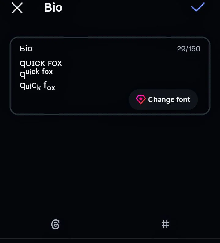
Small Caps, Superscript and Subscript pasted into the Instagram bio field on a Redmi A2+. The three lines counted as 29 of 150 characters, with no empty boxes.
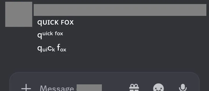
Small Caps, Superscript and Subscript remained visible after being sent in a Discord message on a Redmi A2+.
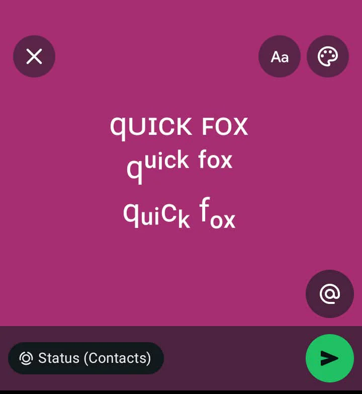
Small Caps, Superscript and Subscript displayed without empty boxes in the WhatsApp Status composer on a Redmi A2+. iPhone remains untested.
Two claims from other generators are worth correcting, because both will waste your time. Small text does not work in an Instagram username, and it does not work in a Discord channel name. Several popular sites say otherwise, and one of them promises complete compatibility on the same page where its own FAQ admits to missing characters. A page that tells you small text works everywhere has not checked. The Discord fonts page goes through each Discord field and its limit in detail, since that platform has more separate name fields than any other.
Worth knowing why platforms block these ranges at all. The same mechanism that produces small letters also produces stacked glitch text and lookalike characters used for impersonation, so moderation filters tend to catch the whole family together. Identity fields get the strictest treatment, which is why handles almost never accept anything unusual. If you want small caps in a profile, put them in the bio or the display name and leave the handle plain. For a softer look that pairs well with them, the cute font generator covers the rounded and script sets.
If the place you are writing supports actual formatting, pasted characters are the wrong tool. Real formatting scales with the reader’s text size, gets read correctly by assistive software, and stays searchable. Small text characters do none of that.
In a web page, small caps come from CSS with font-variant: small-caps, which renders every letter including x. Raised and lowered text come from the <sup> and <sub> tags. In Word and Google Docs, superscript and subscript are keyboard shortcuts and formatting options, not characters. On Reddit, markdown handles it: text^(raised) gives you real superscript for a phrase.
This matters most for maths and chemistry, which is what a large share of superscript searches are really about. If you need x², H₂O, CO₂ or 10⁻³¹ in a document, use the formatting tools built into it. A document keeps real formatting, and a bio field cannot. One catch: the pasted versions do have one legitimate use, which is the case where nothing else works. A plain text field, a chat app, a profile box, a search bar. That gap is the only reason this page exists.
Small text is harder on assistive software than most other styles, and the reason is specific to where these characters came from. Small capitals live in phonetic blocks, where each character stands for a speech sound. A screen reader can therefore announce them as pronunciation notation, and the word itself never gets read out. Superscript and subscript runs are often read out one character at a time, or skipped entirely. A word that looks tidy to you can arrive as a string of character names.
The result is not a minor annoyance. A bio written entirely in small caps can come out as unreadable to someone using a screen reader, and there is no setting on their end that fixes it. At least one accessibility-focused tool ships a permanent warning next to its own small caps generator, telling users that these characters create accessibility problems.
The rule that keeps both things is simple. Anything that has to be read, understood or acted on stays in plain letters, and small text is used only where it is decoration. In practice that means the important line of your bio stays normal and a label or divider gets styled. Quick note for anyone with a business profile: contact details, prices and instructions should never be in small text, since those are the exact lines a reader cannot afford to miss.
Three alphabets side by side, so you can see which letters break before you copy anything.
A letter-by-letter chart that marks every character as real, borrowed or missing, with every cell checked against the Unicode charts themselves.
No borrowed lookalikes passed off as real letters, so what you copy is what the standard actually contains.
Honest compatibility notes instead of badges, including which fields reject small text outright.
Works in the browser with no sign-up, no watermark and no limit on how much you convert.
The limitation we cannot fix: no generator can create a character Unicode never encoded. Small caps x will stay full size on every site, including this one. This page also leaves q plain, and it leaves subscript b, c, d, f, g, q, w, y and z plain.
Because no small version of that letter is being used. Small caps have no x, and this generator also leaves q plain. Subscript is missing b, c, d, f, g and q. Unicode 18.0 added subscript w, y and z, but this generator does not emit them, so w, y and z stay plain too. The generator leaves them plain rather than substituting a lookalike that would sit at the wrong height.
No. It never costs less than plain text. On X, twitter/twitter-text config/v3.json sets a maximum weighted length of 280, a scale of 100 and a default weight of 200. Code points in the configured one-weight ranges count as one, and the others normally count as two, so not every small letter counts as two. For quick fox, Small Caps weighs 14, Superscript weighs 15 and Subscript weighs 14, each from 9 code points. Other platforms count these characters as one, but none counts them as less.
A superscript q was only encoded in 2021, and it sits in a region of the standard that most system fonts do not include. It exists on paper and fails on screen, so expect a box or a full-size q.
No. Unicode has no small-capital x. Twenty-five letters have real small capitals, including ꞯ. This generator does not emit that character, so q stays plain. A proposal to add small-capital x was shelved in 2021 on the grounds that this belongs to fonts rather than to plain text.
No. Usernames accept only letters, numbers, periods and underscores. Use the bio or the name field instead, keeping in mind that the name field is searchable.
Yes in messages, display names and About Me. No in your username or in channel names, both of which are restricted to a short character set.
No. They are separate characters in Unicode, which is why they survive copying. A font is a file on the device and cannot be pasted anywhere.
Yes. Tiny text generator, small text converter, small font copy paste, small letters and mini font generator all describe the same three Unicode sets. The name on the site changes nothing about which letters exist.
The device recognises the character but has no drawing for it in any installed font. Older Android and pre-2015 Mac systems are the usual culprits, especially with subscript.
Use the superscript and subscript formatting in your document editor, or the <sup> and <sub> tags on a web page. Pasted characters are only for fields with no formatting at all.
Often badly. Small capitals come from phonetic blocks, so a screen reader may announce them as pronunciation notation and never say the word itself. Keep anything important in plain letters.