 Fonti
FontiYour Brand Name
Hello World
A cute font generator does not install anything and does not touch your keyboard. It swaps every letter you type for a different character that already exists on your phone, then hands the result back for you to copy. Type Strawberry Milk once and you get it back as script, as bubble letters, as small caps and as a dozen other looks, ready to paste straight into an Instagram bio or a TikTok comment.
Style: Bold Script
Your Brand Name
Hello World
Hello World
Hello World
No favourites yet. Tap the star on a card to save it.
Nothing copied yet.
Nothing matches that search.
Numbers stay plain.
characters
Pick an alphabet, a separator and a decoration, then copy the result.
Live preview
0 units
Marks added over your text, letters unchanged.
An alphabet wrapped in a decoration.
Decoration wrapped around your text, letters unchanged.
Decoration wrapped around your text, letters unchanged.
Decoration wrapped around your text, letters unchanged.
Decoration wrapped around your text, letters unchanged.
Decoration wrapped around your text, letters unchanged.
Decoration wrapped around your text, letters unchanged.
𝓑𝓸𝓵𝓭 𝓢𝓬𝓻𝓲𝓹𝓽
Numbers stay plain.
𝒞𝓁𝒶𝓈𝓈𝒾𝒸 𝒮𝒸𝓇𝒾𝓅𝓉
Numbers stay plain.
Ⓒⓘⓡⓒⓛⓔⓓ
Unicode records the circled capital M at U+24C2 as an emoji character.
🄟🄐🄡🄔🄝🄣🄗🄔🄢🄘🄩🄔🄓 🄒🄐🄟🄢
Numbers stay plain.
Lowercase folds to capitals
🅕🅘🅛🅛🅔🅓 🅒🅘🅡🅒🅛🅔🅓
Lowercase folds to capitals
𝔻𝕠𝕦𝕓𝕝𝕖-𝕤𝕥𝕣𝕦𝕔𝕜
Fullwidth
ꜱᴍᴀʟʟ ᴄᴀᴘꜱ
Numbers stay plain.
Unicode has no small-capital X, so x stays plain. This site ships no small-capital Q, so q stays plain. Capitals and lowercase both appear as small capitals.
🅂🅀🅄🄰🅁🄴🄳
Numbers stay plain.
Unicode's squared letters are capitals only, so lowercase letters appear as squared capitals.
Cⲟⲡⲧⲓc
Numbers stay plain.
Letters c, j, q, u and v have no Coptic shape and stay plain.
ᔕyᒪᒪᗩᗷiᑕᔕ
Numbers stay plain.
A single set of shapes. Capitals and lowercase look the same. Letters i, k, q, t, y and z stay plain.
ᏟᎻᎬᏒᎣᏦᎬᎬ
Numbers stay plain.
A single set of shapes. Capitals and lowercase look the same. Letters f, i, n, q and x stay plain.
ꌩꀤ
Numbers stay plain.
A single set of shapes. Only twelve letters have a Yi form, the rest stay plain.
The Yi block is not in every system font.
Zhuㄚノn ⽖ノx
Numbers stay plain.
A single set of shapes. Only twelve letters have a form here, the rest stay plain.
These shapes come from four blocks: CJK Unified Ideographs, Bopomofo, Kangxi Radicals and Halfwidth Katakana. Line height varies.
𐌏𐌋𐌃 𐌉𐌕𐌀𐌋𐌉𐌂
Numbers stay plain.
A single set of shapes. Letters f, g, j, p, q, v, w and y stay plain.
Old Italic sits above the basic plane, so bio counters on Instagram and X count every letter twice.
The reason to read past the tool is that cute is the one style with no alphabet of its own. Cursive has its own script characters. Gothic has Fraktur. Cute is a mood assembled out of borrowed pieces, and some of those pieces come from living writing systems that will not render on every device. Knowing which is which is the difference between a bio that looks soft and a bio full of empty boxes.
Everything on this page runs in your browser. There is no account, no download, no extension and no font file, because none of these styles is a font in the way a designer means the word. They are characters, the same kind of thing as a question mark or an emoji. They travel inside the text itself. Some people search for a font changer instead, which is closer to the truth: nothing about the font changes, only which characters your words are made of.
Three steps get you from plain text to cute letters.
Type your name, your bio line or your caption into the box at the top. Every style below updates as you type, so there is no generate button to press.
Scroll the styles and find the one that matches what you are making. Names here describe what the style actually is, so the styles built on other writing systems carry the name of that writing system rather than an invented one.
Tap the style to copy it. Paste it wherever you were going.
Because the styling lives in the characters, your text keeps its look after you paste it. The person reading your bio needs nothing installed on their end. That is also the reason a styled line behaves differently from bold text in a document: you cannot un-bold it later, and a search for your plain name will not find it.
Small catch before you commit to a look: a few of the styles further down are built from characters that older phones do not carry. The compatibility table near the bottom says which ones to trust.
There is no Unicode block called cute. Knowing that makes the rest of this page easy to read. What tools label as cute fonts always comes from one of three places, and the place it comes from tells you how safe it is.
Script, bold, italic, double-struck and monospace all come from the Mathematical Alphanumeric Symbols block, which Unicode added so mathematicians could write different kinds of variables. A few letters are missing from that block and get substituted from an older set called Letterlike Symbols, which is why the capital M in ℳ𝒾𝓁𝓀 comes from somewhere different than the rest of the word. 𝒮𝓉𝓇𝒶𝓌𝒷ℯ𝓇𝓇𝓎 ℳ𝒾𝓁𝓀 is not a handwriting font. It is a set of mathematical symbols that happens to look handwritten. These are the most widely supported cute styles you can pick.
Bubble letters like Ⓢⓣⓡⓐⓦⓑⓔⓡⓡⓨ Ⓜⓘⓛⓚ come from the Enclosed Alphanumerics block, built for list markers and diagram labels, while the squared ones come from the Enclosed Alphanumeric Supplement added later. They are common and generally safe. The filled versions do render as coloured emoji on some phones and as plain outlines on others.
The rest are lifted from systems that were never meant for decoration: living and historical writing systems, phonetic notation, and legacy East Asian text forms. Small caps come from the phonetic alphabet linguists use. Full-width letters exist because early East Asian typesetting needed Latin letters the same width as a Japanese character, and they live in the Halfwidth and Fullwidth Forms block.
Not all of this group is risky. Phonetic notation and the full-width forms are old, widely installed and safe to use. It is the rarer writing systems that break, and those get their own section next.
Be aware that a tool showing you two hundred styles is not showing you two hundred alphabets. It is showing you a handful of blocks plus decorations wrapped around them in different combinations.
Several of the most-shared cute styles are not decorative inventions. They are working scripts, and the tools selling them almost never say so.
| Usually sold as | Strawberry Milk in it | What the characters actually are |
|---|---|---|
| Bubbly, rounded, cute caps | ᔕtᖇᗩᗯᗷᗴᖇᖇy ᗰiᒪk | Unified Canadian Aboriginal Syllabics, mostly the Carrier range. ᗩ is U+15E9, CANADIAN SYLLABICS CARRIER PO |
| Gentle, soft, light | Ⲥⲧⲣⲁⲱⲃⲉⲣⲣⲩ Ⲙⲓⲗⲕ | Coptic, the block from U+2C80 to U+2CFF. A real alphabet with both cases, so the capitals are genuine capitals |
| Carved, symbol-heavy | ᏕᎢᏒᎪᏔᏴᎬᏒᏒᎽ ᎷiᏞᏦ | Cherokee, the writing system of the Cherokee Nation. Ꮍ is U+13BD, CHEROKEE LETTER MU |
| Angular, tribal, runic | ꌗ꓄ꋪꍏꅐꃳꍟꋪꋪꌩ ꂵꀤ꒒ꀘ | Yi, standardised in 1956 for the Nuosu language of Sichuan. Mostly Yi Syllables, with two Yi Radicals mixed in (꓄ is U+A4C4) |
| Kawaii Asian, anime style | 丂ㄒ尺卂⼭乃乇尺尺ㄚ ⽖ノㄥㄎ | Four blocks at once: CJK Unified Ideographs, Bopomofo, Kangxi Radicals (⼭ is U+2F2D, RADICAL MOUNTAIN) and one Halfwidth Katakana (ノ is U+FF89) |
| Ancient, gamer | 𐌔𐌕𐌐𐌀w𐌁𐌄𐌐𐌐y 𐌌𐌉𐌋𐌊 | Old Italic, the alphabet Etruscan and related languages were written in. It sits outside the basic plane, which matters for character counts |
| Unnamed decorative mixes | Characters such as ꕷꞆᎽԸĬꕷ | Five different blocks in six characters: Vai from Liberia (ꕷ is U+A577), a medieval Insular T from Latin Extended-D (U+A786), Cherokee, Armenian (Ը is U+0538) and an accented Latin capital. Nothing holds this set together except that the shapes resemble Latin letters |
Three things follow, and none is a reason to avoid these styles.
The first is coverage. Cherokee, Coptic, Yi and Old Italic are not part of the basic character set every device ships with. A phone that has never needed Coptic may not carry it, and your soft aesthetic bio arrives as a row of boxes. If a look has to survive every device, stay in the top half of the compatibility table.
The second is what a screen reader does. Script and bubble letters are often announced close to the intended word. A line of Cherokee syllables is not, because the software correctly identifies them as Cherokee syllables and reads them that way. Anyone using a screen reader gets nothing usable from your bio.
The third is simply accuracy. Calling Cherokee a cute font, when it is the writing system of the Cherokee Nation, is the kind of thing worth getting right. Use the style if you like how it looks. It costs nothing to know what it is.
That is also why the styles above carry the name of the script they came from rather than something invented. No other cute font page does this, which is the only reason it is worth saying at all.
These four words get used as if they mean the same thing. They do not. The gap is wide enough that picking the wrong one makes your bio read as the wrong person.
| Word | What it signals | Usually built from |
|---|---|---|
| Cute | Playful, friendly, soft. Approachable rather than impressive. | Rounded and bubble letters, script, plus hearts and stars |
| Pretty | Elegant and considered. Closer to a wedding invitation than a sticker. | Script and italic, with far fewer decorations |
| Aesthetic | Curated and restrained. The look is the message. | Spaced lowercase, small caps, full-width letters |
| Preppy | Bright, coordinated, unmistakably of the 2020s. | Cute styles plus bows, stars and pastel emoji |
The practical test is what you want the reader to feel. Cute asks to be liked. Pretty asks to be admired. If you are styling a bakery caption or a fan account, cute is right. If you are styling a florist’s name or a quote graphic, 𝒮𝓉𝓇𝒶𝓌𝒷ℯ𝓇𝓇𝓎 ℳ𝒾𝓁𝓀 in plain script with nothing around it reads as pretty, and adding four hearts turns the same line cute.
None of this is a property of the characters. The same script letters appear on cute pages, pretty pages and wedding blogs. What changes the register is the decoration you put around them, and how much of it there is. That is why the tool above keeps alphabets and decorations in separate panels. Nice, sweet and fun show up as loose synonyms for cute and point at the same styles.
Aesthetic and pretty sit right next to cute rather than opposite it, so if the restrained look is what you are after, reach for the plainest script here and leave the decorations off entirely. Go further in that direction and you leave cute behind, because the wide spaced letters that carry the aesthetic look are their own set of characters rather than a decoration added on top. The aesthetic font generator is built around that set, and it explains why the spacing holds up in apps that strip other formatting out. The two pages stay separate on purpose, since a search for cute and a search for aesthetic rarely want the same thing back.
Four separate things get lumped together under kawaii, and telling them apart makes it much easier to build the look you actually pictured.
Kawaii is simply the Japanese word for cute. In practice it points at a specific register borrowed from Japanese pop culture: rounded, pastel, soft, the visual language of Sanrio and Harajuku. A kawaii text generator is a cute font generator with that register emphasised. There is no separate kawaii character block. Cutecore works the same way: a subculture name describing a whole aesthetic rather than any set of characters.
Kaomoji are faces built out of characters, like ʕ•ᴥ•ʔ or (。♥‿♥。). The word means face characters. They are assembled from punctuation and letters pulled from several different scripts rather than drawn from a single set, which is why some kaomoji survive a paste and others fall apart. They are older than most cute font tools, dating from Japanese text messaging.
Emoji are single characters with their own code points. 🍓 is one character, not a picture you attached. That is why an emoji counts against a bio limit the same way a letter does.
Decorations are ordinary characters placed around your text, such as ♡, ✿ and ★. Nothing about your letters changes when you add them. A tool that ships two hundred styles is usually shipping a smaller number of alphabets multiplied by a list of decorations, which is worth knowing before you go looking for the two hundredth alphabet.
These three come up constantly, and each one has a specific answer.
Handwriting is the most searched of the three, and it is also the one where expectations and reality diverge. Real handwriting varies from letter to letter. Unicode script characters do not, because each letter is a fixed character that looks identical every time it appears. Type a double letter and you see it: the two r characters in 𝒮𝓉𝓇𝒶𝓌𝒷ℯ𝓇𝓇𝓎 are exactly the same shape, which no human hand produces. It reads as handwriting at a glance and as a typeface on a second look.
Girly script, also searched as girly handwriting, usually means the bolder of the two script sets. Plain script 𝒮𝓉𝓇𝒶𝓌𝒷ℯ𝓇𝓇𝓎 is thin and holds up in small sizes. Bold script 𝓢𝓽𝓻𝓪𝔀𝓫𝓮𝓻𝓻𝔂 is heavier and survives a phone screen better, which is why it dominates bios. If a full flowing look is what you want rather than a cute one, soften the whole line with cursive fonts, where the whole page is built around it.
Bubble letters come in two versions and people are often surprised by the difference. Outline bubbles Ⓢⓣⓡⓐⓦⓑⓔⓡⓡⓨ stay as text and behave predictably. Filled bubbles render as coloured circles on some phones and as flat black-and-white ones on others, because the phone treats them as emoji. Careful here if you are building something that has to look identical for everybody: pick the outline set.
Preppy has an odd history for a font search. The word is short for preparatory and originally described the students of north-eastern American prep schools, an old-money look of blazers and collars. That is not what people mean when they search for preppy fonts today.
The current meaning arrived through TikTok in the 2020s: bright colours, bows, stars, smiley faces, a specific palette of pink and green, and text styled to match. It overlaps heavily with cute. That is why preppy styles live on this page rather than on one of their own. Type your text above, pick a rounded or script style for the letters, and take the bows and stars from the decorations panel beside it.
Four things people search for alongside it are worth separating.
Preppy letters and copy and paste are the same request as the rest of this page. Pick a rounded or script style and add a bow.
A preppy name generator invents names rather than styling them. This tool styles the name you already have.
A preppy keyboard is a different product entirely. That means an app you install on your phone which changes the keyboard itself. Nothing here needs installing, and nothing here changes your keyboard.
Roblox and Adopt Me come up constantly, because that is where a large part of this audience actually is. Roblox display names and chat run through a filter, and which styles survive it is not something to guess at.
One thing first if you are styling a Roblox or gaming name: test it on a throwaway before you commit, because a rejected name can lock you out of a rename for a while.
Strawberry Milk in every main style, so you can compare them without typing anything.
| Style | Strawberry Milk | How safe it is |
|---|---|---|
| Script | 𝒮𝓉𝓇𝒶𝓌𝒷ℯ𝓇𝓇𝓎 ℳ𝒾𝓁𝓀 | Safe almost everywhere |
| Bold script | 𝓢𝓽𝓻𝓪𝔀𝓫𝓮𝓻𝓻𝔂 𝓜𝓲𝓵𝓴 | Safe almost everywhere |
| Bubble, outline | Ⓢⓣⓡⓐⓦⓑⓔⓡⓡⓨ Ⓜⓘⓛⓚ | Safe, stays as text |
| Small caps | ꜱᴛʀᴀᴡʙᴇʀʀʏ ᴍɪʟᴋ | Safe, borrowed from phonetic notation |
| Double-struck | 𝕊𝕥𝕣𝕒𝕨𝕓𝕖𝕣𝕣𝕪 𝕄𝕚𝕝𝕜 | Safe |
| Monospace | 𝚂𝚝𝚛𝚊𝚠𝚋𝚎𝚛𝚛𝚢 𝙼𝚒𝚕𝚔 | Safe |
| Full-width | Strawberry Milk | Safe, a legacy East Asian text form |
| Syllabics | ᔕtᖇᗩᗯᗷᗴᖇᖇy ᗰiᒪk | Riskier, borrowed script |
| Coptic | Ⲥⲧⲣⲁⲱⲃⲉⲣⲣⲩ Ⲙⲓⲗⲕ | Riskier, borrowed script |
| Cherokee | ᏕᎢᏒᎪᏔᏴᎬᏒᏒᎽ ᎷiᏞᏦ | Riskier, borrowed script |
| Yi | ꌗ꓄ꋪꍏꅐꃳꍟꋪꋪꌩ ꂵꀤ꒒ꀘ | Riskiest, missing from many phones |
| Zhuyin Mix | 丂ㄒ尺卂⼭乃乇尺尺ㄚ ⽖ノㄥㄎ | Uneven, the characters sit at different widths |
| Old Italic | 𐌔𐌕𐌐𐌀w𐌁𐌄𐌐𐌐y 𐌌𐌉𐌋𐌊 | Riskier, and every letter costs two characters |
Three patterns are visible in that table. The safe styles all come from the maths and enclosed blocks. The mixed-case ones look better in a bio than the all-caps ones, because a run of capitals is harder to read at bio size. And the borrowed styles rarely cover the whole alphabet, so letters with no shape in that script stay plain, which is why an i or a w sometimes sits in the middle of a styled word. That is not a bug in the tool. Those scripts simply have no letter that matches.
Small caps have a page to themselves at the small text generator, since the tiny look gets used far outside anything cute.
Worth checking on your own phone rather than trusting any list, including this one.
Decorations do more work than the letters do. A plain script line reads as elegant; the same line with hearts on both ends reads as cute. They are separate characters sitting beside your text. Mix any decoration with any style. This is also what people mean by cute symbols and cute patterns: not letters, but the shapes placed around them.
The pattern is always the same: something on the left, your styled text, the mirror of it on the right.
♡ plus your text plus ♡ gives ♡ 𝒮𝓉𝓇𝒶𝓌𝒷ℯ𝓇𝓇𝓎 ♡
✿ works for anything soft or floral
★ and ✦ add energy without much clutter
⭐ and other emoji versions render in colour, which is louder than the outline symbols
Two costs come with decorations, and neither is a reason to skip them. The first is length: every decoration and every space around it counts against a bio character limit exactly like a letter does, so a heavily decorated line eats a bio fast. The second is that a screen reader reads decorations out. Six stars around your name becomes six spoken words before anyone reaches the name.
Before you paste a decorated line into a username field rather than a bio, check whether the platform allows symbols there at all. Most do not, and the section on names below explains why.
This is the question competitors answer wrongly, and the wrong answer wastes your time. Several cute font pages state that all their styles include the numbers zero to nine. They do not. The reason is in the blocks themselves.
When Unicode added the maths alphanumeric characters, it added digits for some of the letter sets and not for others. Script was one of the sets that never got them. So 𝒮𝓉𝓇𝒶𝓌𝒷ℯ𝓇𝓇𝓎 works perfectly and there is no script version of 2026 to sit next to it. A tool that appears to give you one is quietly swapping in digits from a different style, so your line ends up mixed.
| Style | Has digits | What you get |
|---|---|---|
| Script and bold script | No | Plain digits. There are no script digits in Unicode |
| Small caps | No | Plain digits only |
| Every borrowed script here | No | Plain digits only |
| Bubble, outline | Yes | ⓪①②③ as circled numbers |
| Double-struck | Yes | 𝟘𝟙𝟚 |
| Bold | Yes | 𝟎𝟏𝟐 |
| Monospace | Yes | 𝟶𝟷𝟸 |
| Full-width | Yes | 012 |
The practical answer for a birthday post or a price is to pick a style from the lower half of that table. Use it for both the words and the numbers, so the whole line matches. If digits are the main thing you are styling, style your digits with number fonts, which covers every set that has them.
There are two name fields on almost every platform. They behave completely differently. Missing this is the single most common reason a styled name does not work.
The handle is the one with the at sign, the one people type to find you. It accepts letters, numbers and a small set of punctuation, and nothing else. You cannot style it. Any tool suggesting otherwise is wrong about how the platform works.
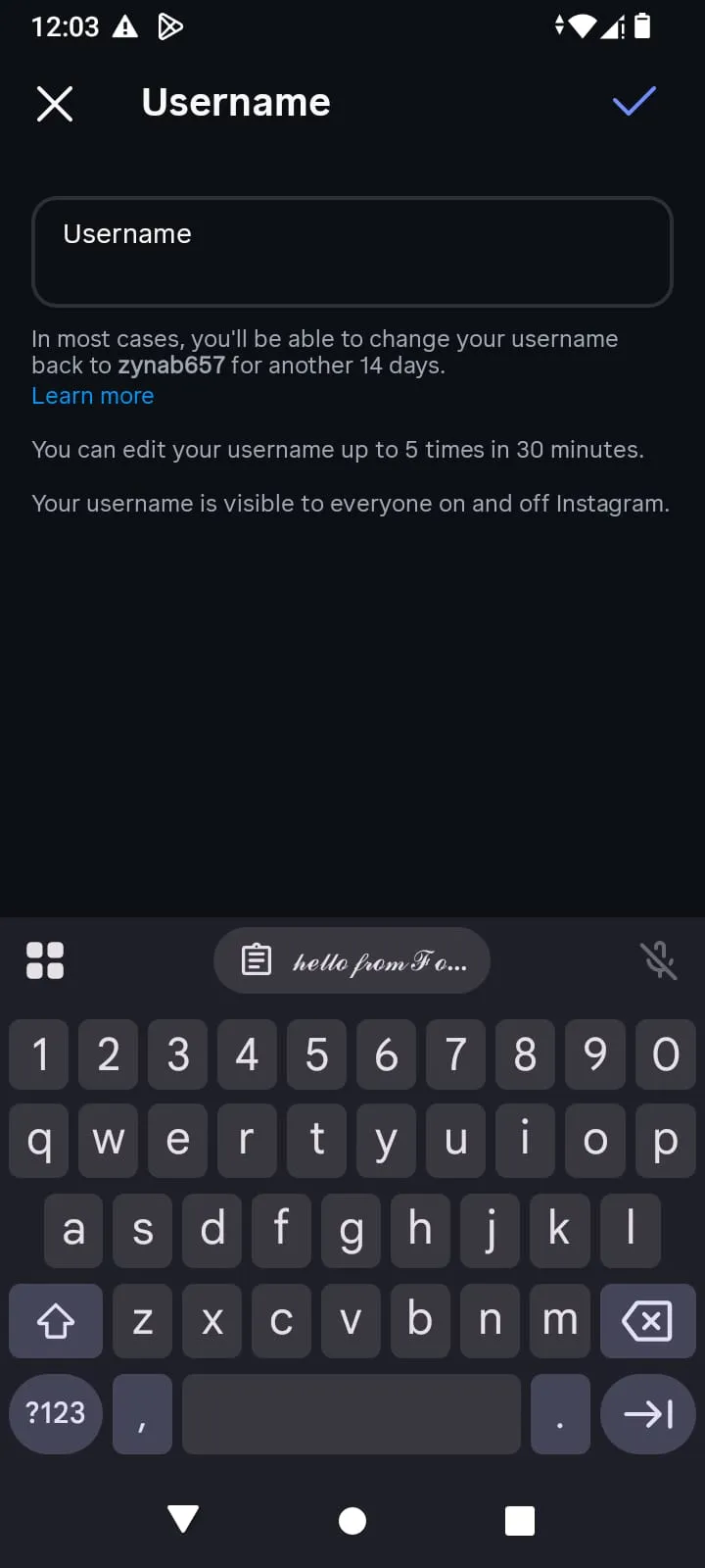
The styled username sits ready on the clipboard. Nothing has gone wrong yet.
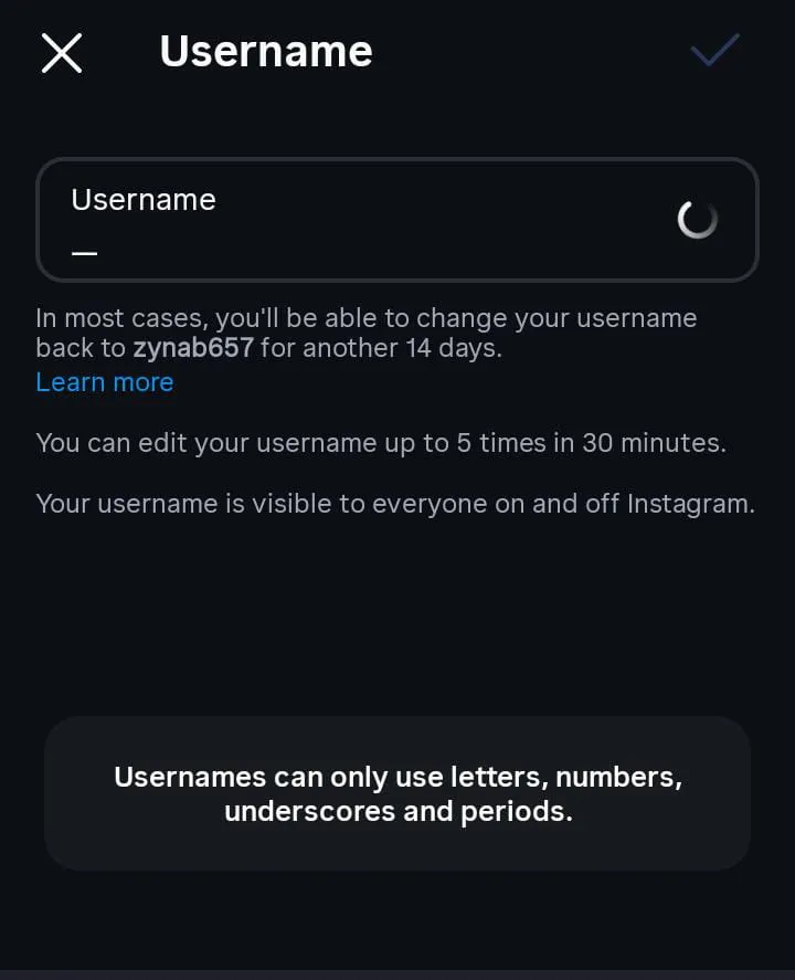
Pasted into the username field, the same text is refused. Instagram accepts letters, numbers, underscores and periods there and nothing else.
The display name is the one shown above your bio or beside your comment. That field usually accepts styled characters, and it is where every cute name you have admired actually lives.
Once you know which field you are filling, a few things follow.
Short names take heavier decoration than long ones. A four-letter name in bubble letters stays readable; a ten-letter name in the same style becomes a wall of circles. Mixed case beats all caps for anything longer than a word.
There is also a cost worth weighing. A styled display name is harder for people to find. If someone half remembers your name and types it plainly into the search box, a styled version may not come back, because the characters they typed are not the characters you used. For a personal account that is a fair trade. For anything you want discovered, it is not.
Straight answer on the numbers other pages quote: claims that a styled name lifts replies by a specific percentage are not something anyone can verify, and this page will not repeat them. Style your name because you like it.
Styled text is accepted in far fewer places than most cute font pages admit. The pattern is consistent once you see it: display fields accept it, identity fields reject it, and anything running a name filter is unpredictable.
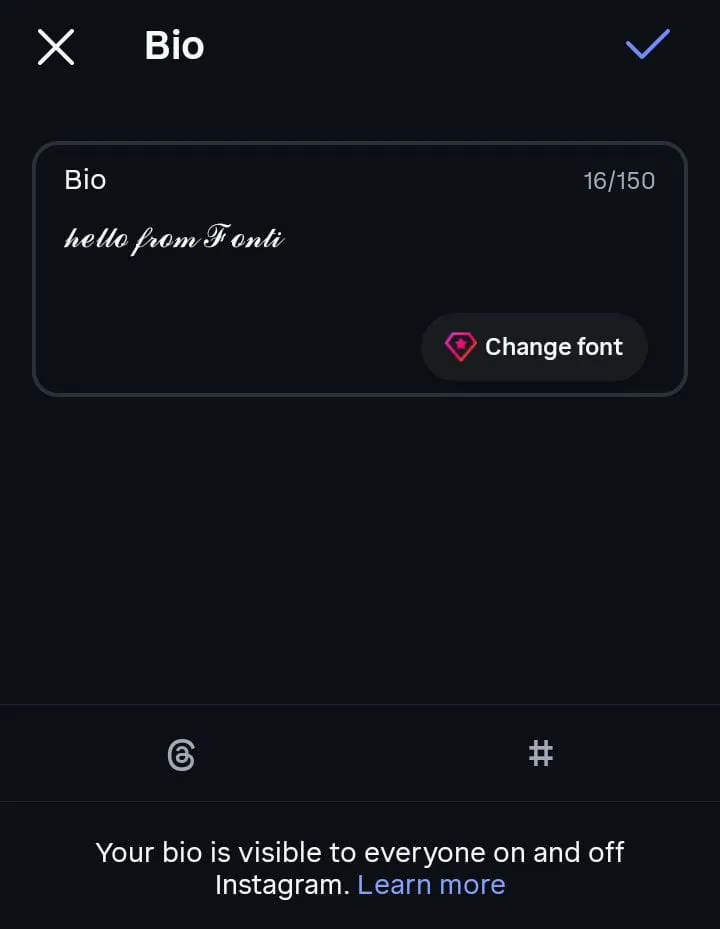
Script text pasted into the Instagram bio field. Sixteen characters of the 150 available, counted the same as plain letters.
| Where | Works | Notes |
|---|---|---|
| Instagram bio | Yes | The main use. 150 characters, and styled letters count as one each |
| Instagram handle | No | Letters, numbers, periods and underscores only |
| Instagram captions and comments | Yes | Occasionally needs a re-copy through a notes app first |
| TikTok bio | Yes | 160 characters, so decorations are expensive |
| TikTok username | No | Display name only |
| Discord display name | Yes | Discord split usernames and display names in 2023 |
| Discord username | No | Lowercase letters, numbers and a couple of symbols |
| X display name | Yes | Accepted, though X counts styled characters twice |
| Facebook name field | No | Rejected by the real-name check |
| Pinterest About section | Yes | Up to 500 characters, the most generous field here |
| WhatsApp status and about | Yes | Reliable across both phone systems |
| Roblox display name | Unpredictable | Runs through a filter. Test on a throwaway |
| Canva and notes apps | Yes | Pastes as text, so it stays editable |
Two limits deserve singling out. The Instagram bio limit is short enough that a decorated line burns through it faster than you expect, since every heart and every space counts against it. X is stranger: it counts many styled characters as two rather than one, so a short styled line can cost double the length of the same words in plain text.
Old Italic has the same problem everywhere, and it is worth knowing before you build a bio around it. Those characters sit above the basic plane, so a single letter is stored as two units. Strawberry Milk in Old Italic is fifteen characters to read and twenty-seven to a counter that measures units. That is nearly double, in a field that only gives you 150.
The other honest point is the one three of the four biggest cute font pages get wrong. They say these styles work on ninety-nine percent of platforms, or that there are no compatibility issues at all. That is not true, and the empty boxes people occasionally see in a pasted bio are the proof. Styles from the maths and enclosed blocks are close to universal. Styles built on borrowed scripts are not, and no amount of confident phrasing changes it.
Two audiences never see what you see.
The first is search. To a computer, 𝒮𝓉𝓇𝒶𝓌𝒷ℯ𝓇𝓇𝓎 and Strawberry are unrelated strings. They share no characters. So a styled bio is effectively invisible to the search box on the platform you posted it to, and a styled business name will not come back when a customer types the name plainly. The same applies to hashtags: a styled hashtag is a different hashtag, usually one nobody follows. If discoverability matters at all, keep one plain version of the name or the keyword somewhere in the bio and style the rest.
The second is anyone using a screen reader. What gets spoken depends entirely on which block the characters came from. Some styles are announced close to the intended word. Others are read out character by character with the full technical name attached, and borrowed scripts are announced as what they are. Decorations are read too, so a name wrapped in six stars is six spoken words before the name arrives.
Neither of these means avoid styled text. It means put the styled text where the look does the work, in a display name or a caption flourish, and keep plain text wherever someone needs to find you or hear you.
No, and the search term hides two completely different needs.
If you want to paste cute letters into a bio, a comment, a message or a caption, there is nothing to download. The styling is inside the characters. It travels with the text and needs nothing installed at either end. That is this page.
If you want to set a headline in a design tool, print a birthday card or use cute lettering in a document, you want an actual font file with an extension like ttf or otf, installed on your computer and chosen from a font menu. Font files give you far better typography and none of them can be pasted into an Instagram bio. Those are two different jobs, and confusing them is why people end up frustrated with both.
One more term worth naming: hacked or glitched text is the effect where letters appear to overflow their line. That is built by stacking combining marks rather than by swapping alphabets, so it is a different technique from anything on this page.
Five things separate a bio that looks intentional from one that looks cluttered.
Styling the entire caption. Styled characters are harder to read than plain ones, and a full paragraph of script asks too much. Style the first line or the name, leave the rest alone.
Mixing three styles in one line. Two at most, and ideally one alphabet plus one decoration. More than that reads as indecision.
All caps for a long name. The borrowed styles carry a single set of shapes rather than two, so they read as capitals whatever you type, which is why they look great on a four-letter name and poor on a full sentence.
Decoration overload. Symbols eat your character limit and get read aloud. Two per line is usually plenty.
Assuming it looks the same for everyone. It does not, and the compatibility table above is the short version of why. If a look is not working, try a neighbouring one instead, or darken the mood with gothic fonts if soft is not the register you wanted after all.
Every style in this tool is named for what it actually is. The borrowed scripts carry the name of the script they came from, so you can look up what you are pasting. No random categories, no invented style names, no inflating the count by wrapping one alphabet in six sets of decorations.
There is no account, no download and no paywall. There are no engagement statistics anywhere on this page either, because nobody can honestly promise what a styled bio will do for your reach. What is here instead is a straight answer about which styles are built on common blocks, which ones are built on rarer writing systems, and the places styled text does not work at all.
None of them are fonts. They are characters that already exist in Unicode, borrowed from maths notation, from list markers and from other writing systems, chosen because their shapes read as soft or rounded.
Yes. Characters are not owned by anyone, so there is no licence and no fee, whether you are styling a personal bio or a shop caption. Font files you install are a different matter and often do carry licences.
Yes in your bio, captions and comments. No in your handle, which accepts only letters, numbers, periods and underscores. If a paste fails in the app, copy it through a notes app first and paste again.
Because the device reading it does not have that character. The box means a missing character, not corrupted text. Styles from the maths and enclosed blocks almost never do this; borrowed scripts sometimes do.
Some do. Bold, double-struck, monospace, full-width and circled all have digits. Script, bold script, small caps and every borrowed-script style have none, so your digits stay plain in those.
Decoration and register. The same script characters read as pretty on their own and as cute once you add hearts or stars. Pretty leans elegant, cute leans playful, and neither is a property of the characters themselves.
Yes, kawaii is simply the Japanese word for cute. In practice it points at a rounded, pastel register drawn from Japanese pop culture. There is no separate kawaii character block anywhere in Unicode.
Sometimes. Roblox display names pass through a filter, and which characters survive it is not consistent enough to promise. Test on an account you do not mind risking before you spend a rename.
Mostly. Both systems carry the common blocks, so script, bubble and small caps are reliable. Older phones and stripped-down builds may be missing the rarer scripts.
Yes. They paste as ordinary text, so they stay editable and searchable within the app. For anything you are printing or setting as a headline, an installed font file gives a far better result.
Yes, and this is the real cost. A styled name shares no characters with the plain version, so platform search will not match it. Keep one plain instance of your name in the bio.
A cute style plus a specific palette of accessories: bows, stars, smiley faces, pink and green. The word once described American prep-school dress; the font search is a 2020s look that arrived through TikTok.