 Fonti
FontiYour Brand Name
Hello World
TikTok gives you up to 160 characters for your bio. Some accounts still show the older limit of 80, so check your own field before you plan around it. That is not much room, and styled letters do not all take up the same amount of space. Some styles let you use the full 160. Others eat half of it before you finish your first line.
Style: Bold Script
Your Brand Name
Hello World
Hello World
Hello World
No favourites yet. Tap the star on a card to save it.
Nothing copied yet.
Nothing matches that search.
Numbers stay plain.
characters
Pick an alphabet, a separator and a decoration, then copy the result.
Live preview
0 units
Marks added over your text, letters unchanged.
An alphabet wrapped in a decoration.
Decoration wrapped around your text, letters unchanged.
Decoration wrapped around your text, letters unchanged.
Decoration wrapped around your text, letters unchanged.
Decoration wrapped around your text, letters unchanged.
Decoration wrapped around your text, letters unchanged.
Decoration wrapped around your text, letters unchanged.
𝓑𝓸𝓵𝓭 𝓢𝓬𝓻𝓲𝓹𝓽
Numbers stay plain.
𝒞𝓁𝒶𝓈𝓈𝒾𝒸 𝒮𝒸𝓇𝒾𝓅𝓉
Numbers stay plain.
𝑩𝒐𝒍𝒅 𝑰𝒕𝒂𝒍𝒊𝒄
Numbers stay plain.
𝐼𝑡𝑎𝑙𝑖𝑐 𝑆𝑐𝑟𝑖𝑝𝑡
Numbers stay plain.
𝘏𝘢𝘯𝘥𝘸𝘳𝘪𝘵𝘪𝘯𝘨
Numbers stay plain.
𝙎𝙡𝙖𝙣𝙩𝙚𝙙
Numbers stay plain.
𝐁𝐨𝐥𝐝
𝗕𝗼𝗹𝗱 𝗦𝗮𝗻𝘀
Ⓒⓘⓡⓒⓛⓔⓓ
Unicode records the circled capital M at U+24C2 as an emoji character.
⒫⒜⒭⒠⒩⒯⒣⒠⒮⒤⒵⒠⒟
Numbers stay plain.
Capitals fold to lowercase
🄟🄐🄡🄔🄝🄣🄗🄔🄢🄘🄩🄔🄓 🄒🄐🄟🄢
Numbers stay plain.
Lowercase folds to capitals
🅕🅘🅛🅛🅔🅓 🅒🅘🅡🅒🅛🅔🅓
Lowercase folds to capitals
𝔉𝔯𝔞𝔨𝔱𝔲𝔯
Numbers stay plain.
𝕭𝖔𝖑𝖉 𝕱𝖗𝖆𝖐𝖙𝖚𝖗
Numbers stay plain.
𝙼𝚘𝚗𝚘𝚜𝚙𝚊𝚌𝚎
𝔻𝕠𝕦𝕓𝕝𝕖-𝕤𝕥𝕣𝕦𝕔𝕜
𝖲𝖺𝗇𝗌-𝗌𝖾𝗋𝗂𝖿
Fullwidth
Vaporwave Greek
Vaporwave Triangle
S p a c e d O u t
Numbers stay plain.
Letters stay plain. The style is a space between each character.
ꜱᴍᴀʟʟ ᴄᴀᴘꜱ
Numbers stay plain.
Unicode has no small-capital X, so x stays plain. This site ships no small-capital Q, so q stays plain. Capitals and lowercase both appear as small capitals.
ˢᵘᵖᵉʳˢᶜʳⁱᵖᵗ
Unicode has no superscript q, so q stays plain. Raised letters are lowercase forms, so capitals are not preserved.
ₛᵤbₛcᵣᵢₚₜ
Nine letters have no subscript form in Unicode, so b, c, d, f, g, q, w, y and z stay plain. Lowered letters are lowercase forms, so capitals are not preserved.
🅂🅀🅄🄰🅁🄴🄳
Numbers stay plain.
Unicode's squared letters are capitals only, so lowercase letters appear as squared capitals.
🅵🅸🅻🅻🅴🅳 🆂🆀🆄🅰🆁🅴🅳
Numbers stay plain.
Lowercase folds to capitals
Unicode lists U+1F170, U+1F171, U+1F17E and U+1F17F as emoji characters.
Ⅎʃıddǝp
Some capitals and digits 2, 3, 4 and 7 use borrowed characters, so their appearance can vary by device. Digits 1 and 5 stay plain. This card does not reverse the line.
uʍo◖ ǝpısd∩
Some capitals and digits 2, 3, 4 and 7 use borrowed characters, so their appearance can vary by device. Digits 1 and 5 stay plain. The text is reversed so it reads when the page is turned upside down.
Cⲟⲡⲧⲓc
Numbers stay plain.
Letters c, j, q, u and v have no Coptic shape and stay plain.
ᔕyᒪᒪᗩᗷiᑕᔕ
Numbers stay plain.
A single set of shapes. Capitals and lowercase look the same. Letters i, k, q, t, y and z stay plain.
ᏟᎻᎬᏒᎣᏦᎬᎬ
Numbers stay plain.
A single set of shapes. Capitals and lowercase look the same. Letters f, i, n, q and x stay plain.
ꌩꀤ
Numbers stay plain.
A single set of shapes. Only twelve letters have a Yi form, the rest stay plain.
The Yi block is not in every system font.
Zhuㄚノn ⽖ノx
Numbers stay plain.
A single set of shapes. Only twelve letters have a form here, the rest stay plain.
These shapes come from four blocks: CJK Unified Ideographs, Bopomofo, Kangxi Radicals and Halfwidth Katakana. Line height varies.
𐌏𐌋𐌃 𐌉𐌕𐌀𐌋𐌉𐌂
Numbers stay plain.
A single set of shapes. Letters f, g, j, p, q, v, w and y stay plain.
Old Italic sits above the basic plane, so bio counters on Instagram and X count every letter twice.
Every field on TikTok behaves differently too. Your nickname accepts styled text, your @username refuses it outright, and your caption counts it under a different rule again. Pick the wrong field and the letters disappear the second you press save. This page shows which style belongs in which field, and what each one costs you.
The tool above does the conversion for you. You type once, then copy whichever style you want. TikTok has no font button of its own, so pasting styled characters is the only way to get this look into your profile.
Type your text into the box above. Your nickname, a bio line, or a caption.
Pick a style from the list. Each one shows a live sample so you can see it before you commit.
Tap copy beside the style you chose. The whole line goes to your clipboard.
Paste it into TikTok. Open your profile, tap Edit profile, and drop it into the nickname or bio field.
The paste step is where most people go wrong. TikTok has five text fields and only four of them accept styled letters. The next section lists all five.
TikTok publishes rules for two of its fields and stays quiet about the rest. The table below marks which is which, because a rule from TikTok is worth more than a rule from a blog. Anything sourced elsewhere should be treated as close rather than exact.
| Field | Limit | Styled letters | Where the rule comes from |
|---|---|---|---|
| Username | 2 to 24 | No | TikTok |
| Nickname | 30 | Yes | TikTok |
| Bio | 160 | Yes | Third party |
| Caption | 4,000 | Yes | Third party |
| Comment | 150 | Yes | Third party |
Your @username is the strict one. TikTok allows letters, numbers, underscores and periods, and nothing else. A period cannot sit at the end of it. You get one change every thirty days, that change rewrites your profile link, and a verified account can lose its badge in the process.
Fair warning: a lot of font sites tell you that styled letters work in the @username. They do not. Paste one in and TikTok either strips it back to plain or refuses the change outright. The allowed characters are listed on TikTok’s own support page and that list has not moved.
The nickname is the field you actually want. TikTok calls it your nickname rather than your display name, which is why searching for display name rules turns up so little. It holds thirty characters, accepts Unicode, and appears in the feed, in comments and in messages. TikTok’s page lists no waiting period between nickname changes.
That reach is what makes the nickname worth styling. It sits beside every comment you leave, at the top of every message thread, and under your video in the feed, so one change is doing work in several places at once. Your bio only appears when somebody opens your profile. If you are going to style one field and leave the rest plain, the nickname gives you more for the same effort.
Your bio holds up to 160 characters, and this is where the counting starts to matter. Some accounts still show the older limit of 80, so check your own field before you plan around it.
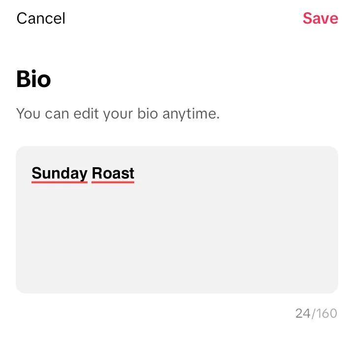
Twelve plain characters in Bold Sans counted as 24 in the bio field.
Captions and comments both take styled text without complaint. The caption limit is 4,000 characters. Comments stop at around one hundred and fifty. The comment figure does not come from TikTok directly, so leave yourself a margin.
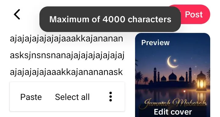
The caption composer states its own limit: 4,000 characters.
Comments deserve a second thought. A ceiling of roughly one hundred and fifty characters is far tighter than your bio, so the cost difference between the style groups bites harder there than anywhere else. A styled reply in one of the expensive alphabets can run out of room halfway through a sentence. If you comment in a styled font regularly, the cheap group is the practical choice.
Twelve styles are worth your time on TikTok. They split into three groups by how much space they take up. The cheap group is the one most guides skip past, and it is the group that matters most inside a 160-character bio.
Four styles cost you nothing extra. Small Caps, Superscript, Fullwidth and Circled letters all sit in the older part of Unicode, which means each one takes a single slot. You can fill all 160 characters of your bio with any of them and still have the same room you started with.
Small Caps letters give you ᴄʜɪʟʟ ʜᴏᴜʀꜱ, which reads cleanly at small sizes and looks deliberate rather than decorated. Superscript shrinks the whole line to ᶜʰⁱˡˡ ʰᵒᵘʳˢ, which suits a short tagline better than a full sentence. Our small text generator keeps every one of those tiny alphabets in one place.
Fullwidth spreads your letters out as Chill Hours, with a wide gap built into every character. It costs the same as plain text but looks twice as long, which is a useful trade in a short bio. Our aesthetic font generator lines up the wide and boxy sets side by side.
Circled letters turn the line into Ⓒⓗⓘⓛⓛ Ⓗⓞⓤⓡⓢ, the softest of the four. Our cute font generator leans into the round, soft look. On one account, a circled bio was saved, the app was closed and reopened, and the letters were still there. That check covers the bio field on that account only.
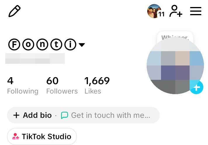
Saved, closed, reopened. The circled display name was still there.
Classic Script and blackletter sit in the middle of the range. Both measure roughly twenty-two units for a fourteen-character phrase, which leaves you about one hundred characters of usable bio. That is enough for a short styled line with a few plain words after it.
Classic Script gives you 𝒞𝒽𝒾𝓁𝓁 ℋℴ𝓊𝓇𝓈, with the loops of handwriting. Bold Script pushes the same shapes harder as 𝓒𝓱𝓲𝓵𝓵 𝓗𝓸𝓾𝓻𝓼 and costs slightly more per letter. Our cursive font generator traces where those looping letters come from.
Fraktur reads as ℭ𝔥𝔦𝔩𝔩 ℌ𝔬𝔲𝔯𝔰, heavy and old. It reads slowly, so it does better across a short nickname than a full bio. Both of these styles share a habit that catches people out, and the examples table below shows it plainly.
Bold, italic, monospace and double-struck are the heaviest four. A fourteen-character phrase measures twenty-four to twenty-six units in these styles, which cuts your usable bio down to somewhere near eighty-six characters. They still work well in a thirty-character nickname, where the limit is generous relative to the amount of text.
Bold Sans prints 𝗖𝗵𝗶𝗹𝗹 𝗛𝗼𝘂𝗿𝘀 and stays the most readable of the styled options. Bold, 𝐂𝐡𝐢𝐥𝐥 𝐇𝐨𝐮𝐫𝐬, carries more weight in the strokes. Handwriting leans the line over as 𝘊𝘩𝘪𝘭𝘭 𝘏𝘰𝘶𝘳𝘴. Our bold text generator weighs up bold against italic properly.
Monospace lines every letter up on an even grid as 𝙲𝚑𝚒𝚕𝚕 𝙷𝚘𝚞𝚛𝚜. Double-struck hollows the strokes out into ℂ𝕙𝕚𝕝𝕝 ℍ𝕠𝕦𝕣𝕤, which reads as technical rather than pretty. Both sit near the top of the cost range, so keep them for your nickname rather than your bio.
Here is the same phrase in every style, with what each one costs. The cost column counts the units most platforms use to measure their limits, which is not the same as the number of letters you can see. The last column is the one people miss.
| Style | Sample | Cost | Room in a 160 bio | Digits |
|---|---|---|---|---|
| Small Caps | ᴄʜɪʟʟ ʜᴏᴜʀꜱ 24 | 14 | 160 | Stay plain |
| Superscript | ᶜʰⁱˡˡ ʰᵒᵘʳˢ ²⁴ | 14 | 160 | Styled |
| Fullwidth | Chill Hours 24 | 14 | 160 | Styled |
| Circled | Ⓒⓗⓘⓛⓛ Ⓗⓞⓤⓡⓢ ②④ | 14 | 160 | Styled |
| Classic Script | 𝒞𝒽𝒾𝓁𝓁 ℋℴ𝓊𝓇𝓈 24 | 22 | About 100 | Stay plain |
| Fraktur | ℭ𝔥𝔦𝔩𝔩 ℌ𝔬𝔲𝔯𝔰 24 | 22 | About 100 | Stay plain |
| Bold Script | 𝓒𝓱𝓲𝓵𝓵 𝓗𝓸𝓾𝓻𝓼 24 | 24 | About 93 | Stay plain |
| Handwriting | 𝘊𝘩𝘪𝘭𝘭 𝘏𝘰𝘶𝘳𝘴 24 | 24 | About 93 | Stay plain |
| Double-struck | ℂ𝕙𝕚𝕝𝕝 ℍ𝕠𝕦𝕣𝕤 𝟚𝟜 | 24 | About 93 | Styled |
| Bold Sans | 𝗖𝗵𝗶𝗹𝗹 𝗛𝗼𝘂𝗿𝘀 𝟮𝟰 | 26 | About 86 | Styled |
| Bold | 𝐂𝐡𝐢𝐥𝐥 𝐇𝐨𝐮𝐫𝐬 𝟐𝟒 | 26 | About 86 | Styled |
| Monospace | 𝙲𝚑𝚒𝚕𝚕 𝙷𝚘𝚞𝚛𝚜 𝟸𝟺 | 26 | About 86 | Styled |
Look down the digits column. Five of the twelve styles leave numbers exactly as they found them, because those alphabets never had digits designed for them in the first place. Classic Script, Bold Script, Fraktur, Handwriting and Small Caps all print a plain 24 beside their styled letters. If there is a number in your name, that mismatch is going to show.
Our number font generator fills the digit gap these styles leave. Pairing a styled letter set with matching digits from there is the usual fix. The other option is picking one of the seven styles that handles numbers on its own.
This is the part that should change how you pick a style. Every character on your screen is stored as one or more units behind the scenes, and most platforms count the units rather than the characters. A letter that looks like a single letter can be charged as two.
Unicode is split into sections. The oldest and busiest section holds ordinary letters, small caps, superscript, fullwidth characters and circled letters, and everything in there costs a single unit. The styled alphabets added later, the ones that give you bold, script, blackletter and monospace, live much further out. Anything from that outer area is stored as two units instead of one.
That is why the same fourteen-character phrase measured fourteen in Small Caps and twenty-six in Bold Sans. Nothing changed on screen. The storage behind it doubled.
Here is what that looks like on a real bio. A line reading chill hours, new video every friday is thirty-five characters as plain text. In Small Caps it still measures thirty-five, leaving you one hundred and twenty-five characters spare. In Bold Sans the same words measure around sixty-five, leaving you ninety-five. Same words, same screen, very different amount of room left over.
Mixing styles is the usual way out of that squeeze. Put the expensive style on the first two or three words where it does the most work, then let the rest of the line run as plain text. A bio opening with three Bold Sans words and finishing plain costs you about six extra characters rather than thirty. The eye reads the styled part as a heading and the plain part as the detail, which is easier to follow anyway.
Now for the part that surprised us. Classic Script and blackletter came in at twenty-two rather than twenty-six, which makes them cheaper than bold. That gap is not a rounding error, and the reason behind it is genuinely odd.
A handful of letters in those alphabets were never given a new home. Characters like ℭ, ℌ, ℋ and ℴ already existed in an older maths section from decades earlier, so Unicode reused them instead of drawing duplicates. Those reused letters sit in the cheap part of the range, which means every time your text lands on one, you pay half price for it. Our gothic font generator explains why five of its capitals look borrowed.
The practical version of all this is short. If your text is long and your field is tight, pick from the cheap group. If your text is short, like a thirty-character nickname, the expensive styles will fit comfortably and you can choose on looks alone.
Reality check: on one account, a 12-character Bold Sans line of Sunday Roast moved the bio counter to 24, and a 5-character Circled line of Fonti stayed at 5. The styled characters used by the two-cost styles count as two, and Circled characters count as one, as measured on that account.
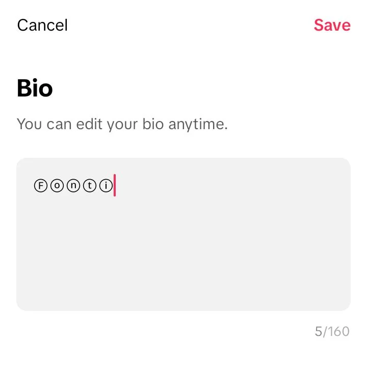
The same field counted a circled word as one character each. Five for Fonti.
TikTok filters certain characters on the way to saving your profile. The letters look fine in the edit box, you press save, and they come back plain or missing altogether. Knowing the list in advance saves a lot of retyping.
Combining marks are the clearest case. These are the accent-style marks that stack on top of letters, and TikTok removes them from bios during the save. Our glitch text generator pushes the same idea until it breaks, and that is exactly the kind of text TikTok will not keep. Use it where it is allowed and leave your TikTok bio out of it.
Zero-width characters are half blocked. The two most common invisible characters, U+200B and U+200C, get filtered out, while the Hangul filler at U+3164 and the blank braille character at U+2800 still pass through. People use those to make a nickname look empty, and TikTok has been closing the gap steadily.
Flipped text is a different case. It survives the save because it uses ordinary standalone letters rather than stacked marks. Our upside down text generator reads back to front on purpose, which is entertaining in a caption and awkward in a bio that people need to actually read.
Two more behaviours are worth listing here. If TikTok refuses a nickname outright you will see the message this nickname is not allowed, which usually points at a single character rather than your choice of words. And if your styled name vanishes after an app update, TikTok has reset it to your account default rather than deleting anything.
Heads-up: changing your display name more than about ten times in one day starts getting blocked. There is no warning before it happens. Test your styles in a notes app first, then make one change once you have settled on something.
Search for the TikTok font method and you will find videos promising a hidden trick. There is no trick involved. The method is copying styled Unicode characters from a generator and pasting them into your nickname field, which is what this page has been describing from the start.
The same goes for bypass font. That name suggests you are getting around some restriction, but nothing is being bypassed. TikTok allows Unicode in the nickname, the bio, captions and comments, and blocks it in the @username only. Pasting into a field that already permits it is ordinary use rather than a workaround.
Where the confusion starts is the gap between the two name fields. Your @username is the plain handle that forms your profile link. Your nickname is the larger name displayed above it, and that one accepts almost anything. People who try the method in the wrong field decide it does not work, when what they really did was pick the field that was never going to take it.
Ask what font TikTok uses and most answers will tell you Proxima Nova Semibold. That answer was correct for years. It stopped being correct in 2023 and the correction has not spread far.
TikTok now uses a typeface of its own, called TikTok Sans. The original was drawn in 2023 by Grilli Type, a Swiss foundry, as a brand face for the company. A brand face and a working app typeface are not the same job, though, so a second round of work followed and ran for roughly nine months.
That stage was handled by Type Network alongside Contrast Foundry, with an engineer brought in for the technical side. What came out is a variable font carrying seven weights and three adjustable axes for weight, slant and width. It reaches past four hundred and sixty languages across Latin, Greek and Cyrillic. For a company shipping one app to most of the world, that coverage is the entire point of the exercise.
The confirmation comes from TikTok itself. Their developer blog states that TikTok Sans is available in the app as Classic, Bold and Oblique among other options. So the font labelled Classic in your video editor is TikTok Sans, and has been for a while.
In 2025 TikTok released the whole family under an open licence and put it on Google Fonts. You can download it free, use it commercially, and install it on your own machine. Good to know: none of that helps you style your bio. A downloaded font lives on your computer, while your bio needs characters that travel along with the text, which is what the generator above produces.
The fonts inside the video editor work the same way. Classic, Typewriter, Handwriting, NEON and Serif are drawn by the app directly onto your video. They cannot be copied out, because there is nothing there to copy. What you are looking at is a picture of letters rather than letters themselves.
This question comes up constantly and it has almost nothing to do with everything above. Yellow font and pink font are caption colours in the TikTok video editor, not Unicode styles. You pick them from the colour swatch when you add text to a video.
Several font sites will tell you these colours are purely visual and carry no meaning at all. That is wrong. The colours turned into a signal, and viewers read them as one. The habit even has a name, font theory, and creators tag their own captions with it.
| Colour | What people read into it |
|---|---|
| Yellow | Something raw and personal. Oversharing, on purpose |
| Pink | Something romantic or soft. Crushes, relationships, longing |
Captions tagged yellow font btw are the clearest sign of the pattern. The writer is flagging that the words underneath are more honest than the video looks. Mainstream press has covered the trend at length, so it is well past being an inside joke among a few accounts.
Quick note: a second reading exists for bright yellow specifically, tied to business and self-improvement videos rather than emotion. Both readings are in circulation right now. Which one your audience reaches for depends largely on what they already watch.
Styled Unicode letters are not letters as far as software is concerned. They are separate characters that happen to look like letters, and screen reading software treats them accordingly. The result is not what most people expect.
The word hello written as 𝐡𝐞𝐥𝐥𝐨 does not get read as hello. A screen reader announces it one character at a time, using each character’s full technical name, in a row. That behaviour is the default on VoiceOver, NVDA, TalkBack and ChromeOS. A request to change it has been sitting open on one of those projects since 2020 without a fix.
Search is a related problem. A styled nickname is a run of unusual characters rather than a word, so anything reading your profile as text may fail to match it. We have not checked whether TikTok search finds a styled nickname. A display name can only be changed once in seven days on the account used for these tests, so that check has not been run.
Old devices cause a separate problem. When a phone holds no drawn shape for a character, it prints an empty rectangle instead, and that rectangle has a name among type people: tofu. It is not a broken character or a failed paste, because the letter arrived exactly as you sent it. The device just has nothing to show for it, which is why the same bio can look perfect on a new handset and half empty on a five-year-old one.
None of this means avoid styled text. It means put it where the cost is lowest. Style your nickname if you like how it looks, and keep your bio readable, since that is the part carrying your actual information.
Most TikTok font pages compete on how many styles they can list. Counting past two hundred is easy if you treat every minor variation and every emoji sandwich as a separate font. We list twelve, each one named, each one measured, each one carrying a note on where it works and where it does not.
The cost figures on this page were generated by script rather than estimated. The samples were produced the same way rather than retyped, so what you see here is what the tool gives you. Where we could not confirm something, it is marked as unconfirmed instead of being smoothed over.
Our homepage holds the whole set together, with every style page linked from one place. Nothing here needs an account, a download or a payment. Type, copy, paste, and you are finished.
Paste, rather than change. TikTok has no font setting for your profile, so you copy styled characters from a generator and paste them into your nickname, bio, caption or comment. The letters carry their styling along with them.
Filtering. TikTok strips certain characters, especially stacked combining marks, during the save. Try a style from the cheap group instead, then close and reopen the app to check the result held.
No. Your @username takes letters, numbers, underscores and periods only, and a period cannot end it. Use the nickname field instead, which sits directly above your username and does accept styled text.
TikTok Sans. It replaced Proxima Nova, appears in the app as Classic, and TikTok released it free on Google Fonts in 2025. Installing it will not style your bio, because bios need characters rather than fonts.
Up to 160. Some accounts still show the older limit of 80, so check your own field before you plan around it. Styled letters may cost more than one slot each, so the number of letters you actually fit can be lower.
Vulnerability. Yellow caption text signals that the words are personal or raw, and pink signals something romantic. This is caption colour inside the video editor, not a Unicode style you can paste.
Possibly. There is no evidence that TikTok penalises styled text, but styled characters are harder for search to match and harder for screen readers to announce. Styling your nickname and keeping your bio plain is the safer split.
Missing glyphs. The box, known as tofu, shows up on any device that lacks a drawn shape for the character. Older phones show it most often, and it means the character arrived correctly but cannot be displayed.
Freely, within reason. TikTok's own page lists no waiting period for the nickname, unlike the @username, which is limited to one change every thirty days. Around ten changes in a single day will start getting blocked.
Yes. Comments accept styled Unicode the same way captions do, with a limit near one hundred and fifty characters. The same counting question applies, so a styled comment runs out of room sooner than a plain one.