 Fonti
FontiYour Brand Name
Hello World
Your letters don't get replaced here. Glitch text works by stacking combining marks onto the letters you already typed, which is why the effect can be turned up, turned down, and taken back off again.
Style: Bold Script
Your Brand Name
Hello World
Hello World
Hello World
No favourites yet. Tap the star on a card to save it.
Nothing copied yet.
Nothing matches that search.
Numbers stay plain.
characters
Pick an alphabet, a separator and a decoration, then copy the result.
Live preview
0 units
Marks added over your text, letters unchanged.
An alphabet wrapped in a decoration.
Decoration wrapped around your text, letters unchanged.
Decoration wrapped around your text, letters unchanged.
Decoration wrapped around your text, letters unchanged.
Decoration wrapped around your text, letters unchanged.
Decoration wrapped around your text, letters unchanged.
Decoration wrapped around your text, letters unchanged.
Combining marks stacked on each letter. The last card removes them.
Ĺî̬g̃ḫ̅t̆ g̈l͓̉i̊ṭ̋čh̥̍
28 characters
Ḿ̷̥̮̅ê̸̶̬̰̆ḓ̴̷̲̃̇̊i̵̸̮̳̣̅̈̋ṵ̶͓̆̉ṁ̷̵̲͙̊ g̴̷͓̤̭̉̌̑l̵͙̥̊̍ị̶̴̬̋̏ť̷̵̤̭̑͛c̸̶̥̮̳̍̽̀h̴̬̰̏̿,̵̸̭̲̑͛ t̷̵̰͓̤̿́̅h̸̲͙͛̂è̴̷̳̣̃ ĉ̶̴͙̥̮̆̉ḷ̷̬̃̇a̸̶̤̭̅̈s̴̷̥̮̆̉̌ṡ̵̸̬̰͓̊̍ï̶̭̲̋c̷̵̮̳̉̌ z̴̷̲͙̥̋̏̿ǎ̵̳̣̑l̶̴͓̤̍̽g̷̵͙̥̏̿́ọ̸̶̬̰̑͛̂ l̵̸̥̮̿́o̶̴̬̰͛̂̆ò̷̵̭̲͙̃̇ḱ̸̮̳̅
243 characters
H̷̵̸̶̥̮̳̣́̅̈̋ê̸̶̴̷̬̰͓̤̆̉̌̑ã̴̷̵̸̭̲͙̥̮̇̊̍̽v̵̸̶̴̷̮̳̣̬̰̅̈̋̏̿y̶̴̷̵̸̰͓̤̭̲̆̉̌̑͛̂ g̸̶̴̷̳̣̬̰̈̋̏̿́l̴̷̵̸͓̤̭̲͙̉̌̑͛̂i̵̸̶̴̷͙̥̮̳̣̊̍̽̀̃ṭ̶̴̷̵̸̬̰͓̤̋̏̿́̅̈č̷̵̸̶̤̭̲͙̑͛̂h̸̶̴̷̥̮̳̣̍̽̀̃̇
165 characters
Ḿ̷̵̸̶̴̷̵̸̥̮̳̣̬̰͓̤̅̈̋̏̿́̅â̸̶̴̷̵̸̶̴̬̰͓̤̭̲͙̥̆̉̌̑͛̂̆̉x̴̷̵̸̶̴̷̵̭̲͙̥̮̳̣̬̰̃̇̊̍̽̀̃̇̊i̵̸̶̴̷̵̸̶̴̮̳̣̬̰͓̤̭̲̅̈̋̏̿́̅̈̋m̶̴̷̵̸̶̴̷̵̰͓̤̭̲͙̥̮̳̆̉̌̑͛̂̆̉̌̑u̷̵̸̶̴̷̵̸̶̲͙̥̮̳̣̬̰͓̤̇̊̍̽̀̃̇̊̍̽m̸̶̴̷̵̸̶̴̷̵̳̣̬̰͓̤̭̲͙̥̈̋̏̿́̅̈̋̏̿,̴̷̵̸̶̴̷̵͓̤̭̲͙̥̮̳̉̌̑͛̂̆̉̌ c̶̴̷̵̸̶̴̷̣̬̰͓̤̭̲͙̥̋̏̿́̅̈̋̏̿ṳ̷̵̸̶̴̷̵̸̶̭̲͙̥̮̳̣̬̌̑͛̂̆̉̌̑͛r̸̶̴̷̵̸̶̴̷̥̮̳̣̬̰͓̤̭̍̽̀̃̇̊̍̽̀̃s̴̷̵̸̶̴̷̵̸̬̰͓̤̭̲͙̥̮̳̏̿́̅̈̋̏̿́̅ḙ̵̸̶̴̷̵̸̶̴̷̲͙̥̮̳̣̬̰͓̑͛̂̆̉̌̑͛̂̆d̶̴̷̵̸̶̴̷̮̳̣̬̰͓̤̭̽̀̃̇̊̍̽̀ t̸̶̴̷̵̸̶̴̲͙̥̮̳̣̬̰͓͛̂̆̉̌̑͛̂̆è̴̷̵̸̶̴̷̵̸̳̣̬̰͓̤̭̲͙̃̇̊̍̽̀̃̇x̵̸̶̴̷̵̸̶̴͓̤̭̲͙̥̮̳̣́̅̈̋̏̿́̅̈̋t̶̴̷̵̸̶̴̷̵͙̥̮̳̣̬̰͓̤̭̂̆̉̌̑͛̂̆̉̌ t̸̶̴̷̵̸̶̴̤̭̲͙̥̮̳̣̅̈̋̏̿́̅̈ĕ̴̷̵̸̶̴̷̵̥̮̳̣̬̰͓̤̉̌̑͛̂̆̉̌ṙ̵̸̶̴̷̵̸̶̬̰͓̤̭̲͙̥̮̊̍̽̀̃̇̊̍r̶̴̷̵̸̶̴̷̵̭̲͙̥̮̳̣̬̰̈̋̏̿́̅̈̋̏ỉ̷̵̸̶̴̷̵̸̶̮̳̣̬̰͓̤̭̲̌̑͛̂̆̉̌̑͛t̸̶̴̷̵̸̶̴̷̰͓̤̭̲͙̥̮̳̣̊̍̽̀̃̇̊̍̽̀ő̴̷̵̸̶̴̷̵̸̶̲͙̥̮̳̣̬̰͓̤̏̿́̅̈̋̏̿́ř̵̸̶̴̷̵̸̶̳̣̬̰͓̤̭̲̑͛̂̆̉̌̑y̶̴̷̵̸̶̴̷͓̤̭̲͙̥̮̳̍̽̀̃̇̊̍̽̀
755 characters
Ć̂̃r̂̃̅̆ẽ̅̆̇̈e̅̆̇p̆̇̈̉ẏ̈̉̊̋ t̉̊̋̌e̊̋̌̍̏x̋̌̍ť̍̏̑
51 characters
C̶̸̵̷̤̬̮̲o̷̴̶̸̥̭̰̳͙r̸̵̷̴̶̬̮̲͓̣r̴̶̸̵̷̭̰̳͙̤̬u̵̷̴̶̸̵̮̲͓̣̥̭p̶̸̵̷̰̳͙̤t̷̴̶̸̲͓̣̥̭e̸̵̷̴̶̳͙̤̬̮d̴̶̸̵̷͓̣̥̭̰̳ ṭ̶̸̵̷̥̭̰e̷̴̶̸̤̬̮̲͓x̸̵̷̴̶̥̭̰̳͙t̴̶̸̵̷̬̮̲͓̣̥
140 characters
Ŕ̂̃̅̆̇̈̉î̃̅̆̇̈̉̊̋s̃̅̆̇̈̉̊̋̌̍i̅̆̇̈̉̊̋̌̍̏̑n̆̇̈̉̊̋̌̍̏̑̽̿ġ̈̉̊̋̌̍̏,̈̉̊̋̌̍̏̑̽ å̋̌̍̏̑̽̿͛̀́b̋̌̍̏̑̽̿͛̀́̂̃ǒ̍̏̑̽̿͛̀v̍̏̑̽̿͛̀́̂ȅ̑̽̿͛̀́̂̃̅ o̽̿͛̀́̂̃̅̆̇̈̉n̿͛̀́̂̃̅̆l͛̀́̂̃̅̆̇̈ỳ́̂̃̅̆̇̈̉̊
174 characters
D̤̥̬̭̮̰̲̳r̥̬̭̮̰̲̳͓͙i̬̭̮̰̲̳͓͙̣̤p̭̮̰̲̳͓͙̣̤̥̬p̮̰̲̳͓͙̣̤̥̬̭̮ḭ̲̳͓͙̣̤̥n̲̳͓͙̣̤̥̬̭g̳͓͙̣̤̥̬̭̮̰,͓͙̣̤̥̬̭̮̰̲̳ ḅ̤̥̬̭̮̰̲e̤̥̬̭̮̰̲̳͓l̥̬̭̮̰̲̳͓͙̣o̬̭̮̰̲̳͓͙̣̤̥w̭̮̰̲̳͓͙̣̤̥̬̭ o̰̲̳͓͙̣̤̥̬n̲̳͓͙̣̤̥̬̭̮l̳͓͙̣̤̥̬̭̮̰̲y͓͙̣̤̥̬̭̮̰̲̳͓
200 characters
S̵̶t̶̷̸r̷̸̴̵u̸̴c̴̵̶k̵̶̷̸ ̶̷t̷̸̴h̸̴̵̶r̴̵o̵̶̷u̶̷̸̴g̷̸h̸̴̵,̴̵̶̷ ̵̶m̶̷̸i̷̸̴̵d̸̴d̴̵̶l̵̶̷̸e̶̷ ̷̸̴o̸̴̵̶n̴̵l̵̶̷y̶̷̸̴
108 characters
Ṃ̷̶̶̴̵̴̬̤̤̥̿̏̇̉̌̑̏̀̌̽̍i̵̵̶̵̷̴̶̵̷̶̮͓̮͙͙̭̭̭̮͙̰̤͙̍̌̀̊̋̍x̸̴̸̵̶̷̶̵̶̷̥̤̰̮͙̤́̑̏̑̽̆̇̈̏̏̏̍ẹd̶̷̷̷̷̮̰̳̣̈̽̀̂̋̇́,̸̶̷̸̶̥͙̭̭̲̮̏̈̈ r̵̶̷̶̴̸̴̵̲͙̽̇̃̏̌̑̃̏̽́a̷̶̶̷̵̶̷̬͙̤̰̮̲̰̳̬̲̥͛̊̌̈͛̌ǹ̸̸̸̵̷̵̵̴̶̷̥͙̬̲̤̭̭̲̥̭̂̇̑̇̋̆d̵̶̵̸̵͓̲̲͙̤̳̤̤̃̿̇̍̃̑̈́̀̃̽̀̉̃o̸̸̷̵̴̸̶̵̶̵̬̳̬̲̬̮͓̭̰̰̮̍̏̌̀̆̍́̃́m̵̤̳̲̤̂̏̆i̷̶̷̶̵͓̮͙̳̍̽̈̆̊̆ṡ̶̴̷̴̴̸̴̴̶̸̶̰̣̳̣̣̬͓̬̅̇̀̋̑̆̅e̶̸̶̮d̶̵̸̸̰̰̬͙̭̭̲̽̽̆̈͛̿̌ e̵̸̶̶̷̵̸̸̵̸̳̣̰̮̲̮̮̰̊̅̑̿̽̊̈̆ḁ̴̸̋č̴̴̶̵̵̶̵̵̳̰̣̲̳̉̋̉̆ḥ̶̷̸̸̶̣̤͙̬̥̥̣͙̰̥͛̀̂̽̊̌̋ ṭ̶̷̶̲̬̭̳̮̤́̿̈ȉ͙͙̥m̵̵̴̷̸̳̣̣̤͙̤̀̇̿̆̍̅̍ȅ̵̵̶̴̷̶̵̶͙̳̭̥̳̥̳̣̽̂̋͛̑̊̇̇̆̇̊
471 characters
Remove marks
12 characters
That makes it behave differently from every other generator on this site. Heavier settings can slow an app down, some platforms delete it the moment you post, and a few cut the effect off at a fixed number of marks. This page has ten settings, and it says where each one survives.
The tool updates as you type, so you can slide between settings and watch the same word get progressively more damaged. Most people find their level in about ten seconds. The step worth slowing down for is the last one, because glitch text is the style most likely to look perfect in the box you typed it into and arrive somewhere else completely different.
Type the real phrase, not a test word. Length matters more here than with any other style, because every letter you add multiplies into several characters once the marks are attached. A short username behaves nothing like a full sentence. You want to see the real thing before you commit to it.
Ten settings run from barely broken to unreadable. The lighter end keeps your word legible and just makes it look damaged, which is what most people actually want. The heavy end stops being text and starts being a texture. Slide through them with your own words on screen before you decide.
One tap copies the whole line. Use the button, because a long press on a phone tends to grab a stray mark or drop the last one, and either changes how the word renders. Selecting glitch text by hand is genuinely awkward, since the marks make it unclear where one letter ends and the next begins.
Paste it into the real field and look at it before anyone else does. Composer previews lie, a desktop browser proves nothing about a phone, and this style has more ways to fail than anything else on this site. Test this first: paste into the actual app rather than a notes app, because the app is what decides whether your marks survive.
Ten settings, and the names matter. What people call zalgo, cursed text, creepy text and corrupted text are the same trick at different densities, so they appear below as intensity levels. Every sample uses the same word, so you can see exactly what each setting adds. Look at the samples before you go by the labels.
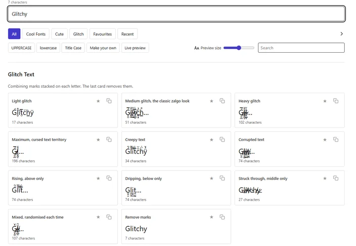
Glitchy at every setting, from barely broken to cursed, with the character cost beside each.
Barely broken. One or two marks per letter, enough to make the word look slightly wrong without costing you readability. This is the setting that survives the most places, because the mark count stays low enough that nothing clips it and no chat filter treats it as spam. It’s the right choice for a username or a bio line that still has to be read.
Ǵl̬̂ĩt̮̅c̆ḣ̲ÿ
This is the one people picture when they say zalgo. Marks stack several deep above and below, the word stays just about readable, and the line height starts pushing into the text around it. It’s the most-used setting and also the most-blocked, which matters before you paste it into a chat server. Our Discord font guide spells out what that platform does with it.
Ǵ̷̥̮̅l̸̶̬̰̂̆ĩ̴̷̭̲̇̊t̵̸̮̳̣̅̈̋c̶̰͓̆̉ḣ̷̵̲͙̊ÿ̸̶̳̣̋̏
Several marks deep in every direction. Your word survives as a shape rather than as something anyone reads quickly, and the lines above and below start getting covered. The trade-off is simple: every mark you add makes it look better and makes it work in fewer places. Heavy is roughly where apps begin clipping the effect instead of drawing all of it.
Ǵ̷̵̸̶̥̮̳̣̅̈̋l̸̶̴̷̬̰͓̤̂̆̉̌̑ĩ̴̷̵̸̭̲͙̥̮̇̊̍̽t̵̸̶̴̷̮̳̣̬̰̅̈̋̏̿c̶̴̷̵̸̰͓̤̭̲̆̉̌̑͛̂ḣ̷̵̸̶̲͙̥̮̊̍̽ÿ̸̶̴̷̳̣̬̰̋̏̿́
This is what most sites call cursed text. The marks run deep enough that the original word becomes a guess, and a paragraph of it will visibly slow some apps down while they try to draw it. This one bites: on older phones and inside some chat clients, a long line at this setting can freeze the input box entirely. Use it for one word, never for a sentence.
Ǵ̷̵̸̶̴̷̵̸̥̮̳̣̬̰͓̤̅̈̋̏̿́̅l̸̶̴̷̵̸̶̴̬̰͓̤̭̲͙̥̂̆̉̌̑͛̂̆̉ĩ̴̷̵̸̶̴̷̵̭̲͙̥̮̳̣̬̰̇̊̍̽̀̃̇̊t̵̸̶̴̷̵̸̶̴̮̳̣̬̰͓̤̭̲̅̈̋̏̿́̅̈̋c̶̴̷̵̸̶̴̷̵̰͓̤̭̲͙̥̮̳̆̉̌̑͛̂̆̉̌̑ḣ̷̵̸̶̴̷̵̸̶̲͙̥̮̳̣̬̰͓̤̊̍̽̀̃̇̊̍̽ÿ̸̶̴̷̵̸̶̴̷̵̳̣̬̰͓̤̭̲͙̥̋̏̿́̅̈̋̏̿
Same mechanism, different selection. This setting favours the thin, spidery marks and spreads them wide across the word, so the whole thing lands as unsettling. It holds up better at small sizes than the dense settings do. If you want a dark look that stays fully readable, the gothic font generator swaps in a completely different alphabet.
Ǵ̂̃l̂̃̅̆ĩ̅̆̇̈t̅̆̇c̆̇̈̉ḣ̈̉̊̋ÿ̉̊
The data-error look. Marks are packed tight and low, so the word reads as damaged hardware, and it sits closer to what a broken display actually does. It’s popular for gaming names, where the aesthetic fits and the field is short enough to make the character cost obvious. Our PUBG font guide deals with what those name fields accept.
G̶̸̵̷̤̬̮̲l̷̴̶̸̥̭̰̳͙i̸̵̷̴̶̬̮̲͓̣ṱ̴̶̸̵̷̰̳͙̤̬c̵̷̴̶̸̵̮̲͓̣̥̭h̶̸̵̷̰̳͙̤y̷̴̶̸̲͓̣̥̭
Marks go above the letters and nowhere else. The word stays fully readable on its own line and only interferes with whatever sits above it, which makes it one of the safest heavy-looking options. Use it where your text is the top line of a bio or the last line of a message. Dripping does the same job in the other direction.
Ǵ̂̃̅̆̇̈̉l̂̃̅̆̇̈̉̊̋ĩ̅̆̇̈̉̊̋̌̍t̅̆̇̈̉̊̋̌̍̏̑c̆̇̈̉̊̋̌̍̏̑̽̿ḣ̈̉̊̋̌̍̏ÿ̉̊̋̌̍̏̑̽
Everything hangs underneath. This is the version that reads as melting or bleeding, and it works well when your text sits at the bottom of a block with space under it. Descenders take the worst of it, so a word containing a g, y or p looks heavier than one without. That’s why the sample word on this page ends in a y.
G̤̥̬̭̮̰̲̳l̥̬̭̮̰̲̳͓͙i̬̭̮̰̲̳͓͙̣̤ṱ̮̰̲̳͓͙̣̤̥̬c̮̰̲̳͓͙̣̤̥̬̭̮h̰̲̳͓͙̣̤̥y̲̳͓͙̣̤̥̬̭
Marks land directly on the letters. This gives a scratched-out look without touching the lines above or below, which makes it the tidiest of the ten inside a tight layout. It’s also the one people most often read as a rendering fault. Keep it to short strings for that reason.
G̵̶l̶̷̸i̷̸̴̵t̸̴c̴̵̶h̵̶̷̸y̶̷
Every letter gets a different amount, chosen at random, so no two runs come out the same. It looks more organic than the even settings, and it’s the closest thing here to genuine corruption. Press it twice and you get two different results, so copy the one you like before you change anything. For a different kind of Unicode trick, the upside down text generator turns your letters end over end.
G̸̶̶̵̵̵̴̤̥̰̳̳̊̌̉̈̀̌̍l̶̸̸̥̤͓̏̀͛̍i̴̴̸̵̵̷̵̸̴͙̮̬̥̽̽͛̇̈̌̑̆̌̂̆̊̀t̴̷̵̸̴̵̷̬̲̥̭̲͓̬̰̍̽́̈̇̃̿́̑̑̿̊̃̆̿ć̴̵̸̲̬͙̳̮̲́̍̊́̽̈̆ḫ̴̸̸̵̷̴̸̷̥̣̲̳̲̰̤̣̰̳͙̰̥̂̌̀̑̍̈̃y̷̤̋͛̀
Here is the same word at every setting, with the character count beside it. The count is the number worth watching, because it’s what every platform limit measures and it’s the reason heavy settings fail in short fields. Copy any row straight from the table.
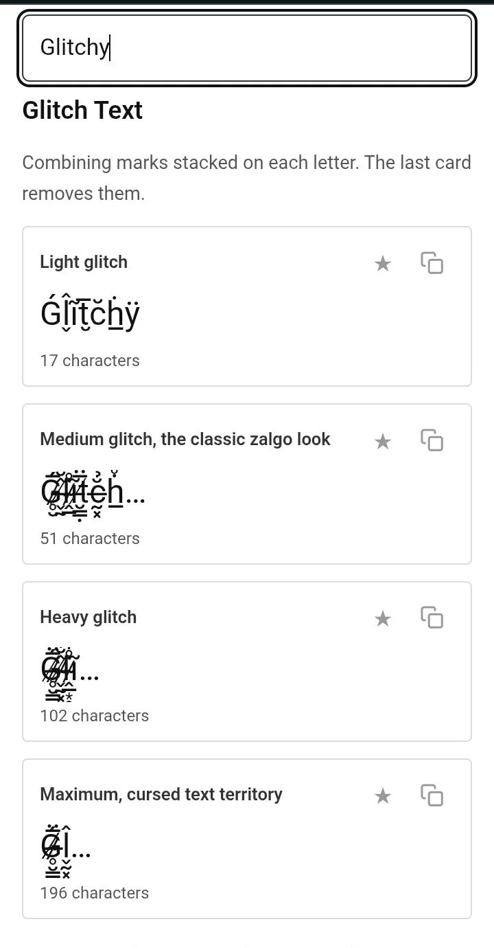
The count climbs with the setting. Seven letters cost 196 characters at Maximum.
| Setting | Glitchy | Characters |
|---|---|---|
| Plain | Glitchy | 7 |
| Light | Ǵl̬̂ĩt̮̅c̆ḣ̲ÿ | 17 |
| Medium, zalgo | Ǵ̷̥̮̅l̸̶̬̰̂̆ĩ̴̷̭̲̇̊t̵̸̮̳̣̅̈̋c̶̰͓̆̉ḣ̷̵̲͙̊ÿ̸̶̳̣̋̏ | 51 |
| Heavy | Ǵ̷̵̸̶̥̮̳̣̅̈̋l̸̶̴̷̬̰͓̤̂̆̉̌̑ĩ̴̷̵̸̭̲͙̥̮̇̊̍̽t̵̸̶̴̷̮̳̣̬̰̅̈̋̏̿c̶̴̷̵̸̰͓̤̭̲̆̉̌̑͛̂ḣ̷̵̸̶̲͙̥̮̊̍̽ÿ̸̶̴̷̳̣̬̰̋̏̿́ | 102 |
| Maximum, cursed | Ǵ̷̵̸̶̴̷̵̸̥̮̳̣̬̰͓̤̅̈̋̏̿́̅l̸̶̴̷̵̸̶̴̬̰͓̤̭̲͙̥̂̆̉̌̑͛̂̆̉ĩ̴̷̵̸̶̴̷̵̭̲͙̥̮̳̣̬̰̇̊̍̽̀̃̇̊t̵̸̶̴̷̵̸̶̴̮̳̣̬̰͓̤̭̲̅̈̋̏̿́̅̈̋c̶̴̷̵̸̶̴̷̵̰͓̤̭̲͙̥̮̳̆̉̌̑͛̂̆̉̌̑ḣ̷̵̸̶̴̷̵̸̶̲͙̥̮̳̣̬̰͓̤̊̍̽̀̃̇̊̍̽ÿ̸̶̴̷̵̸̶̴̷̵̳̣̬̰͓̤̭̲͙̥̋̏̿́̅̈̋̏̿ | 196 |
| Creepy | Ǵ̂̃l̂̃̅̆ĩ̅̆̇̈t̅̆̇c̆̇̈̉ḣ̈̉̊̋ÿ̉̊ | 34 |
| Corrupted | G̶̸̵̷̤̬̮̲l̷̴̶̸̥̭̰̳͙i̸̵̷̴̶̬̮̲͓̣ṱ̴̶̸̵̷̰̳͙̤̬c̵̷̴̶̸̵̮̲͓̣̥̭h̶̸̵̷̰̳͙̤y̷̴̶̸̲͓̣̥̭ | 74 |
| Rising | Ǵ̂̃̅̆̇̈̉l̂̃̅̆̇̈̉̊̋ĩ̅̆̇̈̉̊̋̌̍t̅̆̇̈̉̊̋̌̍̏̑c̆̇̈̉̊̋̌̍̏̑̽̿ḣ̈̉̊̋̌̍̏ÿ̉̊̋̌̍̏̑̽ | 74 |
| Dripping | G̤̥̬̭̮̰̲̳l̥̬̭̮̰̲̳͓͙i̬̭̮̰̲̳͓͙̣̤ṱ̮̰̲̳͓͙̣̤̥̬c̮̰̲̳͓͙̣̤̥̬̭̮h̰̲̳͓͙̣̤̥y̲̳͓͙̣̤̥̬̭ | 74 |
| Struck through | G̵̶l̶̷̸i̷̸̴̵t̸̴c̴̵̶h̵̶̷̸y̶̷ | 27 |
Seven letters is what you typed. The number in the third column is what the platform counts, and it climbs fast enough that a heavy setting can fill an Instagram bio with a single word. That gap between what you see and what gets counted causes most of the problems further down this page.
Rendering and permission are two different questions. Almost every modern app can draw these marks, and plenty of them will still remove your message for using them. The sections below cover both, and where a community publishes an actual rule about it, you’ll find the wording here.
Discord renders it perfectly and then, on a lot of servers, deletes it. AutoMod rules can match these characters by pattern, and ready-made rule sets for exactly this circulate publicly, so a server doesn’t need anyone technical to switch it on. Plenty of servers ban it in their written rules as well. Usernames also get forced to lowercase, which changes your output before anyone else sees it.
There’s one fix worth keeping. If a heavy paste freezes the message box so you can’t send it or clear it, select all and press backspace. It empties in one go where deleting by hand does nothing.
Minecraft has its own glitch effect built in, and it isn’t this one. A formatting code makes characters cycle constantly on screen, which is a genuinely different thing from stacked marks. It also works in places pasted text doesn’t, so it’s usually the better answer inside the game.
| Minecraft’s obfuscated code | Pasted glitch text | |
|---|---|---|
| What it does | Characters cycle constantly | Marks stack on your letters |
| How you get it | Type §k before the text | Copy it from this page |
| Books and quills | Yes | Yes |
| Chat | Yes | Yes |
| Signs | No | No |
The section symbol is typed with Alt and 21 on a Windows number pad. Java sign input rejects that symbol outright, so neither route gets you a glitched sign. For anything more involved, the tellraw command takes a JSON text component and gives you full control.
Both fields refuse styled characters. The username takes letters, numbers and a single underscore. The display name returned “Display name contains unsupported characters” when a styled name was entered on the app. One Roblox-focused reference says unrecognised characters get replaced with hash symbols in some fields; that is a report from elsewhere, not what this test showed.
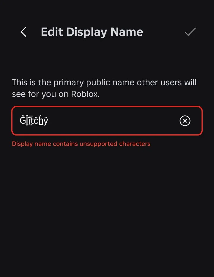
Roblox refuses both fields. The display name returns its own error rather than rendering the marks.
One thing isn’t in dispute. Deliberately using characters to get past a text filter breaches Roblox’s terms, whatever the field happens to accept. That applies to every platform on this page.
Both render the marks in bios and captions. The character cost is the real limit here, because an Instagram bio holds 150 characters and one heavily glitched word can eat most of them. Search won’t match the styled version either, so keep anything you want found in plain text. Our Instagram font guide takes the fields one at a time.
Steam profiles and most game clients render it without complaint, which makes them one of the friendlier homes for the heavier settings. Name fields are usually short, so the count matters more than the rendering does. Some reporting and moderation systems flag unusual character use in names, though nothing published confirms glitch text specifically.
This is where it gets banned most consistently. Wiki and forum rules commonly prohibit it outright, and the reason is practical: heavy marks overflow into other people’s posts and make a thread hard to read. The clearest example is the wiki dedicated to the horror character this effect is named after. Its rules say “Do NOT post Zalgo text”, and warn that doing so will subject you to a ban. If the community built around the lore won’t allow it, most general forums won’t either.
Nothing here changes your letters. A glitch generator takes the word you typed and appends combining marks after each character, and the app you paste into draws those marks on top of, under or through the letter in front of them. Your G is still a G underneath. That one fact explains the removers, the search problem and the character cost all at once.
Five words, one mechanism. They describe how heavy the effect is and what it’s being used for. That’s why each one appears here as a setting.
| Word | What people usually mean | A different mechanism? |
|---|---|---|
| Glitch text | The general term, any intensity | No |
| Zalgo | The dense stacked look, named after a 2004 internet horror character | No |
| Cursed text | The heaviest end, often used as a joke | No |
| Creepy text | Thin marks spread wide, horror styling | No |
| Corrupted text | Dense and low, the broken-display look | No |
Sites running a separate page for each of these words are running the same generator behind all of them. The output is identical and so is the code underneath. The words are marketing rather than categories.
Combining marks are an ordinary part of Unicode and they exist for real languages. An accent over an e, a cedilla under a c, and the marks that Vietnamese, Arabic and dozens of other writing systems depend on. Each one is its own character that attaches to whatever came before it. Glitch text does nothing clever. It just attaches far more of them than any language ever would.
Zalgo started in July 2004 on the Something Awful forums. Somebody began editing newspaper comic strips, Nancy and Archie first and Garfield soon after, replacing the dialogue with warnings about an approaching entity. The entity picked up titles along the way, including He Who Waits Behind the Wall, and a signature line: He comes. The stacked, overflowing text arrived as its visual signature and outlived the comics by two decades.
There’s a published limit, and it’s the reason apps cut the effect off. Unicode’s normalisation annex defines a Stream-Safe Text Format, which caps the marks following a single base character at thirty. The specification says plainly that thirty sits far beyond anything any language or technical use actually requires, and a separate standards paper puts the longest genuinely meaningful run at seventeen. So when a platform clips your text, it isn’t being arbitrary. It’s applying a rule that has a name and a number. Here is the ceiling: thirty marks per letter, after which software is entitled to stop drawing. Anything generated above that line is decoration you’re hoping gets rendered rather than text you can count on.
None of this is formatting. Pressing a bold button tells an app to draw a letter differently. Every generator on this site hands you different characters. Our bold text generator takes the swapping approach and this page takes the stacking approach, and both produce text that travels anywhere and obeys nobody.
No, and the pages promising universal compatibility are the ones to be most careful with. Three separate things can go wrong. The marks can render differently, they can get clipped, or they can genuinely slow software down. Which one you run into depends on the setting you picked and the app you’re pasting into.
Light and the direction-only settings survive nearly everywhere. Medium is fine in most places and blocked in some. Heavy and maximum are where real problems start, and they’re best kept to a single word of decoration. The pattern is short enough to remember: mark count is risk.
Your device draws these marks with whatever font it has installed. Two typefaces in common testing, Bitstream Vera Sans and DejaVu Sans, stack the marks into a neat vertical column, while most other fonts overlap them into a blur. So the same string can look carefully layered on your screen and like a smudge on someone else’s. The text itself is identical in both cases. Only the font drawing it changed.
This is the part almost every other page leaves out, and all of it sits in public bug trackers. A code editor issue reports that pasting this text hangs the terminal, reproduced by the developers themselves. A chat client issue describes it causing font rendering to implode. A children’s programming site warns its users away from it on low-powered machines.
Where this fails, it fails expensively. In January 2022 the author of a widely used programming package deliberately added an infinite loop that printed this text forever, breaking installs across millions of projects overnight. Wikipedia’s entry on combining characters notes plainly that the technique can be used to halt or impair certain computer functions. That’s no reason to avoid the light settings, and it is a reason not to paste a heavy one into somebody’s terminal.
Other writing systems take this badly. Languages that already use combining marks of their own, and scripts where letters join or reshape, end up with the added marks landing in the wrong place or breaking the joins entirely. A few generators advertise that they preserve other scripts, which tells you what the default behaviour is. Test a short string first if your text isn’t in English.
Three problems come up over and over, and each has a different answer. Two you can fix from your side and one you can’t. Work through them in order before assuming the tool is at fault.
The middle one is worth understanding, because it’s the most common and the least fixable. Line height belongs to the app, so a bio field with a fixed row height will cut the top off your marks no matter what you generate. Our small text generator meets the same counting problem from the other direction, where people expect smaller letters to cost less space and they cost more.
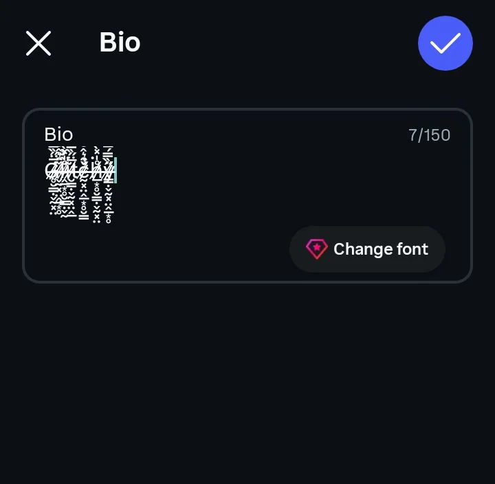
Instagram draws a bio at a fixed line height, so a heavy stack is cut off rather than shown.
The marks sit on top of your letters, so the original text is still there and comes back exactly. Every remover works the same way, stripping out the combining marks and leaving everything else alone. This tool does it too, so you can paste glitched text in and get clean words out.
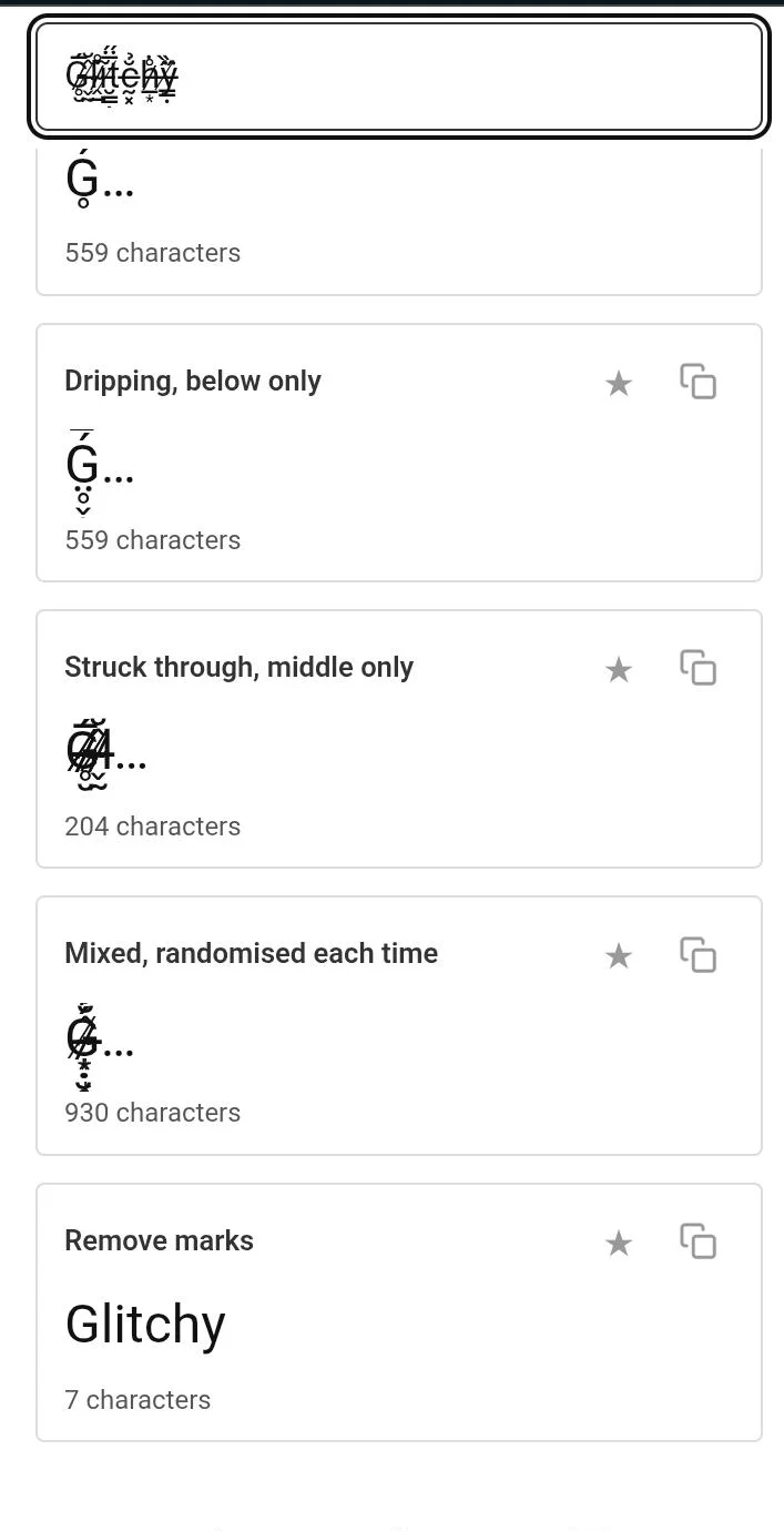
The same string after Remove marks: the letters come back plain.
Five Unicode blocks hold these characters, and a complete remover has to clear all five. Most people never need the ranges themselves, but they matter if you’re choosing between cleaning tools. A remover handling only the first block will look like it worked and quietly leave marks behind. Here is what a complete job covers.
| Block | Range |
|---|---|
| Combining Diacritical Marks | U+0300 to U+036F |
| Combining Diacritical Marks Extended | U+1AB0 to U+1AFF |
| Combining Diacritical Marks Supplement | U+1DC0 to U+1DFF |
| Combining Diacritical Marks for Symbols | U+20D0 to U+20FF |
| Combining Half Marks | U+FE20 to U+FE2F |
Most removers clear only the first row. That covers the marks European languages use, which is where the common ones live, but generators pull from all five blocks to get variety. A tool clearing one range leaves marks behind and looks like it half worked. No workaround exists from your side, so if cleaned text still looks wrong, the remover is the problem rather than your text.
The first is receiving it. Somebody sends a glitched message, or a username you need to type won’t paste properly, and you just want the plain version. Fiction communities and programming forums both discuss this often enough that it’s clearly a common problem.
The second is undoing your own work. You generated something, posted it, and now want it plain, or you saved a name at a heavy setting and it keeps getting clipped. Paste it back in, remove the marks, and your original word comes out unchanged. Nothing is lost, because nothing was ever replaced.
Two different questions sit inside readability. One is whether a sighted person can still make out the word, which the intensity settings handle. The other is whether the text works at all for somebody using assistive software, and that one has an uncomfortable answer.
A username, a bio line, one word inside a message. That’s the range where this style does its job properly. Past that it stops being emphasis and turns into texture, and the reader either skips it or gives up. The one-word habit also happens to keep you under every platform’s clipping threshold.
Screen reading software has no good option here. A public accessibility discussion describes it stuttering through the marks, reading nonsense, and severely hindering navigation for the people who depend on it. Two of the more honest generator sites say the same thing. One well-known generator page claims screen readers announce the underlying letters without trouble, which contradicts the reports coming from people actually using them.
Until that test happens, this page assumes the worse outcome. Keep anything a person genuinely needs in plain text, and treat glitch text as decoration that some readers will never receive. Our aesthetic font generator shares this caveat for the same reason, since both rely on characters assistive software was never built to narrate.
A search box matches characters in order. The marks sit between your letters in the underlying data, so a search for your word never lines up with the styled version even though every letter is still present. This is the detail that’s easy to get half right. The base letters do survive, which is exactly why removers work, but they aren’t next to each other any more, so the match fails.
That makes the rule straightforward. Anything you want found stays plain, meaning your name, your handle, the thing you do and any hashtag. Decoration can be as broken as you like.
This gets recommended online and it’s a poor idea in every direction. Platform terms treat deliberate filter evasion as a violation regardless of the method, so the outcome is the same whether the trick works or not. Moderation tools already decode it, and at least one remover is marketed directly at moderators for that job. Before you post it, be clear about which side of that line you’re standing on.
Plenty of pages generate this. Most run separate URLs for identical output and stay quiet about what breaks. Here’s what’s different about this one.
The tool sits at the top of the page whenever you want it. Type your words, slide through the ten settings, and copy the one that survives wherever you’re heading. There’s nothing to install and no account to make.
No. It's your own letters with combining marks stacked onto them, which is why the effect can be removed and a real font can't be. Nothing in your text got swapped for anything else.
Depends on the server. Discord renders it fine, but AutoMod can be configured to delete it and a lot of servers do exactly that, with plenty banning it in their written rules too. Usernames also get forced to lowercase.
No. Roblox rejects it in both fields. The username takes letters, numbers and a single underscore, and the display name returned "Display name contains unsupported characters" when a styled name was entered on the app.
Depends on where you pasted it. Some fields strip combining marks when you submit, and some apps clip them out of the visible line while keeping them in the data. Try a lighter setting first, since low mark counts survive far more often.
Rarely, but it's documented. Public bug reports show it hanging terminals, breaking rendering inside chat clients and slowing low-powered machines. Light settings are not a risk. Very heavy strings pasted into developer tools sometimes are.
Yes. It's ordinary Unicode characters and it can't carry anything harmful. The risks are social rather than technical: getting your message deleted, being unreadable to some people, and never showing up in search.
Yes, completely. Your original letters are still underneath, so removing the marks gives you back the exact word you started with. Use the remover on this page.
Mostly. Both render the common marks, and both draw them a little differently depending on the installed font, so the same string won't look identical across the two. Heavy settings are the ones most likely to come out wrong on one of them.
No. Signs reject both the pasted characters and the game's own obfuscated formatting code. Books and quills and chat both accept them.