 Fonti
FontiYour Brand Name
Hello World
Instagram has no font setting. There is no menu, no dropdown, no hidden toggle buried in Settings that changes the letters in your bio. Every styled bio you have scrolled past today is doing the same trick: it is not using a font at all, it is using different characters that happen to look like one. Once you understand that one thing, everything else on this page follows, including why some styles turn into empty boxes on your friend’s phone.
Style: Bold Script
Your Brand Name
Hello World
Hello World
Hello World
No favourites yet. Tap the star on a card to save it.
Nothing copied yet.
Nothing matches that search.
Numbers stay plain.
characters
Pick an alphabet, a separator and a decoration, then copy the result.
Live preview
0 units
Marks added over your text, letters unchanged.
An alphabet wrapped in a decoration.
Decoration wrapped around your text, letters unchanged.
Decoration wrapped around your text, letters unchanged.
Decoration wrapped around your text, letters unchanged.
Decoration wrapped around your text, letters unchanged.
Decoration wrapped around your text, letters unchanged.
Decoration wrapped around your text, letters unchanged.
𝓑𝓸𝓵𝓭 𝓢𝓬𝓻𝓲𝓹𝓽
Numbers stay plain.
𝒞𝓁𝒶𝓈𝓈𝒾𝒸 𝒮𝒸𝓇𝒾𝓅𝓉
Numbers stay plain.
𝑩𝒐𝒍𝒅 𝑰𝒕𝒂𝒍𝒊𝒄
Numbers stay plain.
𝐼𝑡𝑎𝑙𝑖𝑐 𝑆𝑐𝑟𝑖𝑝𝑡
Numbers stay plain.
𝘏𝘢𝘯𝘥𝘸𝘳𝘪𝘵𝘪𝘯𝘨
Numbers stay plain.
𝙎𝙡𝙖𝙣𝙩𝙚𝙙
Numbers stay plain.
𝐁𝐨𝐥𝐝
𝗕𝗼𝗹𝗱 𝗦𝗮𝗻𝘀
Ⓒⓘⓡⓒⓛⓔⓓ
Unicode records the circled capital M at U+24C2 as an emoji character.
⒫⒜⒭⒠⒩⒯⒣⒠⒮⒤⒵⒠⒟
Numbers stay plain.
Capitals fold to lowercase
🄟🄐🄡🄔🄝🄣🄗🄔🄢🄘🄩🄔🄓 🄒🄐🄟🄢
Numbers stay plain.
Lowercase folds to capitals
🅕🅘🅛🅛🅔🅓 🅒🅘🅡🅒🅛🅔🅓
Lowercase folds to capitals
𝔉𝔯𝔞𝔨𝔱𝔲𝔯
Numbers stay plain.
𝕭𝖔𝖑𝖉 𝕱𝖗𝖆𝖐𝖙𝖚𝖗
Numbers stay plain.
𝙼𝚘𝚗𝚘𝚜𝚙𝚊𝚌𝚎
𝔻𝕠𝕦𝕓𝕝𝕖-𝕤𝕥𝕣𝕦𝕔𝕜
𝖲𝖺𝗇𝗌-𝗌𝖾𝗋𝗂𝖿
Fullwidth
Vaporwave Greek
Vaporwave Triangle
S p a c e d O u t
Numbers stay plain.
Letters stay plain. The style is a space between each character.
ꜱᴍᴀʟʟ ᴄᴀᴘꜱ
Numbers stay plain.
Unicode has no small-capital X, so x stays plain. This site ships no small-capital Q, so q stays plain. Capitals and lowercase both appear as small capitals.
ˢᵘᵖᵉʳˢᶜʳⁱᵖᵗ
Unicode has no superscript q, so q stays plain. Raised letters are lowercase forms, so capitals are not preserved.
ₛᵤbₛcᵣᵢₚₜ
Nine letters have no subscript form in Unicode, so b, c, d, f, g, q, w, y and z stay plain. Lowered letters are lowercase forms, so capitals are not preserved.
🅂🅀🅄🄰🅁🄴🄳
Numbers stay plain.
Unicode's squared letters are capitals only, so lowercase letters appear as squared capitals.
🅵🅸🅻🅻🅴🅳 🆂🆀🆄🅰🆁🅴🅳
Numbers stay plain.
Lowercase folds to capitals
Unicode lists U+1F170, U+1F171, U+1F17E and U+1F17F as emoji characters.
Ⅎʃıddǝp
Some capitals and digits 2, 3, 4 and 7 use borrowed characters, so their appearance can vary by device. Digits 1 and 5 stay plain. This card does not reverse the line.
uʍo◖ ǝpısd∩
Some capitals and digits 2, 3, 4 and 7 use borrowed characters, so their appearance can vary by device. Digits 1 and 5 stay plain. The text is reversed so it reads when the page is turned upside down.
Cⲟⲡⲧⲓc
Numbers stay plain.
Letters c, j, q, u and v have no Coptic shape and stay plain.
ᔕyᒪᒪᗩᗷiᑕᔕ
Numbers stay plain.
A single set of shapes. Capitals and lowercase look the same. Letters i, k, q, t, y and z stay plain.
ᏟᎻᎬᏒᎣᏦᎬᎬ
Numbers stay plain.
A single set of shapes. Capitals and lowercase look the same. Letters f, i, n, q and x stay plain.
ꌩꀤ
Numbers stay plain.
A single set of shapes. Only twelve letters have a Yi form, the rest stay plain.
The Yi block is not in every system font.
Zhuㄚノn ⽖ノx
Numbers stay plain.
A single set of shapes. Only twelve letters have a form here, the rest stay plain.
These shapes come from four blocks: CJK Unified Ideographs, Bopomofo, Kangxi Radicals and Halfwidth Katakana. Line height varies.
𐌏𐌋𐌃 𐌉𐌕𐌀𐌋𐌉𐌂
Numbers stay plain.
A single set of shapes. Letters f, g, j, p, q, v, w and y stay plain.
Old Italic sits above the basic plane, so bio counters on Instagram and X count every letter twice.
The whole process happens outside Instagram and finishes with a paste. It takes about ten seconds once you have done it once. The only step people skip is the last one, and it is the step that saves you from publishing a row of empty rectangles.
Type the exact text you plan to use into the generator above. If it is a bio line, type the whole line. If it is your display name, type it the way you want it to appear, spaces included. The preview updates as you type, so you can compare every style at once instead of guessing.
Scroll through the styles and press Copy on the one you want. What lands on your clipboard is ordinary text as far as your phone is concerned. That is why it survives the trip into Instagram, and why you can paste the same string into a note, a message or a browser bar and see it unchanged.
For a bio or display name, open your profile, tap Edit Profile, then tap into the field and long press to paste. For a caption, paste into the caption box on a new post. For Stories, tap the screen to open the text tool and paste there. On desktop the shortcut is Ctrl+V on Windows and Cmd+V on a Mac.
Read what actually appeared on screen. Check for boxes or question marks where letters should be, and check that the character counter has not quietly cut your line short. Look at it on the phone you post from, because the device doing the reading is what decides whether a character shows up at all. Five seconds here is the difference between a styled bio and a broken one.
Most sites sort their styles by how pretty they look. That ordering is no help to you, because two styles that look equally good can behave completely differently on a four-year-old phone. The table below runs from the styles that survive everywhere down to the ones with known gaps. Every row shows the same phrase, so you are comparing like with like.
| Style | Coffee and Chaos | Where it holds up |
|---|---|---|
| Bold | 𝐂𝐨𝐟𝐟𝐞𝐞 𝐚𝐧𝐝 𝐂𝐡𝐚𝐨𝐬 | Everywhere |
| Bold Sans | 𝗖𝗼𝗳𝗳𝗲𝗲 𝗮𝗻𝗱 𝗖𝗵𝗮𝗼𝘀 | Everywhere |
| Italic Script | 𝘊𝘰𝘧𝘧𝘦𝘦 𝘢𝘯𝘥 𝘊𝘩𝘢𝘰𝘴 | Everywhere |
| Monospace | 𝙲𝚘𝚏𝚏𝚎𝚎 𝚊𝚗𝚍 𝙲𝚑𝚊𝚘𝚜 | Everywhere |
| Classic Script | 𝒞ℴ𝒻𝒻ℯℯ 𝒶𝓃𝒹 𝒞𝒽𝒶ℴ𝓈 | Almost everywhere |
| Bold Script | 𝓒𝓸𝓯𝓯𝓮𝓮 𝓪𝓷𝓭 𝓒𝓱𝓪𝓸𝓼 | Almost everywhere |
| Double-struck | ℂ𝕠𝕗𝕗𝕖𝕖 𝕒𝕟𝕕 ℂ𝕙𝕒𝕠𝕤 | Almost everywhere |
| Small Caps | ᴄᴏꜰꜰᴇᴇ ᴀɴᴅ ᴄʜᴀᴏꜱ | Gaps on older phones |
| Fullwidth | Coffee and Chaos | Gaps on older phones |
| Circled | Ⓒⓞⓕⓕⓔⓔ ⓐⓝⓓ Ⓒⓗⓐⓞⓢ | Gaps on older phones |
The top four rows all come from one complete block of Unicode that was built for mathematics, which is why they hold up on every current device. The three middle rows are complete as well, but a handful of their capitals are borrowed from a different part of the standard, so those letters sometimes render a shade heavier or lighter than the ones around them. The bottom three deserve a second thought before you commit to them. Small Caps was never finished, Fullwidth comes from an old East Asian typesetting system, and bubble letters run out at certain characters.
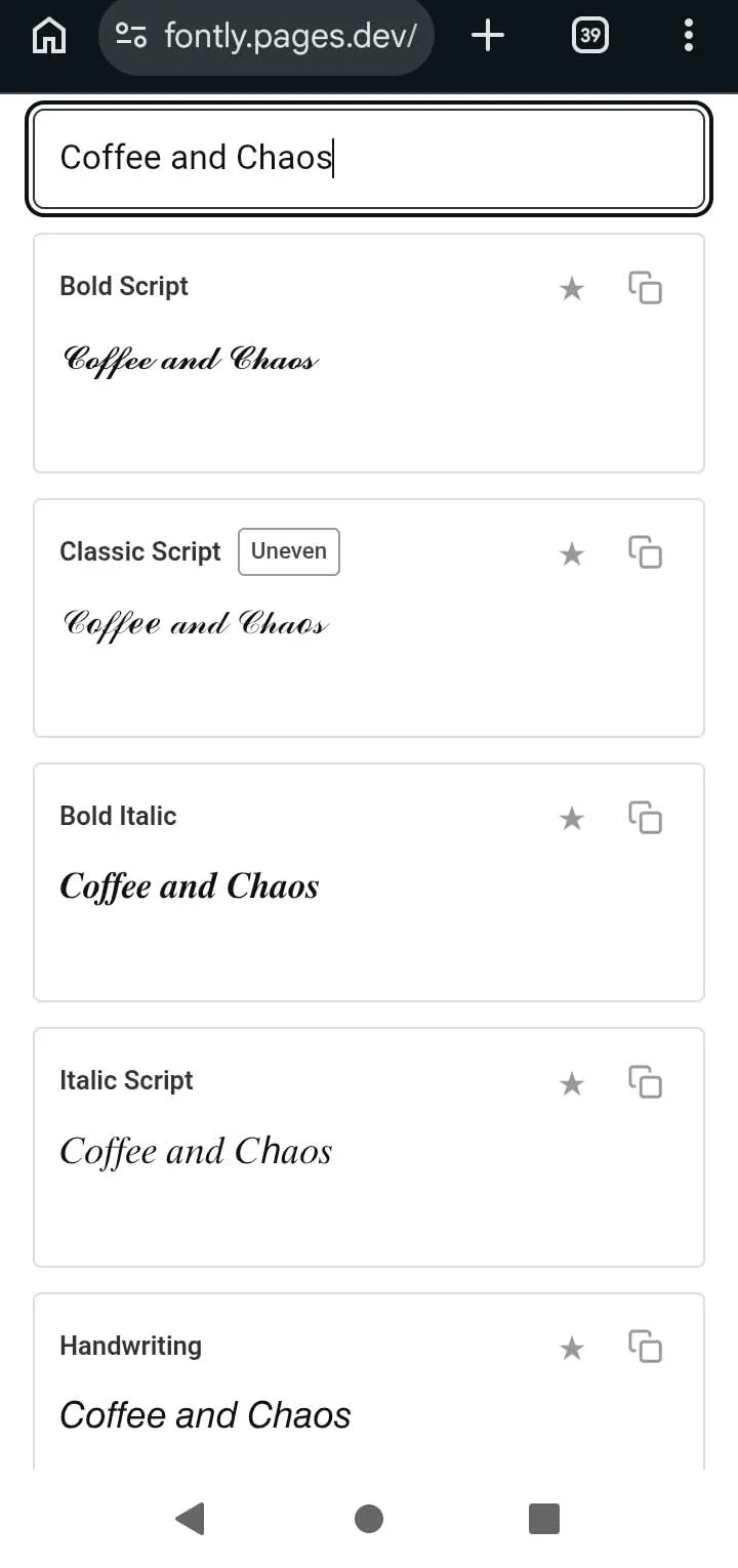
Coffee and Chaos in the five script-family styles, all rendering cleanly on a Redmi A2+ running Android 13.
That last group is not broken so much as incomplete, and the gaps follow a pattern you can learn. Every one of them traces back to why the characters were added to Unicode in the first place. There is a section further down that names the missing letters and explains what happened to them.
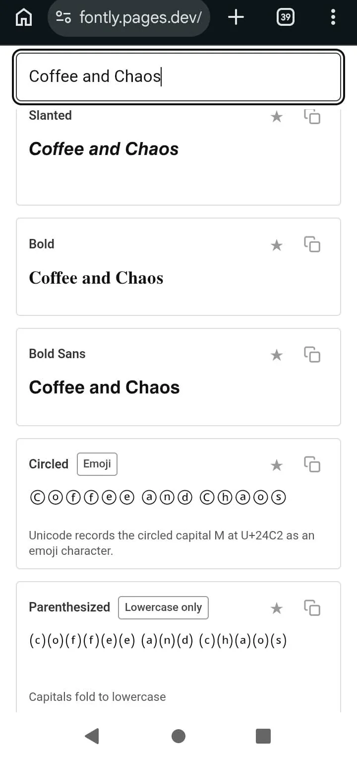
The bold family and the two enclosure styles, with no empty boxes. The Circled card carries the app’s own Emoji note.
Instagram is not one text box. It is nine or ten of them, each with its own limit and its own rules, and styled text behaves differently depending on which one you are standing in. Nobody seems to publish this in one place, so here it is.
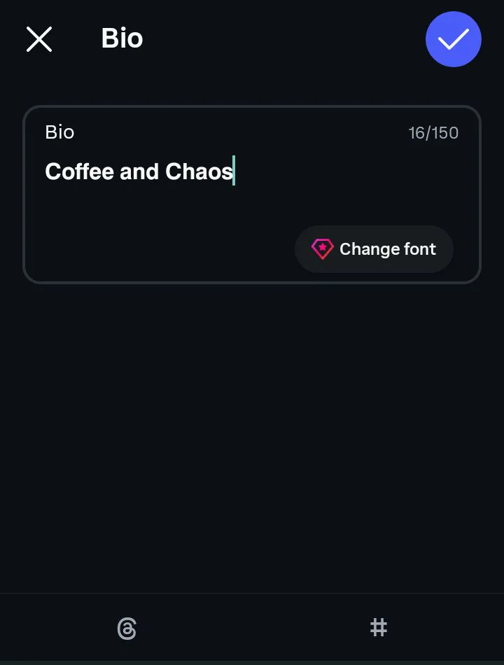
The bio takes it, and the counter counts plain characters. Sixteen of 150 here.
| Field | Limit | Takes styled text? |
|---|---|---|
| Bio | 150 characters | Yes |
| Name (the bold line) | 64 characters | Yes, with a catch |
| Username (your @handle) | 30 characters | No |
| Post caption | 2,200 characters | Yes |
| Reel caption | 2,200 characters | Yes |
| Comment | 2,200 characters | Yes |
| Direct message | 1,000 characters | Yes |
| Story text | No fixed limit | Yes, by pasting |
| Highlight title | Truncates on the cover | Yes |
The username is the one hard no on that list. Instagram accepts letters, numbers, periods and underscores there and nothing else, so a styled handle is simply not possible. Several font sites tell you otherwise. They are wrong, and you will find that out the moment you hit Save.
Story text works, but only by pasting. The Story text tool has its own built-in fonts and no way to import anything, so you style your text in the generator, copy it, then paste it into the text box on screen. It behaves like any other pasted string once it lands.
Good to know: the first 125 characters or so of a caption are what people see before the More link appears. Styled text in that opening line costs you more than styled text buried at the bottom of a post. The opening line is doing the work of getting someone to tap, so it needs to be readable at a glance.
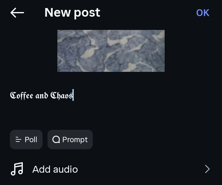
The same paste, in a caption box on a new post.
This is the part most people get wrong, and it is the reason a lot of styled profiles quietly stop showing up in search. The two fields sit inches apart on your profile and look like they belong together. They do not, and they behave nothing alike.
Your username is the @handle. It sits under your photo, it is how people tag you, and it is locked to plain characters: letters, numbers, periods, underscores, thirty characters maximum. Nothing you paste will change it. TikTok divides its profile the same way, and our TikTok fonts guide names which of its two fields will actually keep what you paste.
Your Name is the bold line that appears above your bio. It is a completely separate field, it has nothing to do with your handle, and it accepts any character you can paste into it. It also holds more than most people think. Instagram raised the limit from thirty to 64 characters, a change widely reported in 2022.
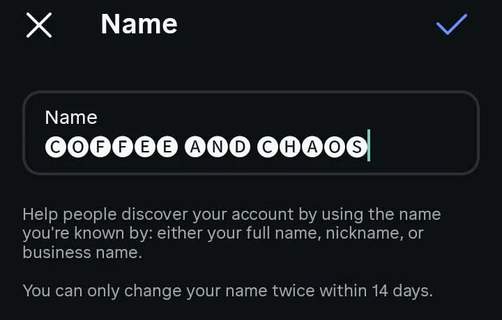
Styled text in the Name field, with Instagram’s own warning: a name can only be changed twice in 14 days.
Here is why that field matters more than the rest of your profile put together. The Name field is searchable. When somebody types photographer or bakery or Manchester into Instagram search, the app reads Name fields. It is the one part of your profile that actively brings strangers in.
Straight answer: Instagram’s search only reads standard characters. Style your Name and it still looks the way you wanted, but it stops matching anything anyone types. You keep the look and you lose the discovery, and because sixty-four characters is a generous amount of room, you are giving away the most valuable space on your profile for a visual effect.
The fix is not complicated. Keep the words you want to be found for in plain text in your Name field, and do your styling in the bio underneath, where nothing was searchable in the first place. You lose nothing and you keep everything.
The numbers are worth knowing before you write anything, because they are tighter than they feel. Your bio holds 150 characters. Captions on posts and Reels both hold 2,200, with roughly the first 125 visible before the More link. Comments hold 2,200, direct messages hold 1,000, your username holds 30 and your Name field holds 64.
Worth knowing: some styled characters cost you more than one character each. Most Unicode letters are a single character, so a styled bio uses up exactly as much room as a plain one. The exceptions are the decorative ones built out of several pieces stacked together.
Keycap numbers are the clearest example. A single keycap digit is actually three separate code points glued into one shape, which means writing a four-digit year that way spends twelve characters of your 150. There is a full breakdown of how those are put together in our guide to number fonts.
Emoji behave similarly. A plain emoji is usually two characters, and the ones with skin tones or gender variants can be more. None of this is a reason to avoid them, but it does explain why a bio that looks half empty refuses to accept another word.
A real font is a file sitting on your device, and an app decides when to apply it. That is why you cannot copy Times New Roman out of a document and paste it into a comment box: the styling lives in the app, not in the text.
| A real font | An Instagram font | |
|---|---|---|
| What it is | A file on the device | A character in Unicode |
| Who applies it | The app | You, by pasting |
| Survives copy and paste | No | Yes |
| Works where there is no font setting | No | Yes |
| Guaranteed to display | Yes | No |
What font generators produce is something else entirely. Unicode, the standard that assigns a number to every character on every device in the world, happens to contain several complete alphabets that were added for other reasons. There is a bold alphabet for mathematics, a script alphabet for equations, a small-caps set for phonetic notation, and a full-width set left over from East Asian typesetting.
The useful name for these is borrowed characters. A mathematician needed a bold letter that meant something different from a plain one, so Unicode gave them a separate character with its own permanent number. You are using that character as decoration. It works, and it works everywhere text works, but nobody designed it for this.
That single fact explains almost every strange thing about styled text. It survives copy and paste because it is the text. It shows up as a box when a device has no drawing for that particular character. And it is invisible to search because, as far as the software is concerned, a styled letter is not the letter it resembles. The same logic applies to every platform, which is why the styles on our cursive font generator behave the same way in a document as they do in a bio.
This question gets asked constantly and answered badly. Instagram does not ship one font across the app, and the honest answer has three parts. There is the font you see in the interface, the font the company owns, and the fonts inside the Stories editor.
The interface uses whatever your phone uses. On an iPhone that is SF Pro, Apple’s system typeface. On Android it is Roboto. This is why the app looks subtly different across devices, and it is also why you will find sites confidently naming a single font and contradicting each other.
Instagram does have a typeface of its own, called Instagram Sans. It was built for the brand and it turns up in the logo, in marketing, and now inside the Stories text tool. Almost no font-generator site mentions it exists.
Inside Stories you get a small set of named text styles: Classic, Modern, Neon, Typewriter and Strong, with Instagram Sans available to most accounts as well. These are the closest thing Instagram has to a font picker anywhere in the app. Instagram adds and removes them without announcing anything, so treat any list you read as a snapshot.
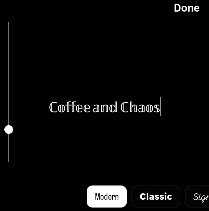
Stories keep their own font chips, so styled text arrives by pasting.
Reality check: none of these fonts can be typed into a bio, a caption or a comment. They live inside the app and stay there. That gap is the entire reason Unicode styling exists, and it is why a copy-and-paste generator is the only way to get styled text into a text field that has no styling controls.
A box, sometimes called tofu, means one thing: the device trying to display your text has no drawing for that character. Your text is intact. The phone reading it simply does not have that letter on hand, so it draws a placeholder instead. Whether that happens depends entirely on which part of Unicode the style was borrowed from, and that is something you can predict.
Bold, Bold Sans, Italic Script, monospace and double-struck all come from the Mathematical Alphanumeric Symbols block. Mathematics needed a complete alphabet, so the block contains every uppercase and lowercase letter with no holes, and it ships in the system fonts of every current phone and computer. If you want a style you never have to think about again, pick from this group.
Classic Script and Bold Script are also complete, with one quirk. A few of their capitals were already in Unicode before the maths block arrived, so those letters live somewhere else and were never duplicated. Your script capital B, E, F, H, I, L, M and R come from a block called Letterlike Symbols. They display fine almost everywhere, but they occasionally render at a slightly different weight from the letters beside them.
Small Caps, Fullwidth and Circled are the risky ones, and each fails for its own reason. Small Caps was borrowed from the phonetic alphabet, which only ever needed some of the letters, so the set was assembled from whatever existed and still has no proper X or Q. Fullwidth comes from legacy East Asian typesetting and carries a built-in wide space that looks odd in a short bio. Bubble letters cover the alphabet but thin out once you leave the basics, which is the same limitation you will find on our cute font generator.
Blackletter sits in this tier too, and its weak spot is the borrowed capitals described above. Five of its capital letters come from Letterlike Symbols and render at a visibly different weight from the letters around them. There is more detail on which letters behave oddly in our gothic font generator guide.
Other sites label each style with an all devices or most devices badge and leave it there. A badge tells you the outcome. The reason tells you what to do about it, which is to keep tier three for decoration and keep tier one for anything that has to be read.
Ask this question on three font sites and you will get three answers. One says styled text boosts engagement, one says it costs you followers, one shrugs. They are all answering the wrong question, because reach and search are two separate systems and styled text does something different to each.
For the feed and for Reels, there is no public evidence that Unicode styling changes how your posts are distributed. Instagram has never said it treats styled captions differently, and no credible test has shown it does. Anyone quoting you a percentage for this has not measured it.
Search is where the real answer lives, and it is not ambiguous. Instagram’s search reads standard characters. Styled characters do not match what people type, so anything written in them is effectively not there as far as search is concerned.
Fair warning: this is why the Name field matters so much and why captions matter so little. Caption text was never a strong way for strangers to find you anyway, so styling a caption costs you close to nothing. Styling your Name costs you the only searchable field you have.
One site in this space prints a run of percentages for profile visits, sales and follower growth with nothing attached to any of them. No study, no sample size, no date. We have no number to give you here, so we are not going to make one up.
This is the part almost nobody writes about, and it has a bigger effect on real people than anything else on this page. Somebody arrives at your profile using software that reads the screen aloud to them. What they hear depends entirely on which style you picked in the generator.
Screen readers work from code points, not from shapes. When software reads a styled letter, what it finds is a character called mathematical bold capital A. That is a separate entry in the standard with its own name and its own number. The reader has no way of knowing it was ever meant to look like an ordinary A.
Two things tend to happen from there. Some readers announce the character description before every single letter, so a short styled word becomes a long string of technical names. Others give up on characters they cannot map to speech and skip the run entirely, which means the sentence silently disappears for that listener.
One catch: the exact behaviour varies between JAWS, NVDA and VoiceOver, and it changes between versions, so anyone telling you precisely what each one does is generalising. What is consistent across accessibility guidance is the conclusion. Unicode styling gets classed as inaccessible, full stop.
The practical rule is easy to follow and costs you almost nothing. Never style the sentence that carries the information. Style the decoration, the dividers, the flourish at the end of a line, and leave the part that actually says something in plain characters. Your bio still looks the way you want and it still works for everyone who visits.
A popular figure floating around is to style twenty to thirty percent of your bio at most. It is not bad advice. The site quoting it never says where the figure came from, though, so the reasoning below will serve you better than the percentage.
You have 150 characters and roughly three jobs to do with them. Say who you are, say what you offer, and say what to do next. The first of those is really handled by your Name field, which needs to stay plain. The second gets scanned in under a second, so it needs to be legible at a glance. The third is usually a link or an instruction.
Quick note: that leaves the personality line as the natural place for styling, because it is the part nobody searches and nobody needs to read carefully. Style that and you get the look without paying for it anywhere else. It also happens to be the line people remember, which is a fair return on a few characters.
As for whether any of this grows an account, the honest answer is that nobody knows. Competing sites claim forty percent more profile visits, twenty-five percent more sales, and twenty-five to forty percent more followers, none of it sourced. A styled bio changes how your profile looks. Whether it changes what your profile earns has not been measured by anyone publishing on this topic, including us.
Every style is labelled with where it breaks, so you know the risk while you are still choosing.
The difference between your Name and your Username is built into the tool itself.
Character counts are shown against Instagram’s real limits, including the 64-character Name field that most sites still list as 30.
Nothing is stored, nothing is uploaded, and there is no account to create.
Styles are grouped by how well they survive, not by which ones look most impressive in a screenshot.
The limitation: we cannot promise any style displays on every device ever made, because that depends on the system font of whoever is reading, and we do not control that. Where we are unsure, we say so on the page.
No. Your username accepts letters, numbers, periods and underscores only, and Instagram rejects anything else when you save. Any site telling you otherwise is confusing the username with the Name field, which does accept styled text.
Because the device displaying it has no drawing for that character in its system font. It is almost always an older phone or an out-of-date operating system. Switching to a bold, italic or monospace style fixes it immediately, since those come from a block every current device carries.
Not in the feed, as far as anyone can demonstrate. In search they absolutely do, because Instagram's search only reads standard characters. Keep searchable words plain and style the rest.
Sixty-four. Instagram raised it from thirty in 2022, and a large part of the web has not caught up, so you will still see thirty and even twenty quoted on otherwise reputable sites.
Yes, by pasting. The Story text tool has its own fonts and no import option, so you copy your styled text from the generator and paste it into the text box after tapping the screen.
No. Stories have a handful of named text styles, but there is nothing anywhere in the app that changes the font of a bio, a caption or a comment. That is why copy-and-paste generators exist.
Yes. They are Unicode characters, which are part of an open international standard rather than a licensed font file, so there is nothing to buy and no licence to worry about, including for business accounts.
No. You are typing ordinary text characters, the same as if you typed an accented letter or a symbol. Instagram may still act on the content of what you write, but the characters themselves are fine.
Sometimes, and often badly. A screen reader may announce a technical description before every letter or skip the styled section completely. Keep the meaningful part of your bio in plain characters.
Because a few capitals in the script and blackletter styles were added to Unicode before the main sets and were never duplicated. Those letters live in a different block and can render at a slightly different weight.